Cursive font issue

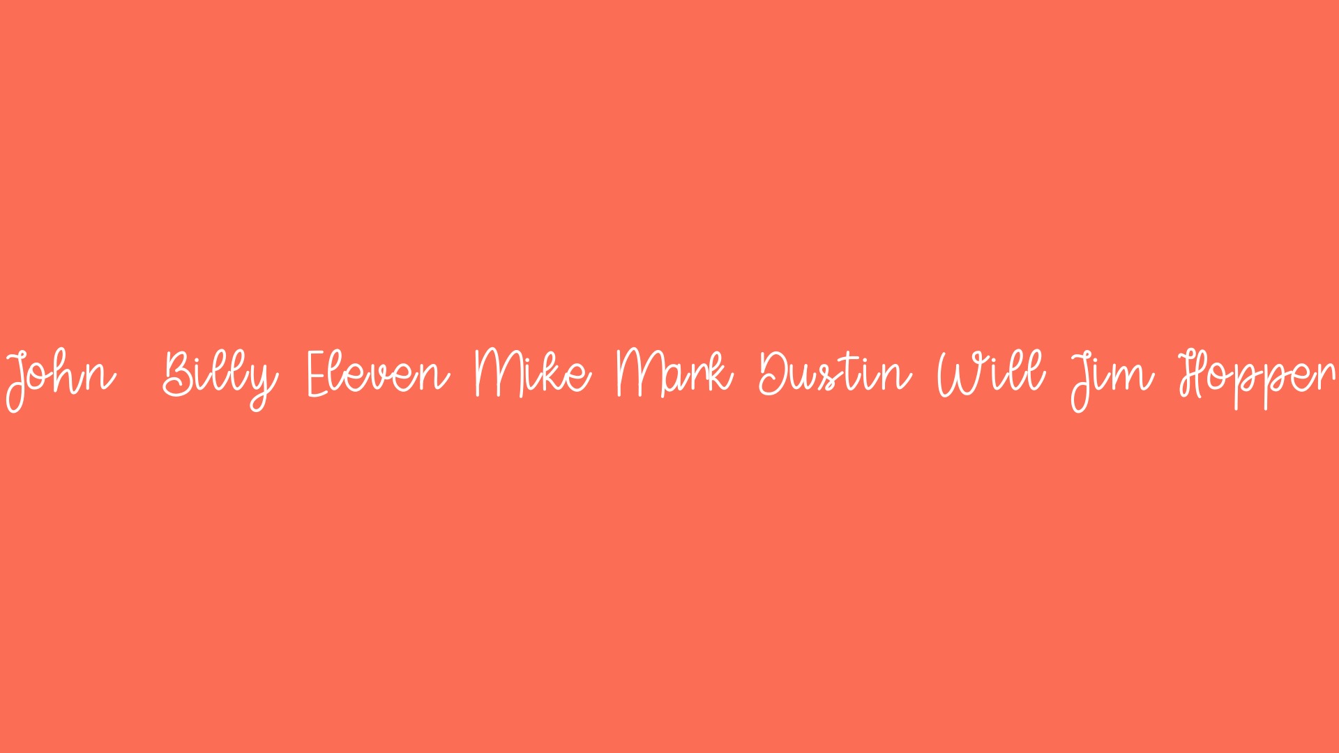
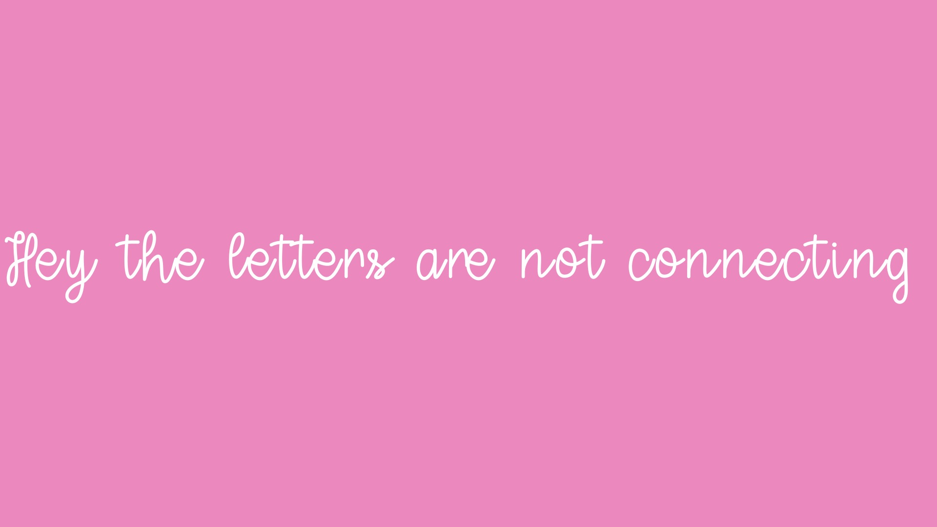
Hi guys! So, I’ve decided to create a cursive font for the first time and I’m having a bit of issues. The lower-case letters are not connecting the right way. I must mentioned that I did not create the font from scratch on Glyphs (I used IFont Maker). I only use Glyphs to finish my fonts. Here is a picture to show my issue


As you can see, the letters do not connect between each other. I’ve also got another cursive font with this same issue. And because of that, none of them work the way I wanted then to…
Is there any way to fix this in Glyphs?

You need to adjust spacing. See the tutorial of the same name.

I tried to adjust spacing already (in the other app), but since it alters the spacing of all the letters, some of them stay connected perfectly, and others stay overlapping…

For example, if I move the letters any closer, the “a” will overlap with the “M” in Mark

I’ve also tried to change the spacing of each glyph, but then one glyph connects nice with a glyph but not with some other…


Here’s another photo that illustrates my issue. If anyone can help me, I’ll be thankfull.


And the same issue happens with this other font I’ve created

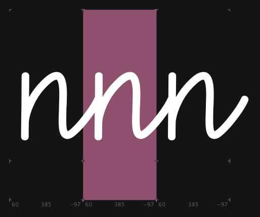
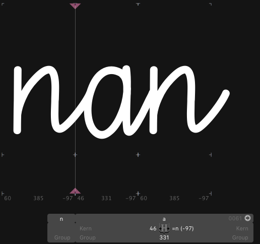
You need to find a system how you set the side bearing. So all glyphs with a typical outspoke need to have the same right side bearing, like “-50”. Then type “nxn” (where x means each letter) and adjust the lsb so that it connects with the n. That should work for most glyphs. For all other, you need kerning.

You start with “nnnnn” and make it look good. make sure the “n” stays in the visual centre of the bounds. Then step through all other glyphs (is FN+left/right arrow key or page/down) to get to the next/previous letter.

Thanks! I will try that. As soon as I make something, I’ll post updates here!

You may need alternates for some combinations. You will find tutorials about adding glyphs, and about something called OpenType features. What you want is a so-called ‘contextual substitution’.

Hey! I’ve done that and it actually helped with most of the letters connections. However some of then didn’t work out fine.

an cd ce cn dd dn dq ds ea ed ee en eo fj ft gd gj hd hh hj hn hs hu hv hw hx ih in iv jj jt kn lb ld lh li lj ll lm ln lr ls lt lu lv lw lx ly mh mn mv nn qj qn ra rb rc rd re rf rg rh ri rj rk rl rm rn ro rp rq rr rs rt rt ru rv rw rx ry rz tn tt ud un uq us vn xn xx yj yn zc zd zj zn zq zs zx
I will try to create the contextual substitution and see if it solves that. Thanks for your Help GeorgSeifert!

Any tips to do that? I saw the tutorial, but the “coding “ part was way too confusing for my beginner’s mind. Plus, i sounded to me as if using this feature would create just an alternate (that means that the wrong connection would still work in some apps). If that’s true, would there be any feature that replace the wrong connection for good?

The idea is that you use an appropriate alternate in the cases where the default glyph does not work. There is no general solution to this, you will need to find a system that works for your design. I cannot spare you from OT feature coding. It may look confusing at first glance, but if you go through the Features tutorials step by step, it is not so difficult. Trust me, others have done it before. It’s no rocket science, and it’s not programming.

Hi, I’ve tried to do the contextual substitution, but when I add the code and click compile, it says there was a problem with my font. When I click details it directs me to the Temp folder. Any tips to solve that?

Can you please send me the .glyphs file to support (at) (this website without www). I will have a look.

I got your file, thank you. The error was caused by a duplicate glyph name. Glyph names must be unique throughout a font file.

Let me document the process here.

First, I cleaned up things from the export of the other app.

  • In Font View (Cmd-Opt-1), select all glyphs (Cmd-A), and:
    • Paths > Other > Convert to Cubic (converts from TrueType to PostScript curves, PS curves are better for editing)
    • Paths > Correct Path Direction (Cmd-Shift-R)
    • Paths > Tidy Up Paths (Cmd-Opt-Shift-T)
  • File > Font Info > Font:
    • delete all Custom Parameters (select them and press the minus button, they were set by the other software, and are not necessary)
    • choose a better Family Name, e.g., Sweet Cake
    • put your name in the Designer field and press the update button (⟲) next to the Copyright field
  • File > Font Info > Masters:
    • Delete all custom parameters again
  • File > Font Info > Instances:
    • Delete all custom parameters again
    • Change the Style Name to Regular
    • Change the Weight popup menu to Regular
  • File > Font Info > Features:
    • Disable the calt feature, I believe you do not need it for this design
    • Press the Update button at the bottom
  • File > Font Info > Other Settings:
    • NO custom naming
    • NO disable automatic alignment
    • Keep grid spacing and subdivision at 1/1, the other settings don’t matter

Now, back to the Edit view:

  1. Type three n’s after each other (nnn) in a new Edit tab (Cmd-T)

    • Move them with the spacing shortcuts (see the short Spacing video on the Get Started page)
    • alter the RSB until they connect nicely
    • alter their position (LSB and RSB at the same time) without changing their width until the n appears centered in its width:
      51
  2. Type a different letter between them, e.g. the a.

    • Set the RSB to the metrics key =n
    • Adjust the LSB until it fits between the n’s:
      17
  3. Proceed to the next glyph between the n’s (View > Show Next Glyph or fn+Right Arrow)

    • if it has an outstroke like the n or a, set its RSB to =n. If not: adjust individually (in your case, the g and the j are such exceptions).
    • make it fit between the n’s in any event
  4. Consider changing the shapes of your lowercase s and x (or keep them as initial shapes only)

    • see the Monoline tutorial for how to change their shapes
    • see the Positional Alternates tutorial on how to make a glyph work as an initial shape, if you want to do that, but that is a bit advanced.
  5. File > Export

    • Consider using the Adobe Fonts folder, if you have Adobe apps to test your font in.
    • In any event, avoid font cache problems
    • You do not need overlap removal, because your shapes have no overlapping paths.
    • Autohinting: NO, this design does not lend itself for hinting at all.
    • Save as TTF: NO

Hope this helps.

PS: You can delete the .alt glyphs, as well as the glyphs called CR and .null. None of them are necessary.

1 Like

Thanks for your help! I tried exporting the font after following all the steps you mentioned before, but it says no file was created with a yellow warning sign . What can I do?
PS: I’m sorry to be making soooo many questions…

It worked for me but I had a different version:

Try the latest beta please. Go to Glyphs > Preferences > Updates, activate both checkboxes and press the Update button.

It now worked out! Thanks for your huge help!

1 Like