Is there a way to make my cursor more viable and easier to locate. (By Colour or weight.)

Most people complain that the cursor is to big as it disturbs the visibility when doing the spacing.
Something else: why do you have an italic angle when your glyphs are upright?
When Most People get older and their eyes sight starts given them trouble they too will need all the help they can get. As for the Italic I had indicated an italic in the font info panel when setting it up. I have now deleted the measurement and the cursor is now vertical. Sorry if this offended you. I 'm doing the best I can. Is there an answer to my. original question? I have a question for you in turn. Why are Most People looking at the editing page and not the Editing panel at the bottom this is a more realistic vie of the actual kerning aspaces.
I don’t think anyone of us know what most people think.
I can only say that I almost never look at the edit area for visual judgments, that’s what the preview bar is for. Working on the technicalities under the hood vs looking at the resulting rendering.
And, btw, the spacing and kerning can be seen in both. The only little inaccuracy in the edit view is that the baseline is not sharp as it does not necessarily sit on a full pixel border.
I know we all have our different ways and preferences in the way we work.
I still havn’t got an answer to my original question.
Is there a way to make my cursor more viable and easier to locate. (By Colour or weight.)
Are you referring to the Mac OS cursor or the various guides and indicators specific to Glyphs?
You can make a system-wide change to the OS cursor size by clicking the Apple menu, selecting System Preferences, then selecting Display. From the choices provided, choose Cursor and adjust the slider to the size you prefer.
I didn’t meant to disregard your request. I’ll have a look if I can improve this.
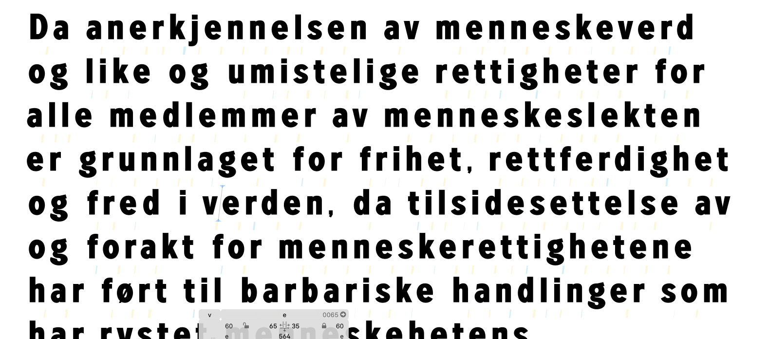
I’m talking about the Glyphs 3 cursor.
That would be great. I look forward to hearing the results. I think this could be a good preference choice.
I would suggest keeping a few glyphs or words in Edit View. If you want to preview multiple paragraphs of text (or even the contents of an entire book) you can use Text Preview from Window → Text Preview . It updates live as you edit kerning and spacing in Glyphs and is a preview of how it would look like in other Mac applications. This also allows you to see the cursor better since you can make the glyphs larger on screen.
Thanks for the good tip.