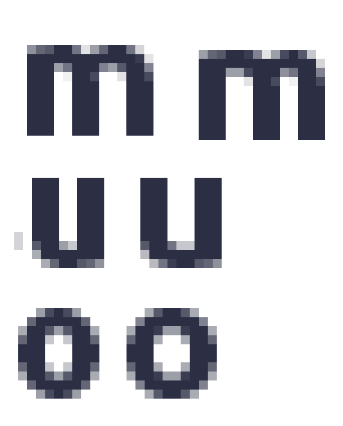
On small sizes the spaces between vertical stems of letter m rendered randomly a bit different (on screen). The same situation with contours happens with some other letters like u, o, b, d…
Is there any way to improve it? To equal contours? If manually do NOT hint the middle stem than contours will be similar but it appears fuzzy.