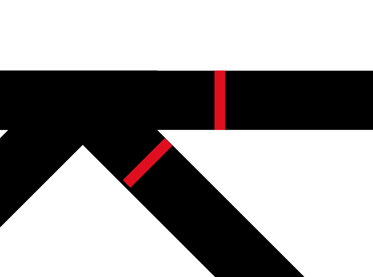
This little detail is killing me. I have made a geometric font in Glyphs, creating the stroke with the Offset Curve filter. One part of a glyph has a 45° corner. The stroke is 8 units. Looks perfect on Glyphs but we I export the variable font (it’s in 3 weights) and I try it in AI the stroke is not the same weight anymore.
I have made 3 masters in Glyphs for the 3 weights I need. 8, 16, 24 units. When I test the font in AI it happens whatever the weight in the variation. Even if I export the font not as a variable it happens the same. I export in the Fonts folder I created for the Adobe Apps.
I measured it and the thicknesses are the same. I think the error happened when you rotated the square. You need to disable the grid before you do this. Or use the measurement tool.
You should note that your top stroke is 8 units in weight, but by rotating your stroke 45° it will automatically snap to the grid (thus likely changing the weight of your stroke.)
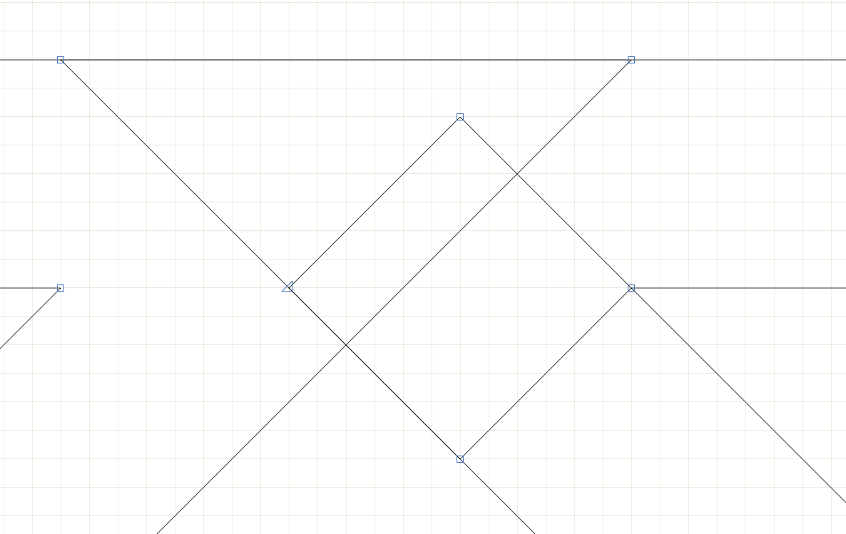
You can calculate the weight of the diagonal stroke using the Pythagorean theorem: a^{2} + b^{2} = c^{2}
The butt of the stroke rises 6 units and crosses 6 units. So you get 6^{2} + 6^{2} = c^{2}. And when you solve for c you get ~8.48.
That example works because I can see that the end of the stroke and the stroke itself are perpendicular to each other. But as Georg suggested, you can use the measurement tool to check the weight of your lines.
Another tip you may find helpful is: select two points on your stroke then right click and add a guideline. This will add a guideline which passes through those two points you selected. If you then double click on the center circle of that guideline, it will make the guideline perpendicular to that angle. From there, select the guide (by clicking on the circle) and then click on the ruler icon (“show measurements”) in the info box at the bottom. This will then you show you the distance between each line that it crosses through. (Please note, this is still a rounded number [to the nearest hundredth])
One last thing: If you’re looking for absolute precision, you should know that all fonts have to conform to some sort of UPM so compromise usually has to happen in order to adhere to a grid. This is something you may have to look into more on your own. But if you aren’t too worried about complete software compatibility, then you can switch the grid spacing to zero in the font info (under Other Settings).