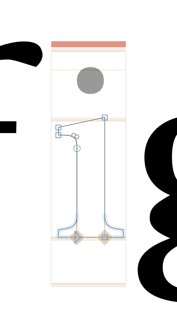
The red bar above the glyph indicates if a letter is compatible (same point amounts, interpolatable, ..) but im not building a veritable font, where I want all masters to be compatible. I checked with with the preview options, and so far as I saw non of the selection options disabled the red bar/indicator. Therefore I wondered if there is a way to turn of this red bar/indicator, since its a bit annoying.
An additional question would be: Is it possible to have 2 masters interpolate with each other, and then two additional masters that do not have to be interpolatiable within the origional two (4 masters => 1+2 interpolate, 3 separate, 4 separate) one glyphs file? Or will I have to set them up in different files?
I would appreciate any direction on this, as im not sure where to find the answer.
Thank you! Turning of the second checkbox in “Enforce Compatibility Check” works for me as a solution! Im not planning on interpolation between all masters, and im not sure if its a smart move to do everything over alternates as I amm doing a font with a Roman, a slanted italic, and a true italic + upright italic. The true italic has more points as the slant in most characters. Id be nice if the Roman and slant interpolate, but they do not have to interpolate with he true italic based Typeface cuts. Well, more importantly tough I want to see the masters together while editing in one file… anyway. Thank you for your help!
Bear in mind that you can’t switch kerning groups between masters. I would leave the incompatible italic in a separate file, since I assume that your shapes will be different and thus require different kerning groups.
If you have upright and slanted masters in one file, and you can add instances that interpolate between the upright only and the slanted only. The two sets of masters don’t need to be compatible.
And I would suggest to build the “i” from “idotless” and “dotaccentcomb” (select the outline of the “i”-stem and right click > Component from Selection > idotless). Or if you have a “idotless” already, do Glyph > Create Composite.
If you have upright and slanted masters in one file, and you can add instances that interpolate between the upright only and the slanted only. The two sets of masters don’t need to be compatible.
Yes, this is what im trying to communicate. As I understand currently , if you add Axises, and assign the distinct Positions, still all of the masters have to be interpolatable with each other. How do I ‘disconnect‘ the two sets of Upright + Italic in the way you describe?
You need to add the parameter and only add instances that use one set of the masters. So if you only have upright and only slanted instances, there is no need to interpolates between the two sets of masters. So they don’t need to be compatible.
As mentioned, having an upright and a proper italic in one files has problems beyond the compatibility and thous is not recommended.