However, if I export all the weights in OTF, there is no distortion shown. hmmmm
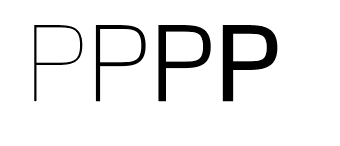
However, if I export all the weights in OTF, there is no distortion shown. hmmmm
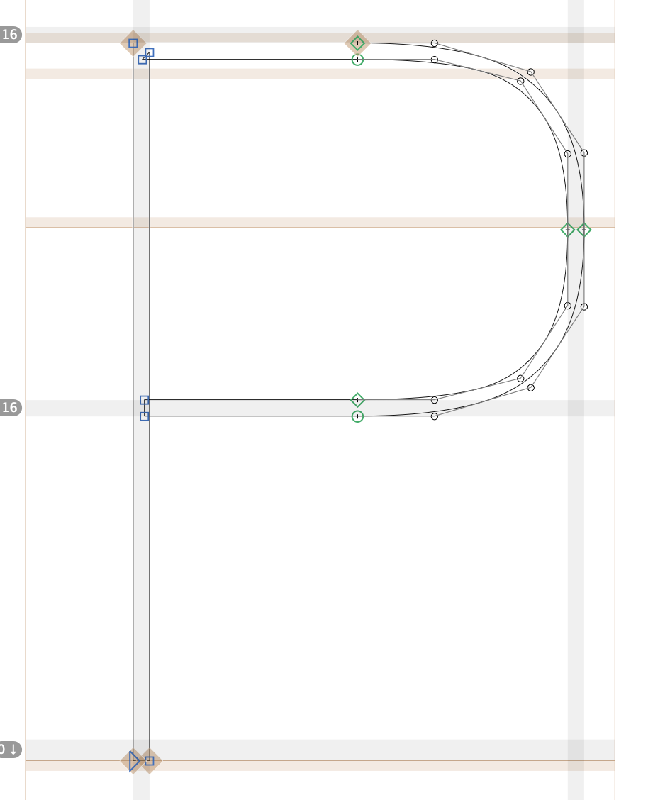
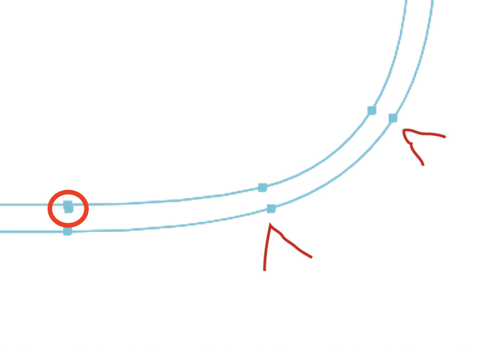
The variable font contains TrueType outlines. When you convert to outlines, those will be converted back to cubic curves. That explains the extra nodes.
I suspect that the distortion is a rendering artifact/bug.
How does it look if you export an PDF?
When I change paths in Glyphs into quadratic curves, there’s barely a visible change in the shape of the initial Design.
PDF looks fine or maybe not as bad as in InDesign I guess…
It is not only adding the points, you must very slightly move them in a symetrical manner and pull the control points slightly to align the tension in the curve. Very small adjustments!
I don’t think there is a problem to be fixed with the outlines. But could you send me the file that I could have a look?
Thanks Georg. How can I send it to you?
Send an email to support at this domain.
Thanks! Send
That seems to be a bug in Indesign. The same outline exported as variable font renders curves differently than lines.
I played around with manually TrueType hints and that seems to improve this. But that shouldn’t be needed.
Thanks for checking! So should I just ignore the distortion for the moment?
Yes.