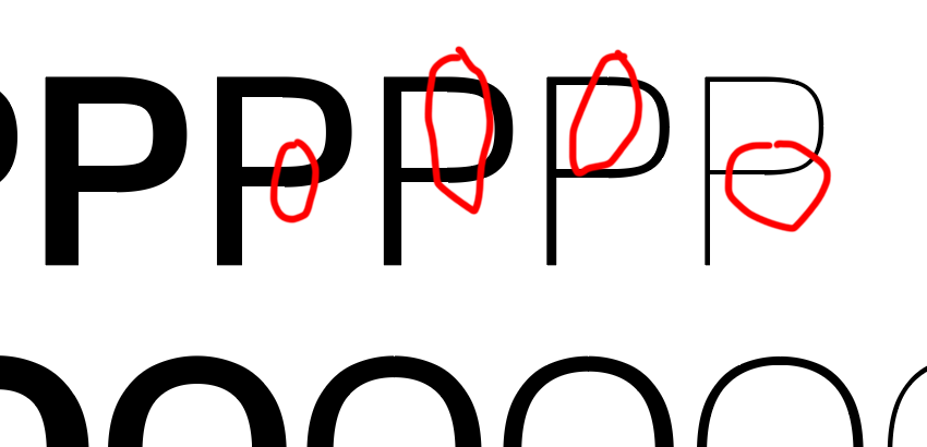
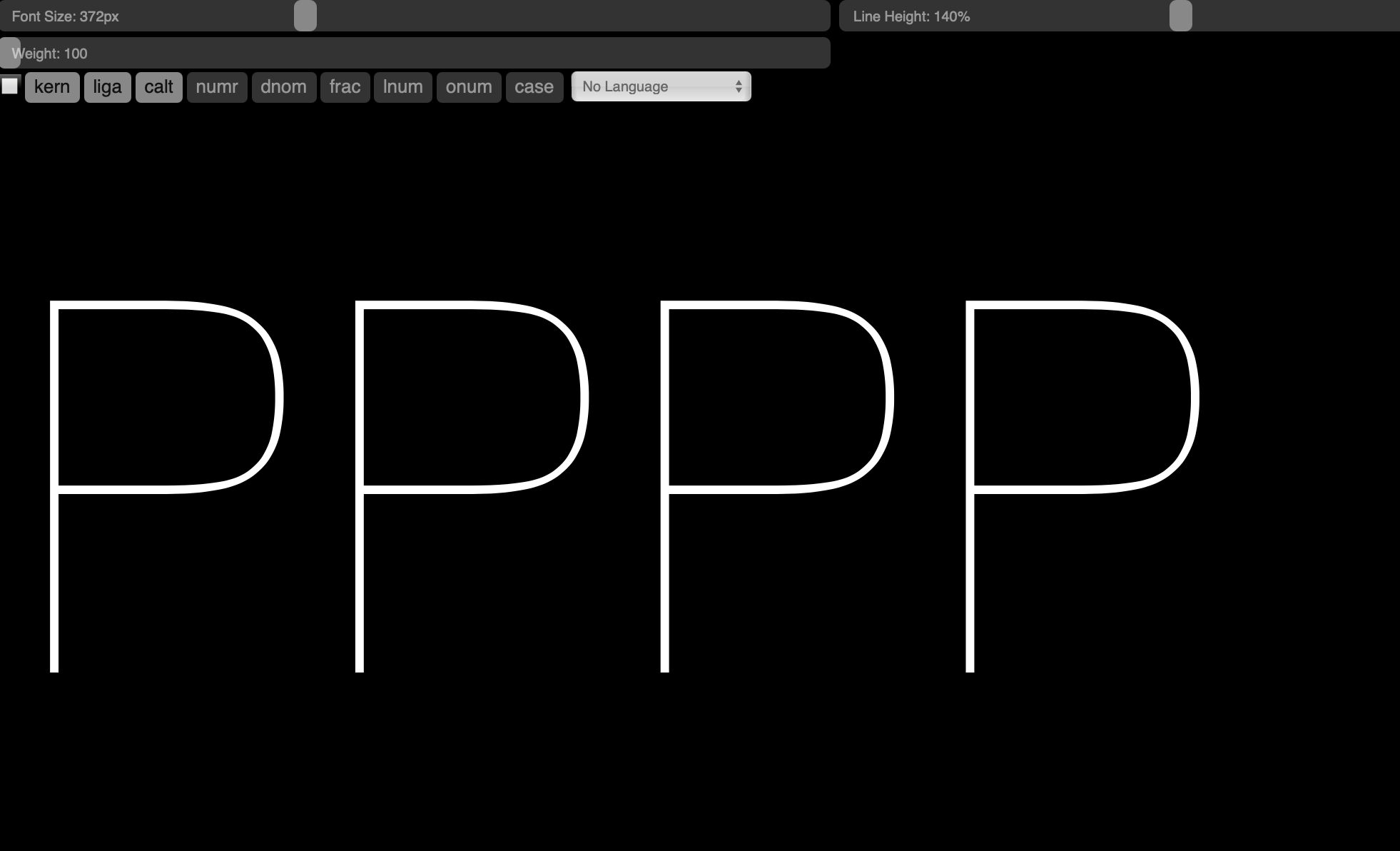
Any advice/explanation on this? When I zoom in the distortion is partially gone. Printed is also fine. I exported the typeface as a variable font.
Has this something to do with hinting?
- What are your grid settings in Font Info > Other?
- What kind of export? Static TTF, OTF, variable font?
1 Like
Any insight on this?
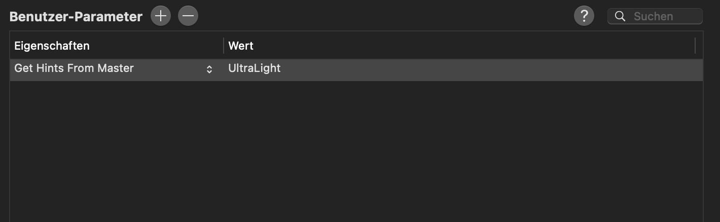
Hard to say. May be a hinting issue. Are there manual TT hints in the affected glyphs?
Or a rendering issue. In which app do you see the bumps? On which macOS?
The affected glyphs contains no manual TT hints. Bumps are seen in InDesign. I’m on Big Sur 11.1
- Nowhere else? What about browsers?
- Which InDesign version?
Looks fine on web (test) but Indesign & Ilustrator, which I just updated still show some distortion…

Very likely a rendering issue in the Adobe apps. You can double check the TT conversion and see if there is anything wrong in the deltas with Samsa.
1 Like
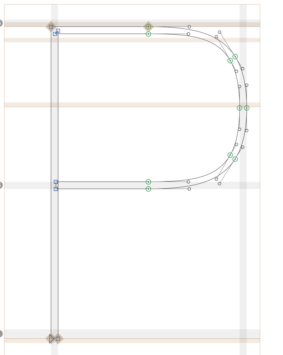
Looks to me like a problem at the tightest points of the curve that it is too pinched in the drawing. This seems like a drawing issue. You may need to add a point at the apex to control the continuity of tension along the curve. You can then use the control handles to adjust the tension more uniformly.
1 Like
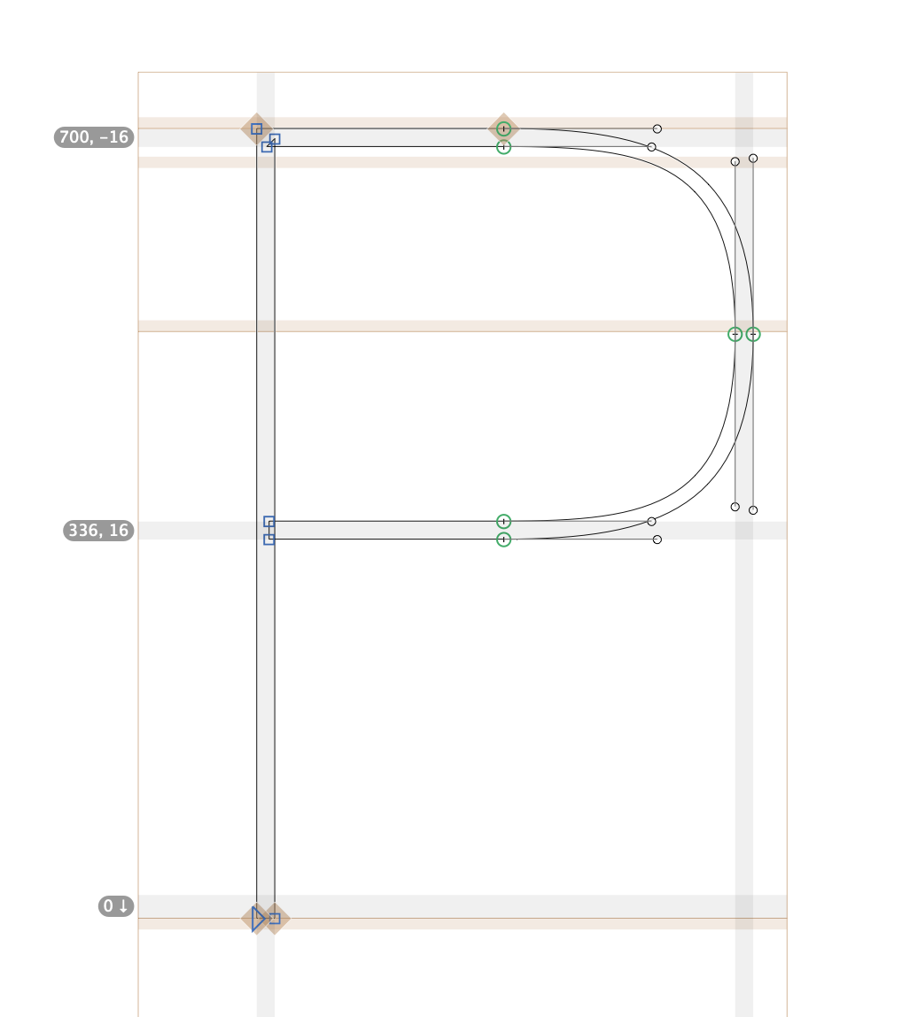
Check whether the variable font has extra points in that spot (convert to outlines in AI). The converter sometimes adds points if the curve is too flat. If so, you may need to push the points a bit closer towards rounding
1 Like
The weird thing is, that when I zoom in to the maximum the distortion is gone. Also when printed it all looks fine
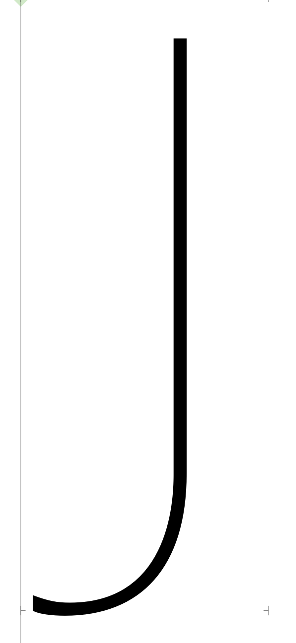
Another weird thing I noticed, is that my uppercase j is not shown (InDesign) as it is drawn in glyphs. This stays consistent in print too…
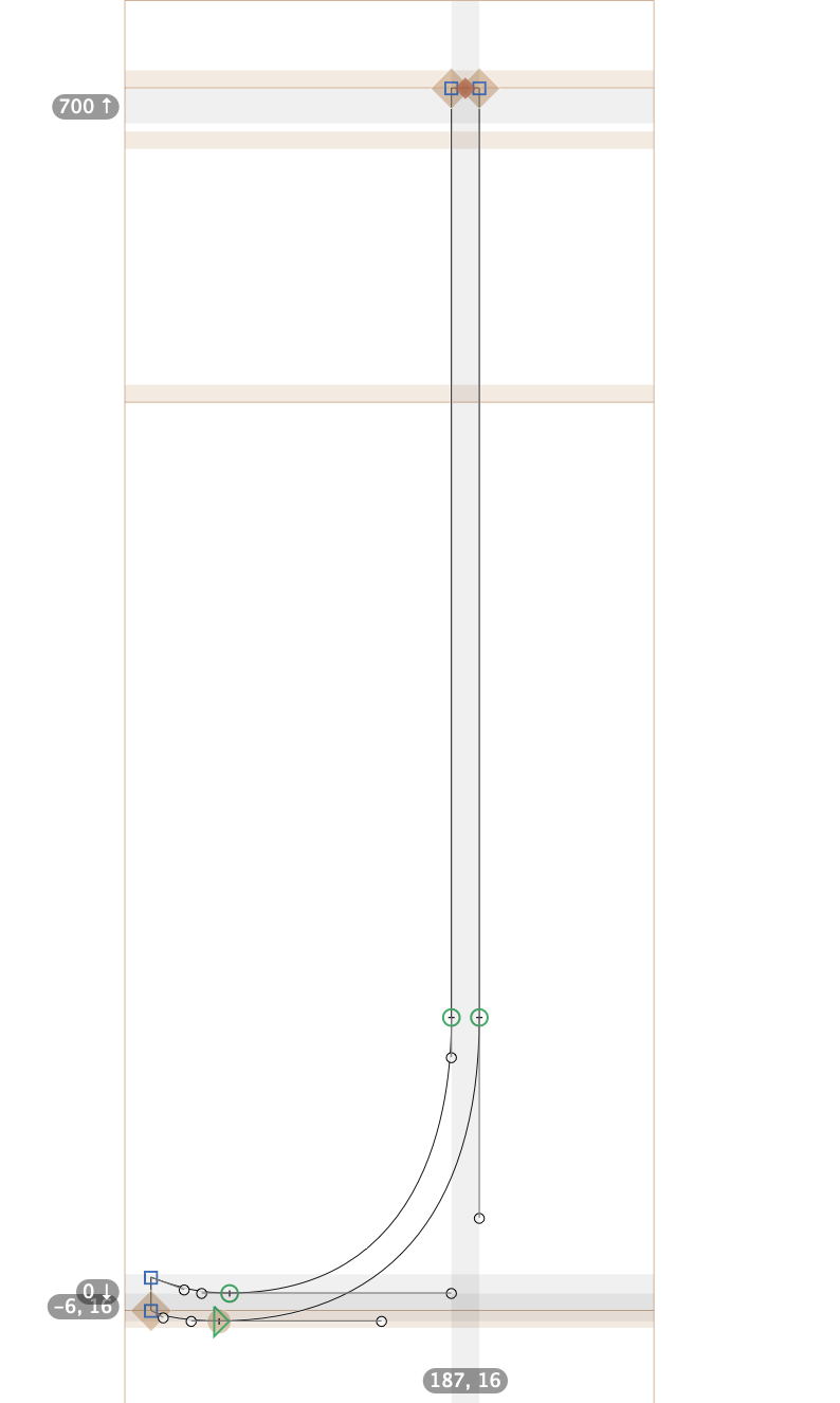
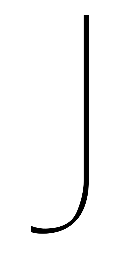
The problem is the very uneven curve. Converting those to TrueType is tricky.
1 Like
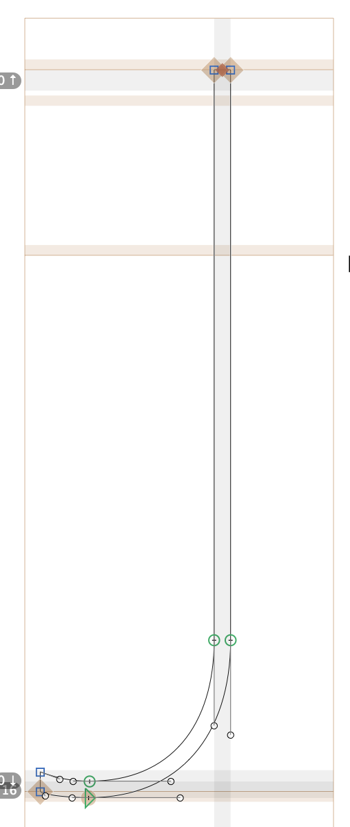
When you export to a variable font, all outlines are converted to quadratic curves which would lose some information from your original design. Some control points are automatically added to minimize that but it won’t always keep your shape. Try converting some of your glyphs into quadratic curves in Glyphs just to see how they would shown up after export. Tweak them if you are not satisfied with the result.
The easiest way to deal with that is to add another control point in the middle of the curve, but beware that you have to keep its handle angle or proportion consistent among all masters, or kinks would occur.
1 Like
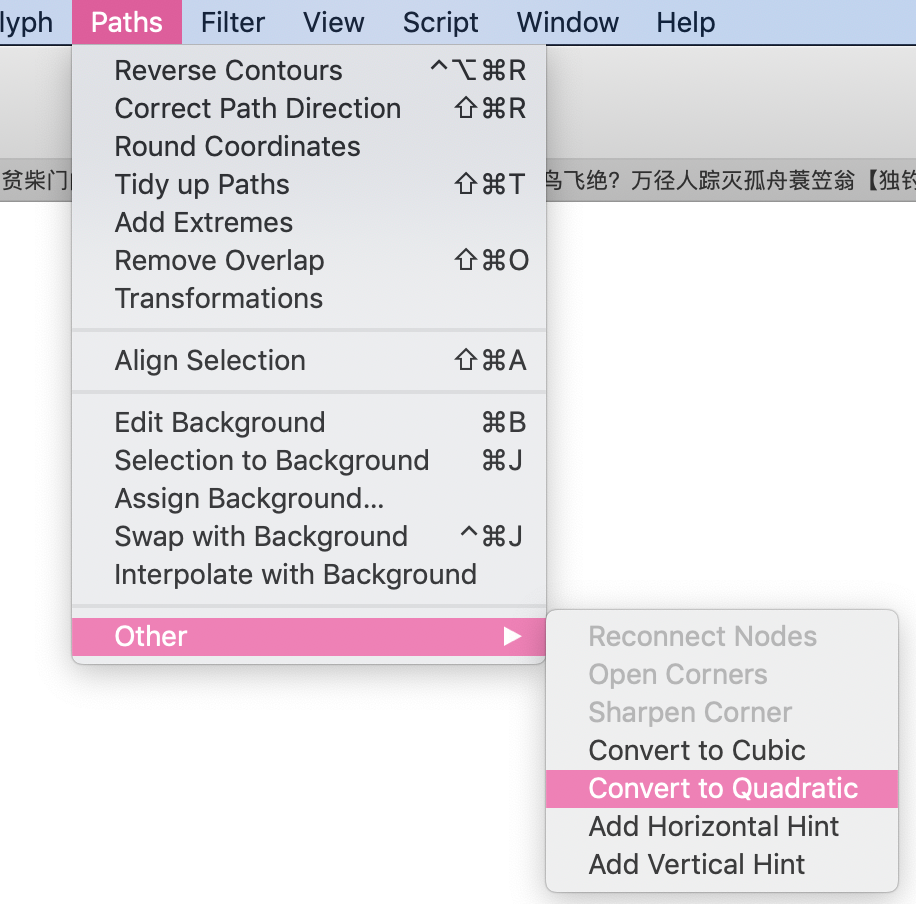
How do I do that?
Rounding errors compound at lower resolution.
1 Like
I tried this out and found out that InDesign actually adds a lot of extra points. Wow this is very surprising & annoying!
Why does this happen???