I know this topic has been discussed more often, but I’m not really convinced how to go about this topic.
This article (Vertical metrics | Glyphs) by @mekkablue states:
Attention: whatever extends above or below these values, will likely be cut off when rendered by the Windows text engine. Hence, the easiest way, it seems, is to make sure everything in the font fits into the win span. So, usually, the win span will encompass more than 1000 units (or whatever your UPM value is).
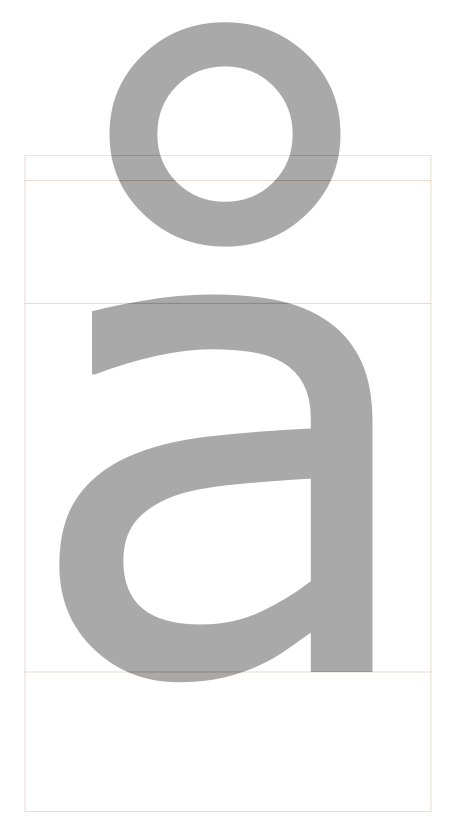
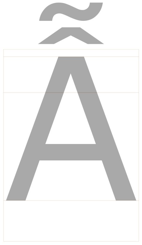
But I’ve opened loads of fonts, made by professional type designers. And almost all these fonts have accents ascending the top of the font box (be it 1.000 or 2.048 UPM). Which would make sense to me, with these double accents on some glyphs:
Verdana for instance:
But I never saw one extend BELOW the font box. All downward accents are within the UPM size.
Verdana again:
Is it save to presume that this is best practice? That Microsoft software (where cutting of mostly appears) ‘just’ cuts off anything hanging out below the font box?
I’m asking this because I’m reworking a really old font of mine, extending it with loads of accents. And they extend below the font box, so I’m thinking about shifting the glyphs, scaling the font down, or something else.
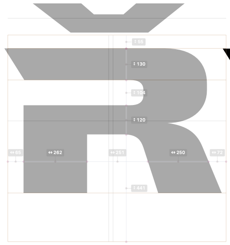
It looks like this. And I know by the experience I have, that that doesn’t look right.
I’m not really an expert nerd, but I have run into some issues with these metrics. I think this is the key:
I ran into problems with a font I exported from Fontlab Studio 5. People using my font on PCs complained that anything below the baseline was cut off. I had paid attention to only the Ascender and Descender values because I thought they were the only thing that mattered. I never saw any problems on my Mac to make me question it. The export from FL5 created custom parameters in the .glyphs file for TypoAscender, TypoDescender, WinAscent, and WinDescent. I noted this, deleted the custom parameters, and exported my font again. The problem was gone. Removing them allowed Glyphs to set them correctly. I do know that the span of WinAscent and WinDescent is larger than my UPM of 1000.
There is a script that will show these Win values as labeled guides. I think it’s ‘Show Vertical Metrics’, but it doesn’t seem to be working for me right now. I don’t see the guides. Not sure why.
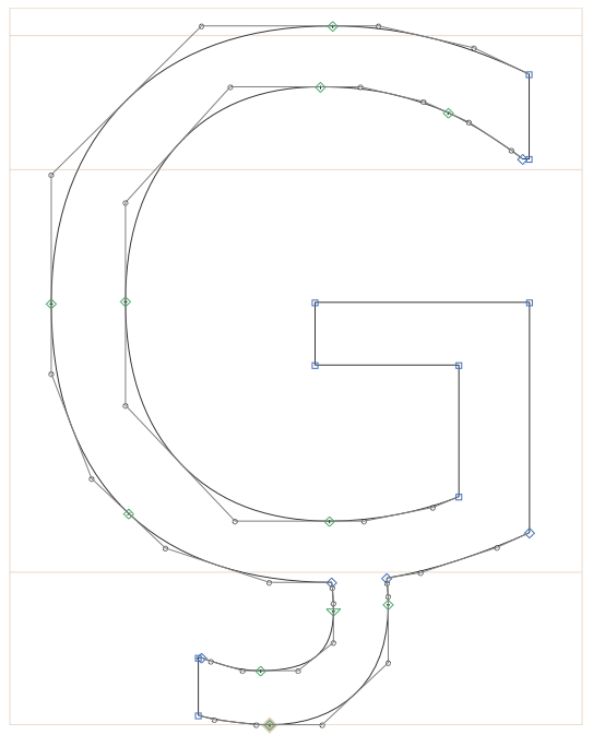
Not sure what you mean by font box. The font bounding box are the maximum measures of all outlines.
The UPM is not a height like ascender or descender. It just is a reference for the scale, there is no way to say where the UPM starts and ends.
But WinAscent and WinDescent are such heights, and those are used by some rasterizers for clipping. And the distance between WinAscent and WinDescent can exceed the UPM amount. That is what the quoted sentence says.
Sorry, bad terminology on my side. I meant the max dimensions of the font, ascender + descender. The max space the glyphs live in, so to speak. Is this the bounding box?
I’ve changed the UPM of my font (with the scale arrows in Font Info > Font > Units per EM) down to 900. And then in the field back to 1.000. This solved all my presumed ‘problems’. The glyphs ánd the accents now nicely live inside the bounding box.
But my initial question stays the same: Is it okay for a glyph (incl accents/marks) to exceed the bounding box (ascender + descender), the max font dimensions?
What I saw, in fonts from pro type designers, was that accents mostly rise above the top height, but not descend below the bottom. Is this correct, and doesn’t this risk being clipped in MS Word or on the web as web fonts, for instance? I’ve had this happen to a font of mine, and want to prevent it with this one. See this page:
The bounding box is not at all the problem. The winAscent is. It was supposed to be just the clipping height but the problem is that it is used as the default line spacing in some apps.
Glyphs calculates a winAscent automatically based on the Ascender. You can set it yourself to whatever value you need. Have a look at the feature file in the Temp folder (or in the final font) to see what values Glyphs has chosen.
So you set your Ascender/Descender and UPM according to your design and then tweak the settings that go into the font by custom parameters if needed. And having accents outside of the metrics box in Glyphs is not a problem.
I’d just need to come up with the right winAscent value to keep these accents/marks from being clipped in MS Word and on the web?
I was just wondering, because plugins like Show Stems Pro from @Mark doesn’t measure outside the bounding box. And loads of people report these problems.
That has nothing to do with those values. I just made it to measure everything inside the Metrics box between descender and ascender. Probably need to change that to extend to the layer bounds. I put it on the list.
The answer to this question, if you still have it, is yes.
As I understand it, winDescent (not to be confused with Descender) must be set low enough to contain the lowest descender, and winAscent must be set high enough to contain the highest diacritical mark. Glyphs can do it automatically, or you can set the values with custom parameters.
Actually Glyphs is not measuring the outlines to compute the win-metrics. It uses the same values as the typo-metrics to give equal line spacing in apps that still use them. Otherwise different members of the family can have quite different spacing.