Symmetrical letters should have identical sidebearings left/right (A, N, O, T, X, Y)
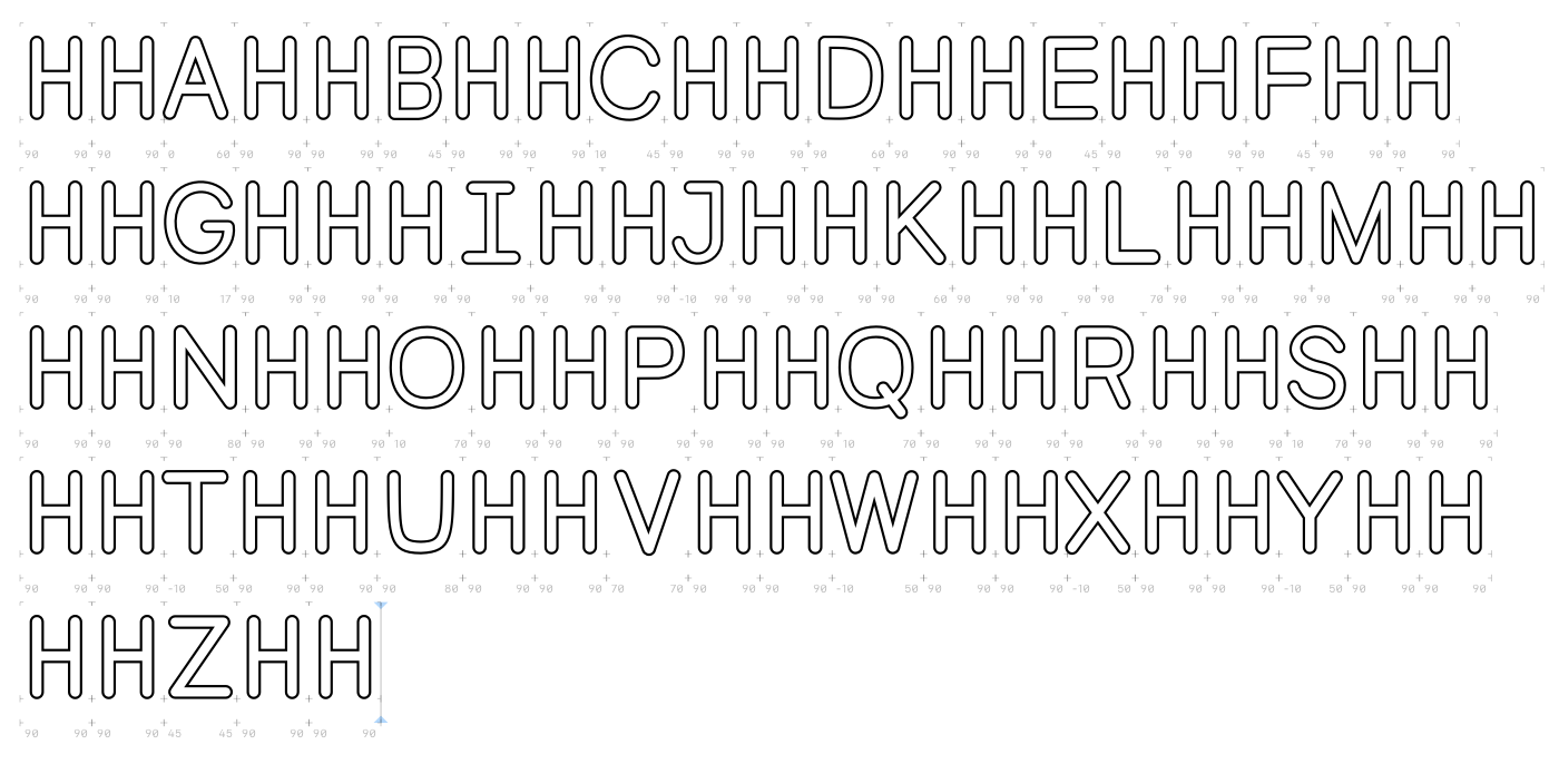
In the image, the H appears very narrow in relation to the other letters. I suggest you make the H wider until the visual difference in the image is reduced. A good starting point would be to make the H as wide as the N.
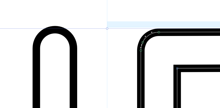
Letters with vertical lines, such as H, look too small compared to letters with flat tops and bottoms, like E or Z. Because of the round stroke endings, those vertical strokes must be a little bit longer so they look the same. It is just a small amount that makes the difference:
I took a look at your file and would have some suggestions:
First, just as a heads-up,the metrics key in the G is missing a = (you did this correctly in the other glyphs):
Another trick concerning metrics keys is to use the | (Option + 7) to designate the opposite side of the letter, to achieve symmetrical sidebearings like Jens suggested:
You can also use this to point to other glyphs, such as =|k to designate the right side of the k.
That said, though, I would recommend to reconsider the usage of metrics keys to such an extent in this case – you are using spacing rules for all letters, with calculated values based on the H. Using metrics keys for shapes that are the same on one side is fine, such as using H for BDEFKLMNP, but using calculated metrics keys is not very helpful. I would advise to space glyphs like O separately by hand. You can then use the O metrics key for CGQ. Spacing is manual work, which will also over time train your eye a lot. In addition to the comments Jens made on proportions, you can, after balancing these out more, start adjusting the positioning of glyphs so that the rhythm of the stems is more even.
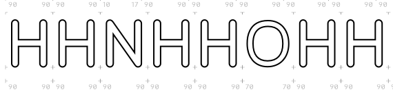
After spacing the alphabet between Hs and Os, definitely check it in real words, then it’s super easy to spot problems (one of which is too narrow word space by the way):
take a look at this document, it describes a process from walter tracy’s book “letters of credit” which is very relevant to this subject (the second page) http://www.appliedaesthetics.org/ART264-F12/03/1B.pdf
it’s not a perfect method but it’s often a good starting point.