I’m currently designing a font and I’m curious if every font needs to have contextual kerning. I, of course, understand the principal of it, as every letter has some bits that have plenty of negative space or too little, but is there a way to quickly kern or do I need to go through and manually kern every letter pairing?
No, only the pairs that cannot be improved by simply adjusting sidebearings. Your sidebearings seem to be all set to 0 on both sides which you will need to change first (after throwing away the kerning data first; open Kerning window, option+cmd+K, select all, and delete).
Kerning is contextual by nature, so you don’t need to say “contextual kerning” which is a different, more technical thing. It’s just kerning in this case.
Once I delete all of the data in the kerning window, where would I go from there to properly kern everything? Is there an efficient way to set proper spacing on all of my sidebearings? Apologies if this is a bit of a redundant question. I’m used to creating individual type pieces and this is my first shot at crafting a full font!
Forget about kerning, at first. Concentrate on spacing your font properly. You can minimise the kerning work by spacing your font well.
For starters, write out “nnnnnnnn” and adjust the width of the n until you are happy with the rhythm. Then place it between two Hs and move the paths in the n around (without changing the width) until it appears visually centred between the Hs. This will be your basis for spacing the other lowercase characters: place them in the context of the ns and adjust their sidebearings until they blend in well. Same goes for your uppercase: Adjust the width/sidebearings of the H until you achieve a good rhythm with “HHHHHHHH”, then space your other uppercase letters accordingly. These initial characters, especially O, H, n, o are often called control characters, as they define a lot about the rhythm of your typeface.
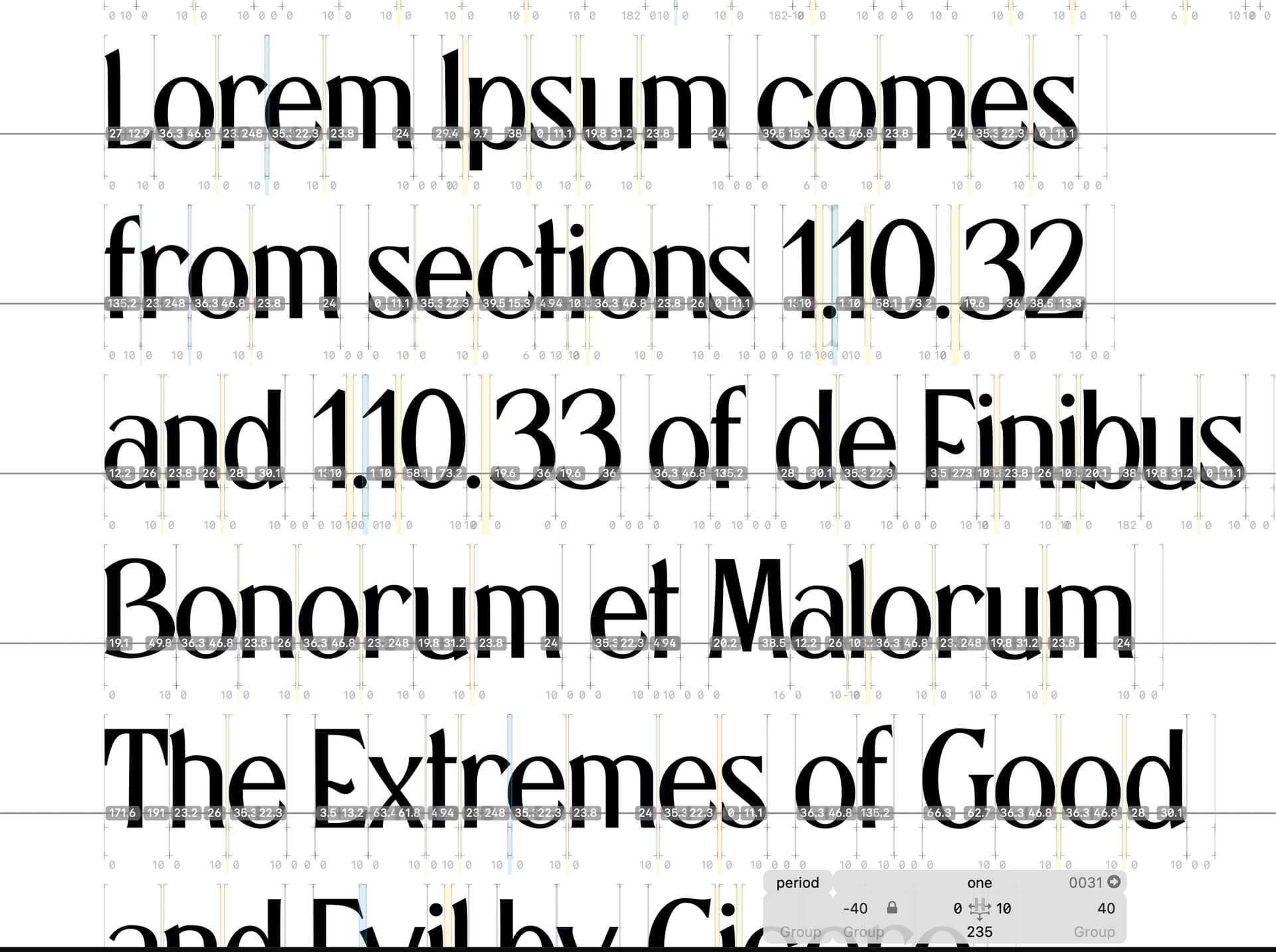
Don’t forget that you can use metrics keys for syncing sidebearings for glyphs that share the same shapes. Look at your typeface in the size you want to design it for, not blown up really large. Once you have gone through all your letters and have achieved the rhythm you want, you can think about kerning. Use kerning groups to group similar shapes together, which minimises the amount of kerning you need to go through. I see in your screenshot that you didn’t set any groups.
You can find more in-depth learning resources here:
Contextual kerning is something different, but that is nothing you need to worry about at the moment.