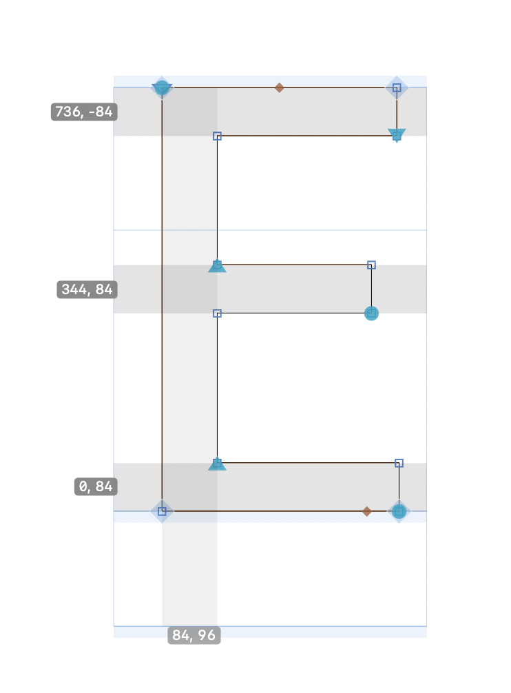
I noticed that PS autohinting places the hints “inwards” as applicable. However, when exporting an OTF, and opening in Glyphs, all horizontal hints are upwards. Is this something I should worry about?
Here is an example. The top bar of the E is what I am referring to.
Hints in the binary are always upwards. For me it looks better when the hints start at the zone. It is how they are processed but not how they are stored.
Will this be corrected – it is a bit confusing. FontLab shows the hint direction as up.
Previously Glyphs showed it correctly too and opening old files, shows it correct (as a positive value).
When I delete and remake the hint at the top, it becomes a negative value.
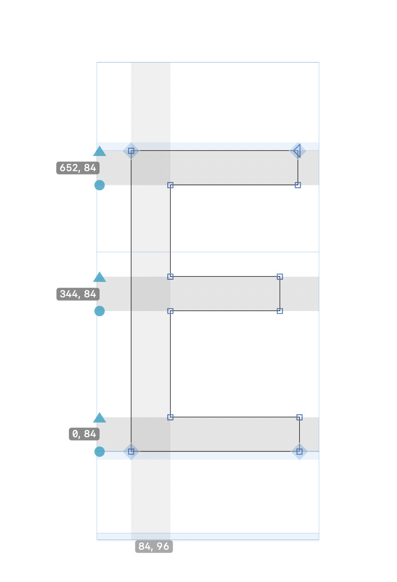
What exactly is the confusion? The hints in Glyphs connect to nodes and interpolate along with them, so you only need to set them in the first master. That is why they have those connectors. Ghost hints have negative widths in PS binaries to differentiate them mathematically from stem hints. But I wouldn’t use that to visualize them. Because you get into all kinds of trouble then. E.g. the difference between -20 and -21 is technically important but hard to visualize. We visualize that one is a top ghost, the other a bottom ghost. I think that makes more sense for a UI.
The blue dot and triangle are confusing, because they indicate that start, end, and direction for PS hints being relevant when they are not. A simplified UI, with only blue dots, no direction and only a positive value would probably be more Glyphs-like.