The weird problem with my font is back. It was solved when I disabled autohinting, but now it’s there again:
After exporting I activate the font in Fontbook. When I convert my font to outlines in Illustrator I get anchor points that are exactly on top of each other — something I really don’t want to happen…
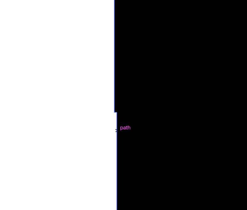
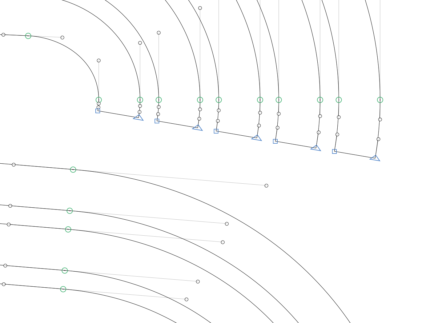
For example, this is my lowercase o, and the node in the red circle becomes a double anchor point after exporting. It also happens with some other characters, and the double anchor points are sometimes on other spots after exporting the font again.
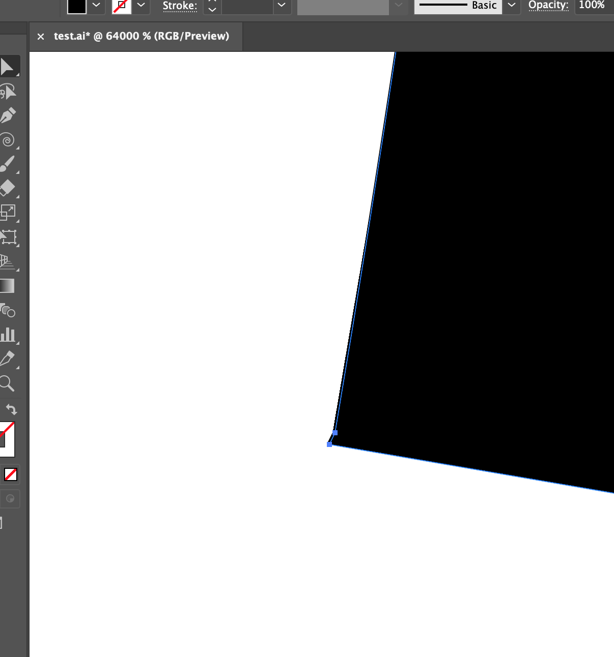
This is a screenshot of the outline in Illustrator. This should be a straight line with one anchor point like in Glyphs, but it has two anchor points and the line is shifted horizontal a tiny little bit…
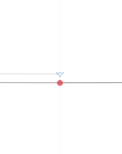
Here’s a Glyphs file with the lowercase o.
I’ve discovered something: if I disable ‘remove overlap’, the double anchor point appears on a different node than when I enable ‘remove overlap’. Odd!
Thanks mekkablue. Yes, I would prefer not to have a grid, like spacing 0 / subdevision 0. Because of the curves that are slightly different (but visibly different) when the points are exactly on a grid.
I tried spacing 1 / subdevision 10 or 100, but no luck. The double anchor points still appear.
Hi Georg, thank you!
Grid 1/10 helps a little, but I still get some ‘broken lines’ due to double anchors next to each other.
I noticed that the affected anchor is the first node of a shape. When I make another anchor the first node, this node will be the affected one after exporting the font. Even when the coordinates of the node are changed to round numbers.
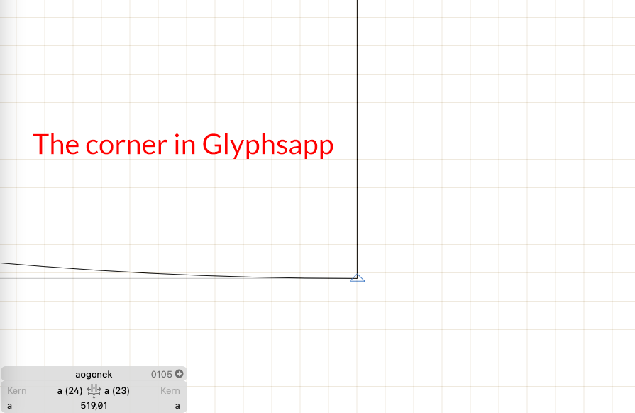
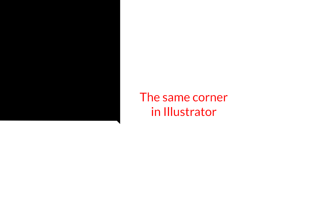
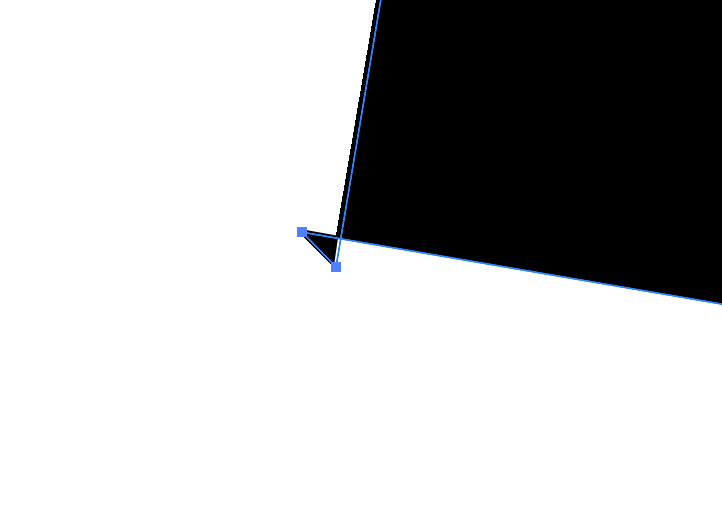
This is a detail when I open the exported OTF again in Glyphs (this gives a better picture of the problem than in Illustrator):
I had a look at your file and checked the export code. It seems to be a rounding problem in Illustrator. I checked the postscript spec and those small errors are mentioned there. So you can’t seem to be able to avoid them. And it only shows up when you zoom in all the way.
Thanks for the investigation. What a pity that there is no solution for now. I have three short questions:
Where can I read about these Illustrator/Postscript specs?
Is there anything wrong with opening the final .otf files in Glyphsapp, removing the duplicate nodes and saving them again as .otf?
Is there a way to draw shapes like this in GlyphsApp with swatches or something like that? I had the idea to make a whole series of weights from one basic centerline.
1000x thanks for all the help!
The double node is not rally in the file. The outlines are drawn with relative drawing operations and if each one introduces a tiny rounding error, the end of the curve will not hit the beginning. And as Glyphs applies the same math, it suffers from the same problems. I see if I can circumvent this.
That is quite complicated to do but possible: with the help of a lot custom scripts.
Thanks for the explanation, this helps a lot understanding it!
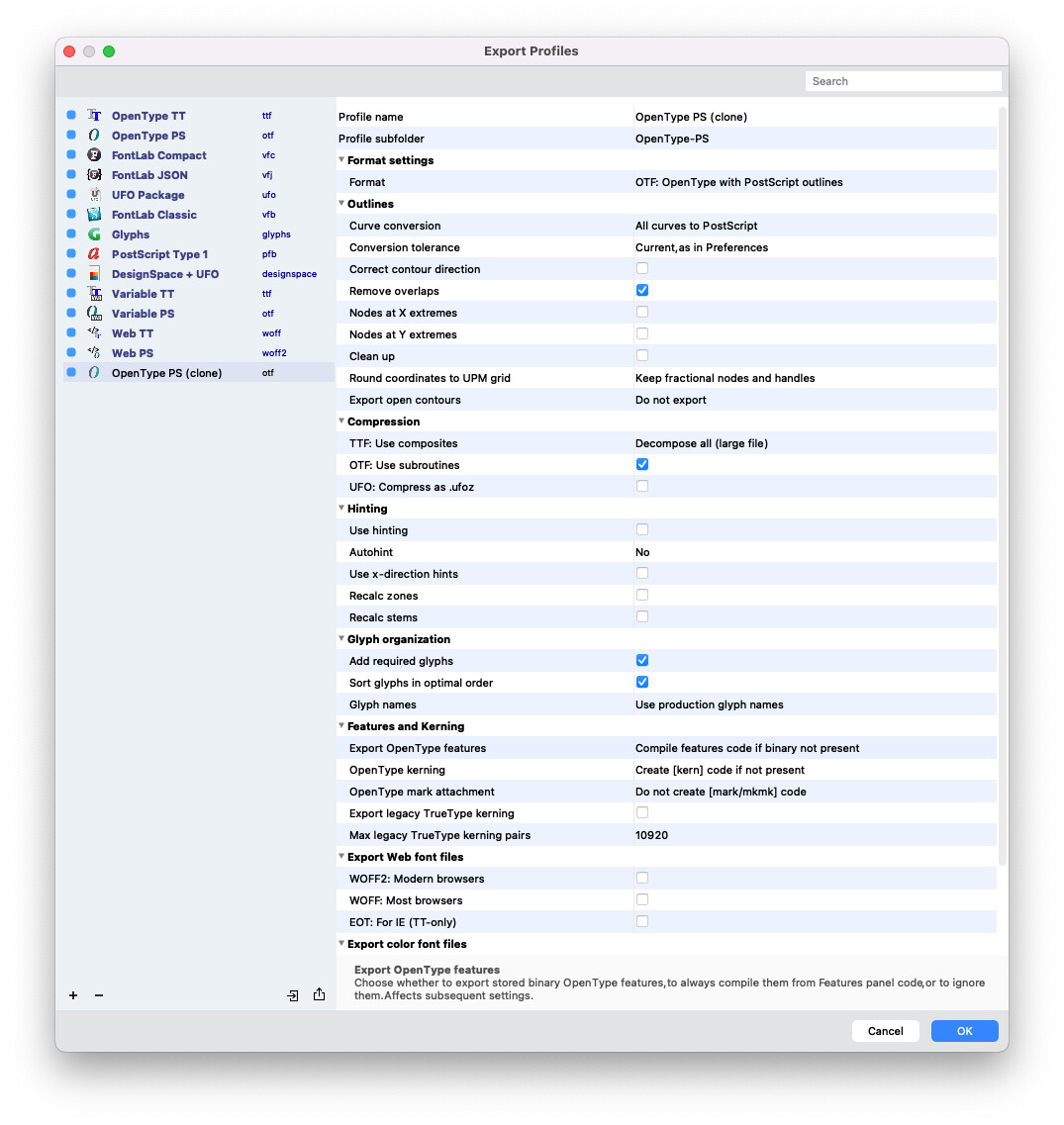
I did some testing in Fontlab this morning, pasting the original Illustrator outlines. Fiddled with the starting points, contour directions (both affect the ‘double anchor points’ and where they emerge) and export settings. I mainly try to avoid changing floating points to integers.
No idea why, but in Fontlab I am now rid of my ‘double anchor points’ problem. This is a screenshot of my export profile: