I’m working on an extended Cyrillic font and noticed an issue with some diacritics.
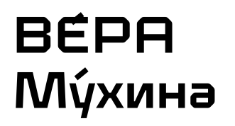
I copied the following words from Wikipedia “ВЕ́РА Му́хина” into Figma. Both the diacritics look weird and I noticed that this happens because "Е́"and “у́” are not composed glyphs. It’s Ie-cy followed by acutecomb and u-cy also followed by acutecomb. I can have the acutecomb with a negative LSB but then the problem is the height. If I align it, so that it matches the height of the lowercase, it won’t work well with the uppercase and vice-versa.
I also noticed that many fonts have this issue but was trying to find a solution and went to Google Fonts. The fonts that have extended Cyrillic look good on the Google Fonts website. But, if I use them in Glyphs, Illustrator or Figma the diacritics are not aligned. So, I don’t know how to find a solution.
Any ideas how I can solve the issue with the height so that it doesn’t look like in the attached image?
Hadn’t thought about that. However, when I copy the text and paste it on the Google Fonts website the diacritics look fine. If I then download a font, Roboto for example, open it on Glyphs and copy the text it does not look fine. If what you suggested were the case, shouldn’t diacritics look weird on the Google Fonts Website? Or… maybe not. I’m honestly a bit confused. But maybe that’s it… it seems to work well on websites but not with other software.
How can I be sure and what’s the best practice here?
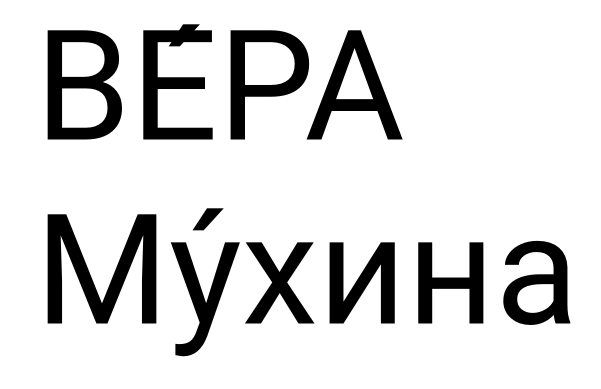
What I feel is weird is that this seems to happen with all the fonts I checked. I’m using again Roboto as an example. The first attached screenshot shows the text “ВЕ́РА Му́хина” copied to the Google Fonts website. The second screenshot is the exact same text copied to Glyphs.
So the problem doesn’t seem to be the font I’m working with (it might be the browser like you suggested) but, perhaps there’s still a way to circumvent this?
As these are not characters with a Unicode designation they can only be set as decomposed elements. It is down to the application to be smart enough to display the elements together by using the mark feature in the GPOS table.
I don’t think Glyphs can do this but I think most browsers can.
Where did you test the font? The preview in Glyphs doesn’t support mark positioning. So you need to export the font and test it a Webbrowser or Indesign.
Actually when testing on Illustrator something else happens… the text appears without any diacritics whatsoever.
I’ve just tested it on cereal.org and it appears fine. I’m a bit more relieved now.
So is this just lack of support of some software?
I think that you need legacy diacritics too -IN ILLUSTRATOR-
You can create it easily adding glyphs from menu typing
acutecomb=acute
gravecomb=grave
…etc etc