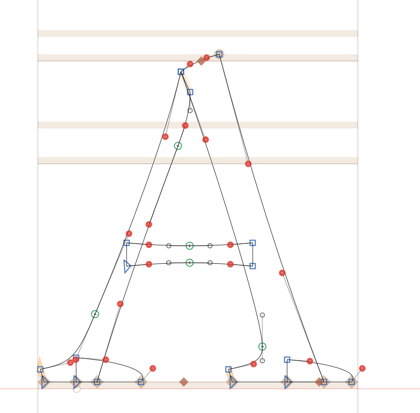
This came up in the Google Fonts discussion forum. I make sure the sides of my glyphs are bounded by extreme points with handles aligned with the italic angle (although I since there is no way to enforce that, I have to do it by eye, and power-nudging and Harmonizing tend to mess with the orientation). I figured Glyphs counted on that to get sidebearings and autohinting right.
Am I wrong about that? Do vertical handles work just as well for Italics, or are they even preferable?
Curves are nicer with slanted extrem points. But they don’t need to be exactly aligned with the italic angle. Later in the production process, it is a good idea to add points at the outmost extremes to get LSB and RSB without fractions.
As far as I know, you need the Extrems only to add x direction hints. Vertical stems in italics are a bit blurry so you don’t like to have some stems to be sharp.
I agree that X-hints for italic and integer sidebearings are not relevant for most computing environments today. Only if you need optimum hinted results in TrueType black and white rendering (e.g. as good as Georgia), it makes sense to add vertical handles to curves. (fighting with my obsessive-compulsive disorder to add all extreme points in Italics )
I have a related question to this issue – specifically about vertical extremes (regardless of italic or regular). In my case, the shape of the serifs technically does not have proper extremes, the difference is very small, and even the “add extremes” command does not pick it up! When added manually, I have to create a much rounder curve in order to have a smooth shape, which changes the look. Will this cause major issues if left as it is? And what would the problems be? (All horizontal curves have extremes.)
Adobe Type 1 Font Format, 1990 (PostScript T1 specifications), on page 29:
It is not necessary to place an endpoint at extremes of very small curves such as the tips of curved serifs.
 )
)