Hi! I was trying to work in some projects, and realised that the unified toolbar does not play well with a white canvas and the right side panel open, at least when running Glyphs 4.x on macOS 26.0 Golden Gate and the system look set to Dark Mode.
Basically, the names on my open tabs will all be rendered in white and, thus, become illegible atop anything but the sidebar or filled in shapes.
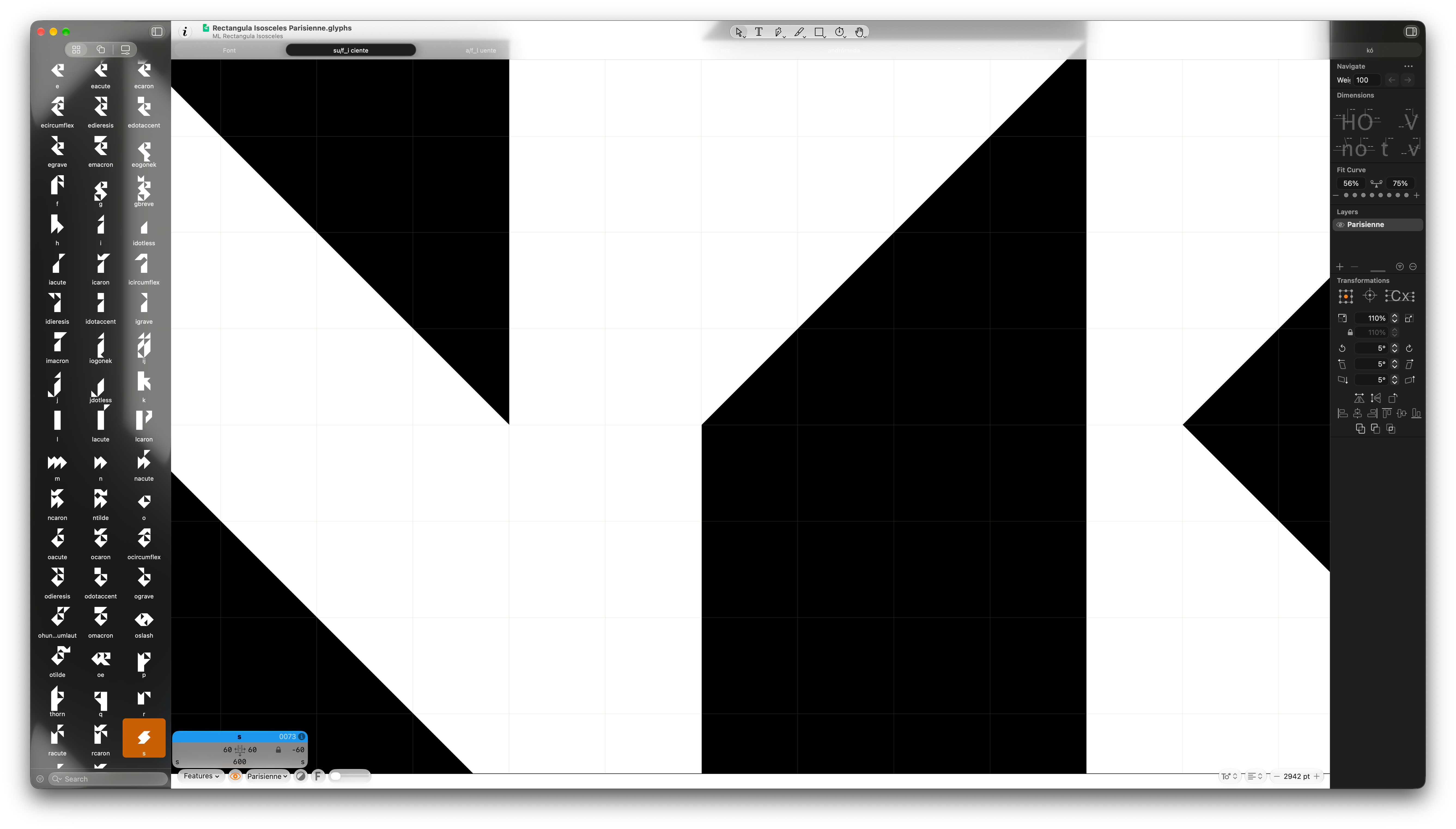
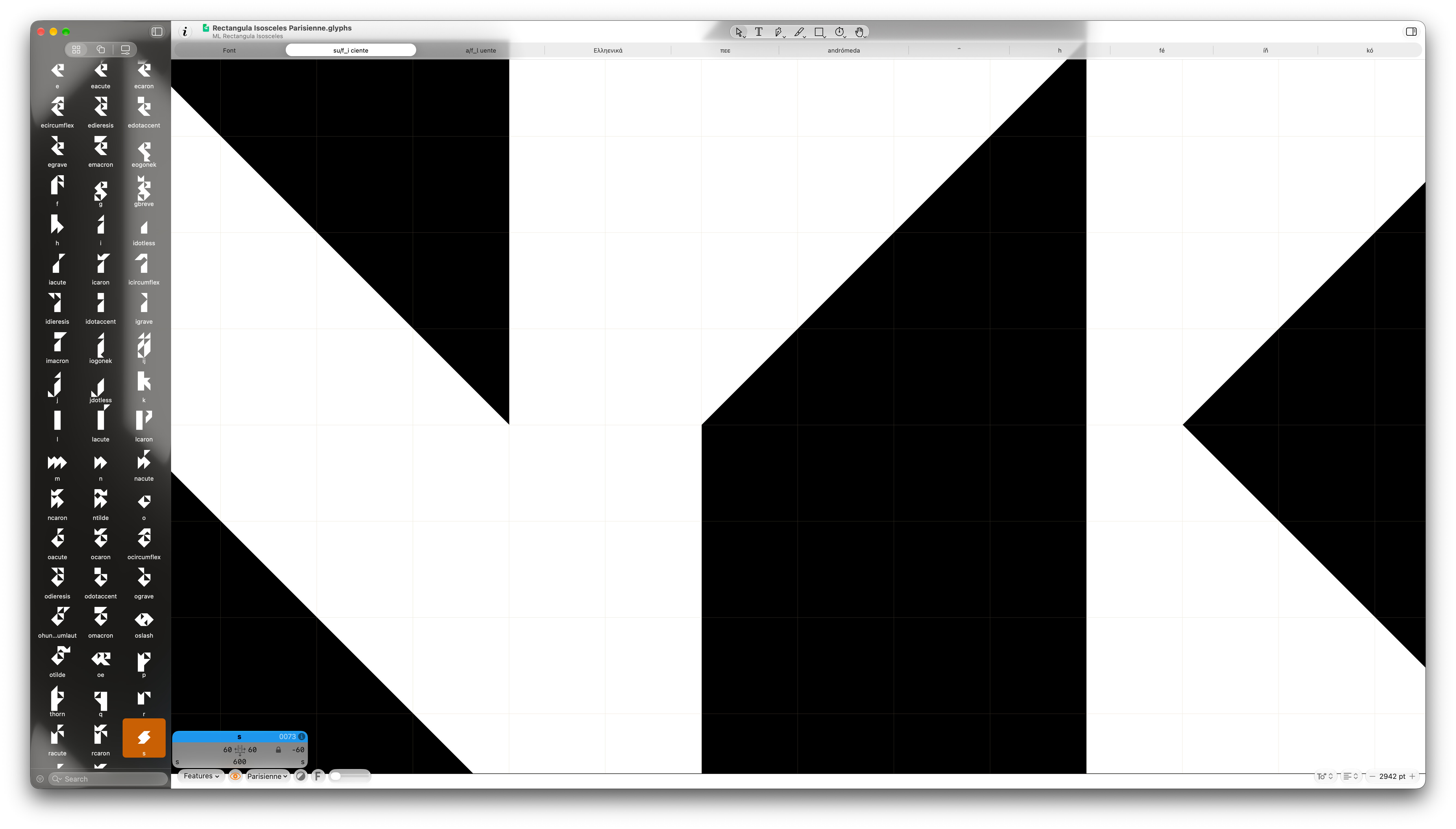
I understand that complying with Apple’s new UX/UI paradigms is great on principle, but in this case it’s clearly not working, and using a more opaque, dark toolbar like in Glyphs 3.x is warranted. Either that, or it’s a bug on my system, so let’s find out.
I should also add that I have my Liquid Glass transparency setting smack on the middle, so it’s not GG’s or my fault for having overdone it on that, either.
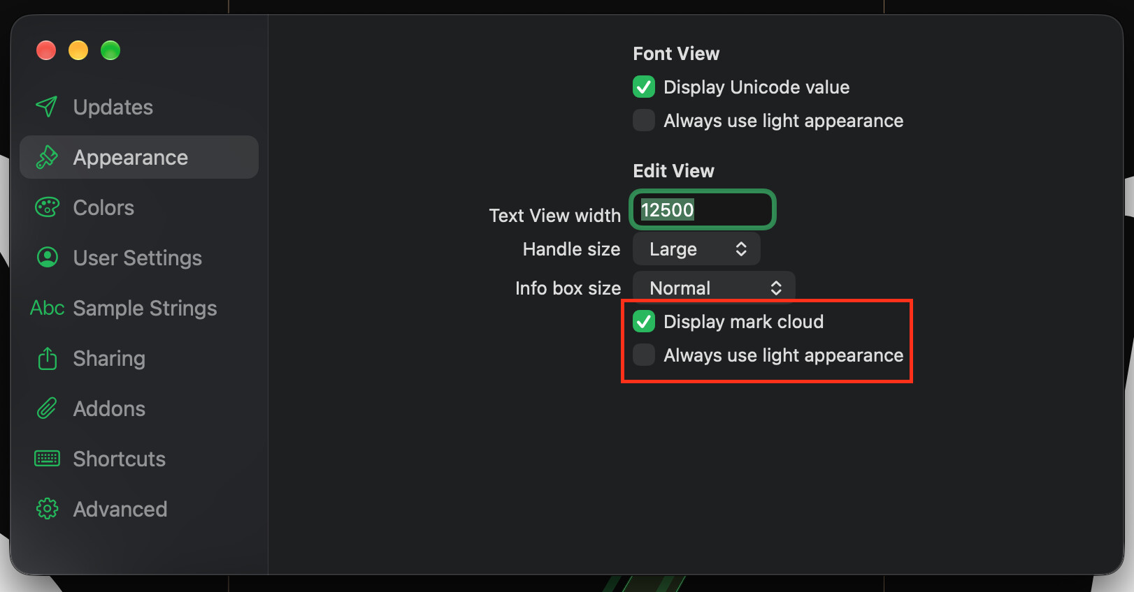
Edit: I had inadvertently set Glyphs to “Always use light appearance” in the main Settings > Appearance tab. I’ve since turned it off, because I really don’t want to use that setting and don’t know why it was toggled on in the first place, but the app’s behaviour under this scenario and user-accessible setting is still buggy, so I’m leaving the report up anyway.
TL;DR: when that setting is on in a system set to Dark Mode, the toolbar and tab bar should always be rendered as on the second screenshot.