File name in title bar truncated

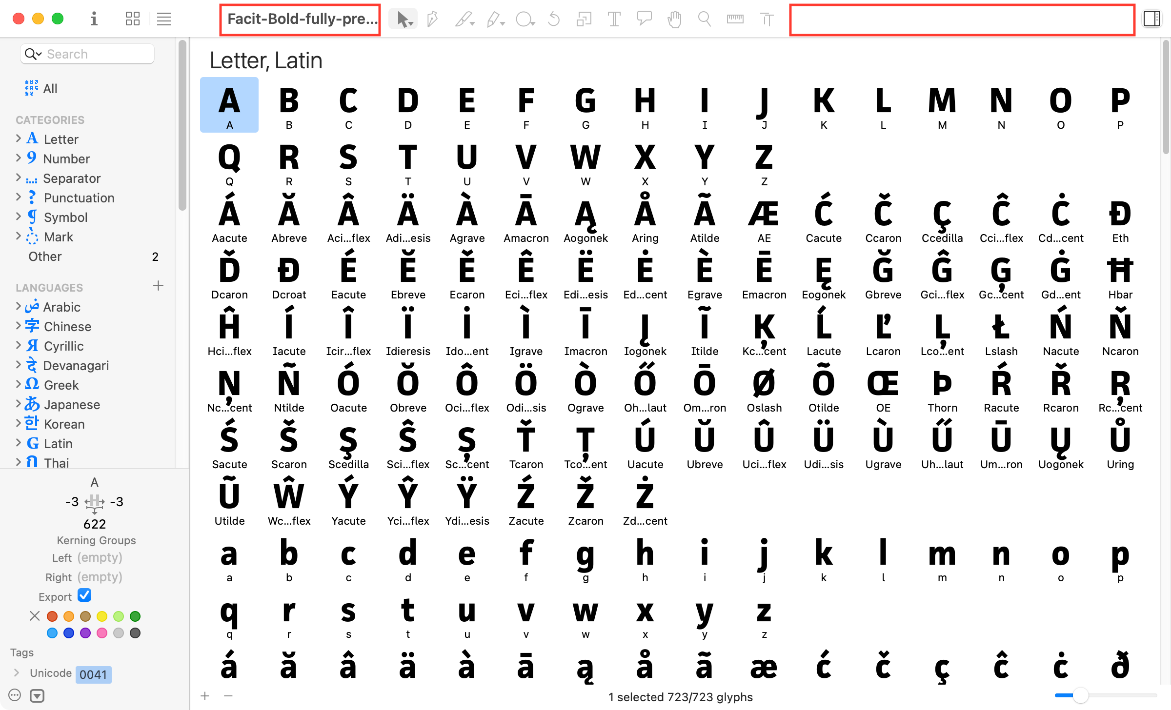
Sometimes the file name in the title bar is truncated even though there seems to be enough space available. I understand that the concept is to center the tool bar but it’s inconvenient if I have multiple files open that only differ in the end of the file name. Different versions of the same font, quite simply.

Playing around with the width of the window, it does seem that the layout is allowed to deviate from the centred toolbar – maybe that value just needs to be tweaked so as to guarantee a bit more space for the file name?

This is due to the new “inline title” style that was introduces by Apple as part of the Big Sur redesign. You can switch to the classic title style by running the following in the Macro Panel:

Glyphs.boolDefaults['NSWindowSupportsAutomaticInlineTitle'] = False

Or, reset the option back to the default by running

Glyphs.boolDefaults['NSWindowSupportsAutomaticInlineTitle'] = None

You need to relaunch Glyphs for those changes to be visible.

1 Like

Thanks for your comment. However, I was not primarily asking for help but tried to make a specific suggestion of how to improve Glyphs.

Does that mean my proposal is dismissed? I have a feeling a simple tweak of the auto layout constraint(s) could be helpful for the average user.

I’m not sure if I can influence this. But I will have a look.

When Big Sur was released, the tools were (more) right aligned, see this thread:

Also, consider the masters switch, which conflicts somewhat with the new title style in Big Sur.

There is also another option that may be relevant: NSToolbarTitleViewRolloverDelay, which is the time it takes (in seconds) for the inline window title to expand on mouse over. By default, it stays truncated for a few seconds before expanding, but setting this option to 0 removes the delay:

Glyphs.intDefaults['NSToolbarTitleViewRolloverDelay'] = 0

I have this option set to 0 globally, for all apps. Not a big fan of the Big Sur redesign when it comes to toolbars :​|

Again, reset to default with

Glyphs.intDefaults['NSToolbarTitleViewRolloverDelay'] = None

Glyphs relaunch required to see the effect.

Or for all apps, run in Terminal:

defaults write -g NSToolbarTitleViewRolloverDelay -int 0

and reset with

defaults delete -g NSToolbarTitleViewRolloverDelay

System relaunch required after any of those commands to see the effect.

Sorry, I was not aware this is all controlled by macOS. Seems like Apple is to blame?

Is there any example of another app that displays the file name next to a button bar?

Apple’s own document based apps used a separate row for the title:

Other apps like Pixelmator Pro keep the toolbar mostly empty to make the long, bold title fit:

Others, like OmniOutliner and Monodraw, also just keep the classic style:

If someone knows a successful incorporation of the new title style in a document based app with a rich toolbar, that would be interesting to know about.

Excel has a handful of buttons plus the search box next to the document title. The type size and the size of the controls is much smaller than in Glyphs, though, so truncation happens only if the window is really narrow.

Affinity has an even smaller type size and removes buttons selectively as the window is re-sized. Seems to be specifically programmed. The minimum remaining document title is longer than Glyphs but still not long enough for my taste (as the end of the title is often the most important part).

I had a look. And for now I can’t find a way to fix this.

I like the vertical toolbar in Pixelmator. Would match Adobes default layout, too.

The vertical toolbar on the right would also match the one in the Photos app.

What made me curious is that there is obviously a mechanism to guarantee a minimum length for the document title (see video). The button bar is allowed to be off-center if the title would get too short otherwise. I was assuming this was auto layout set up by Georg but if that’s all controlled by macOS and the minimum width cannot be controlled by the app then that’s what we have to live with. Sorry about the misunderstanding.

Maybe simply making the type size a lot smaller, and the buttons a little smaller would help.

Some people have long long long final 2 final last draft long names. That would push the tools off the window :​)

We think about alternatives.

With auto layout, it’s easy to set up a simple system of rules, each one overriding the previous one if necessary:

  1. Center the toolbar
  2. Keep the document title wide enough
  3. Don’t push the toolbar out of the window.

The title is not controlled by the app, so adding auto-layout there probably requires hacks. It might work, but there are other avenues that may also help (rearrange toolbar, split title into title/subtitle, etc …).