I’m having troubles to get the font dimensions of my typeface right. My typeface is a revival of an original metal type. The typeface’s original dimensions are 18 didot points. When I produce the font and set it to 18 points, the outcome is much bigger.
Is there a good way to preset it to match it to the desired size?
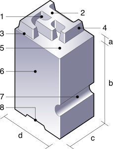
The 18 points would be the measurement d in the image. So it is not something you can see directly in a printed sample of the typeface. The distance from the descender to the ascender would usually be slightly smaller than the nominal point size.
If you have a page from a book as source material, perhaps the distance from one baseline to the next would correspond to those 18 points. But only if the type was set without any additional leading.
EDIT: Sorry, I forgot the most important point: The measurement d, 18 points, would be equal to the units per em (usually 1000) that you chose. So you need to scale your drawings accordingly.
thank you both. georg’s hint was very helpful indeed. i will experiment with the values to match it to the physical size on the paper.
units per em seem to be redundant here, though.
do you mean changing the units per em with or without scaling?
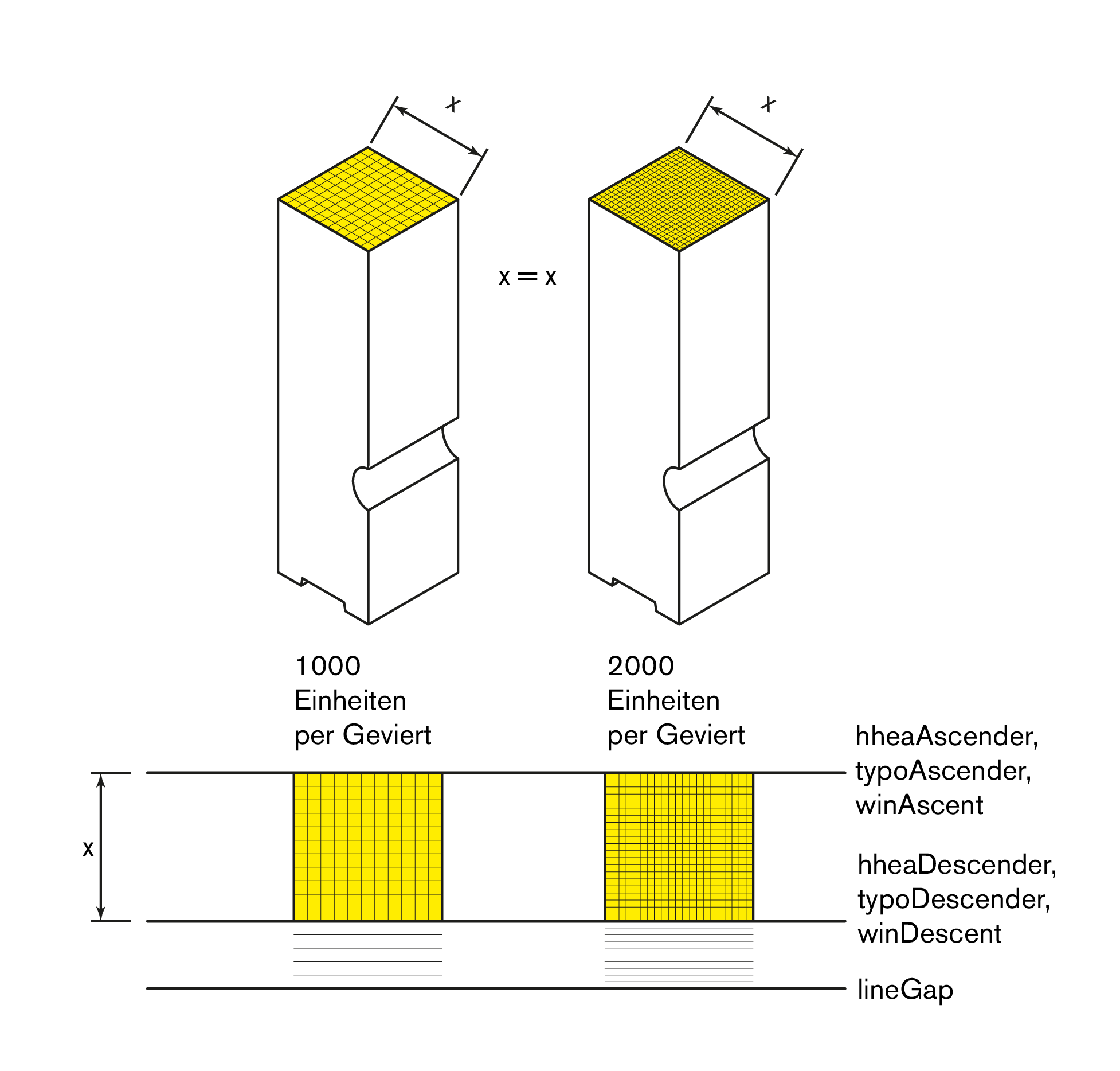
die schriftart war auf einem raster von 2048 einheiten im geviert angelegt. als ich sie auf 1000 einheiten proportional skaliert habe, war das resultat im druck identisch groß. deshalb erschien mir die höhe der einheiten im geviert nur als eine mathematische unterteilung relativ zur größe des gevierts zu sein (entweder fein oder grob). deshalb geh ich davon aus, dass um die kegelhöhe an das historische original anzugleichen, die definition der oberen und unteren kante wie in dem “vertical metrics tutorial” wichtiger ist. weil die kegelhöhe, wie sie dann z. b. in indesign in punkt eingestellt wird, skaliert die schrift auf basis dessen, was als oberes und unteres extrem angegeben wird. oder liege ich falsch?
x bleibt in glyphs immer gleich, egal wie groß die UPM sind und wird dann in der anwendung definiert, wenn ich in indesign den punktwert definiere, oder?
Without scaling.
The UPM value defines how many units are in one “em”. That “em” will be the size of the selected point size. So if you select 18pt in Indesign and you have a UPM of 1000, each font units will be 18/1000 pt. So if you change the UPM (without chaining anything else) e.g. to 900, one font unit will be 18/900. So everything will appear bigger. You can play around with this until the font looks as big as the scan of the original typeface. If you found your size, then you might scale the font back to 1000 UPM.