Hi,
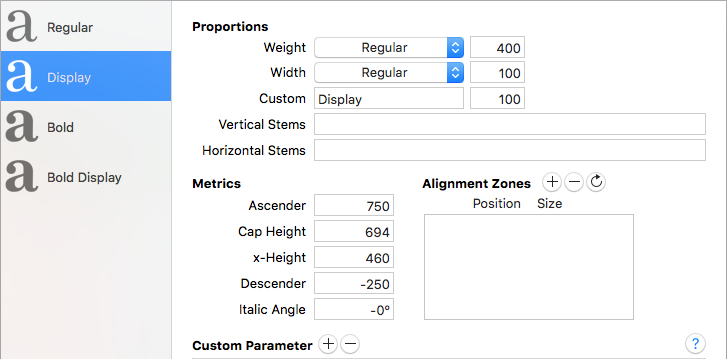
I’m creating a font file with 2 axis, Weight and Display. Usually, I start with the predefined values from Glyphs for Weight (400 for regular, 700 for bold) and then I adapt them to my needs. Can you suggest me what kind of values I should use for the Display parameter (should the display master have a positive or negative value? 100, 1000, how much?)
There is not a real recommendation. Just pick any number. But I would use a different value for the weight. I usually use the stem width of the lower case n.
Ok Georg. But may I ask you why I should use a different value like the width of the “n”?
Then you can define instances very precisely. And match the weight of different interpolations, if maybe the italic has a different master setup (the heavy master might not be as heavy as the in the upright).
1 Like