that does the trick – danke, mekkablue!
genius level
Hi, I’m also wondering about best practice here for naming of “unconventional” (i.e. not the typical light, bold, italic, etc.) styles within a family.
What I want to do is have all of the separate styles under a single family in font menus—instead of breaking them out as separate families, or occurrences.
Here’s an example of what I’m wanting to do—one family with multiple styles:
FontName (family)
– Fill (style)
– Shadow (style)
– Outline (style)
I had once been told that because each of those styles are not the typical weight or width styles/names, that I should break them each into individual families:
FontName (family)
– Regular (style)
FontName Fill (family)
– Regular (style)
FontName Shadow (family)
– Regular (style)
So is that first option doable (and professionally acceptable) just by keeping the family name “FontName” the same for each and only changing the style name to “Fill”, etc.)? Or does it break anything (like not showing up in Word, etc.)? It’s less clunky in the font menu to do so.
Did the person who told you this also specify why?
It comes down to testing in the apps you care about, of course. But I would first try the way you originally envisioned.
Thanks mekkablue…
Ideally I would like to nest all those styles under one family name, so it’s cleaner and everything is together.
They told me that those subfamily fields (style names?) are reserved only for weight and styles (bold, italic, etc.). So essentially any subfamily not using those conventions should be broken out under a separate family name.
The way i mention indeed works in Adobe apps, but i plan on selling these, so hoping for a second (experienced) opinion if this is a poor practice or will cause any problems in other software that users might have (Word, etc… obviously can test some).
I’m having the same menu ordering problems described above in various posts. The menu order for the font weights is correct in Adobe applications (lightest weight to heaviest), but is out of order in most other software applications.
I’m in the process of transitioning from FontLab Studio 5 to Glyphs. When using FontLab there are many workarounds, hacks and oddball settings one can use to address the idiosyncrasies of how various software applications order fonts. These workarounds are a big hassle, but they do work. Trying every suggestion I could find for Glyphs, I’m still having no luck in getting everything ordered correctly in most applications.
Reading through the manual and the suggestions in this and other forum threads, I’m coming to the conclusion that Glyphs’ font ordering is really only optimized for the way Adobe applications order fonts and that no workarounds exist to address how other applications choose to order (or misorder them). Is this correct?
Could you send me a few fonts from a family that you got to sort correctly. And what ‘oddball’ settings did you use in FLS?
Have you read the Naming tutorial?
And what do you mean by 'most applications’? Cocoa/CoreText apps? To my knowledge, CoreText does its own sorting, it is undocumented, and Apple is not answering questions about it.
@GeorgSeifert : Thanks for the reply. I’ve been opening up a variety of applications today to see how the type menus are organized. It turns out that the menu order in previous fonts I’ve built in FLS V aren’t as well-organized as I had remembered them to be. I had been using Karsten Lücke’s instructions: shttp://kltf.de/downloads/FontNaming-kltf.pdf
Those FLS-built fonts are, however, organized correctly in Word, Adobe CC apps and QuarkXPress. The Glyphs-built family I’m currently working on is out of order in QuarkXpress. It’s also out of order in Apple’s various applications, which is true also of the FLS-built fonts.
I’m beginning to think that no one’s really solved this problem for the majority of software applications. All things considered, I suppose it’s a fairly minor annoyance that affects everyone and doesn’t make the fonts any less usable.
I can still send you one of my FLS-built families if you’d like, but at this point it probably irrelevant.
@mekkablue5h : Yes, I had read through the Naming tutorial and did so again today to make sure I hadn’t missed something.
Like I mentioned above, I’m thinking this menu ordering problem isn’t universally fixable for anyone.
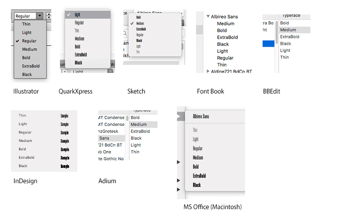
I’ve attached what my Glyphs-built family looks like in various MacOS program menus. Thanks for the help!
- Sketch, Font Book, BBEdit, Adium use Apple’s libraries. Nothing you can do about those.
- CMIIW but Adobe apps and MS Office look fine.
- XPress: You can try the Compatible Name Table parameter.
