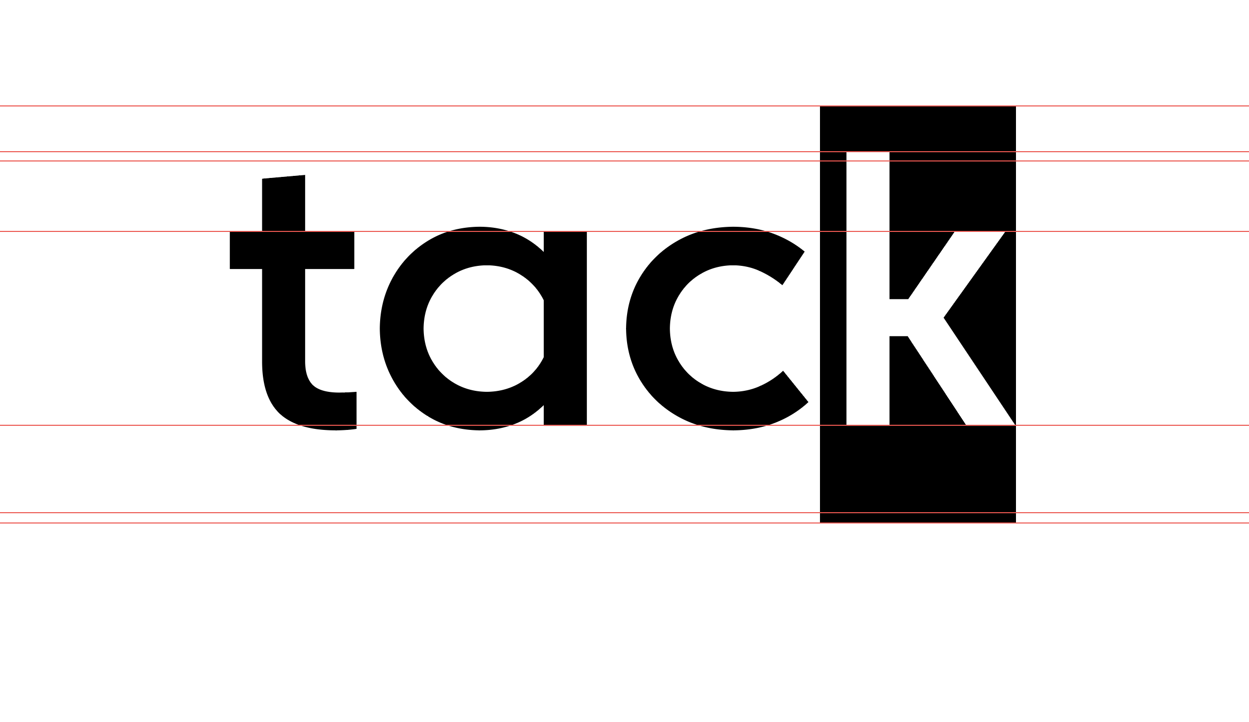
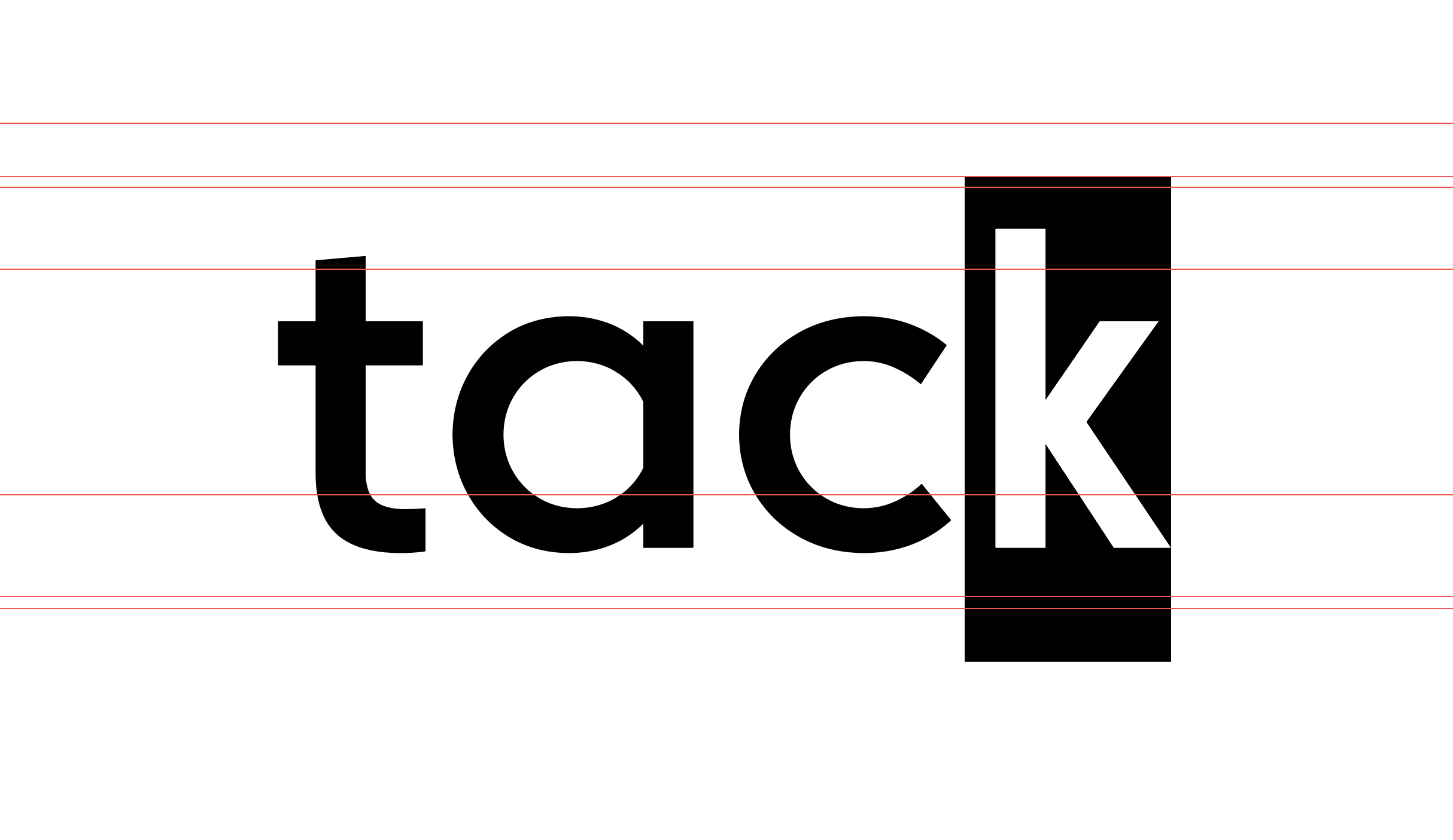
I’m making a few glyphs to use alongside an existing font for personal use. My intended use is to type primarily in the original font and swap certain letters with the variables I’ve created (for example, simplifying the lowercase k as seen below.) However, when I export and make the swap, the entire word is pushed down:
Have you added the custom parameter in Font Info – Font called “Use Type Metrics”?
If I understand correctly, you are switching out the font in the software you are typing in. Don’t you want to add the glyphs to the original font as alternates? This would make it a lot easier (and ensure consistent vertical metrics).
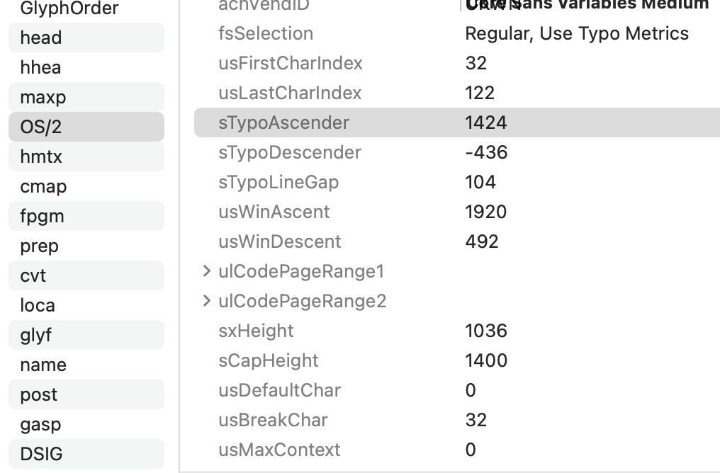
Have a look at the vertical metrics tutorial. That explains all the places that influence the vertical positioning.
Then compare those table in both fonts with the FontTableViewer.
Have you added the custom parameter in Font Info – Font called “Use Type Metrics”?
Yeah, I have.
You are switching out the font in the software you are typing in. Don’t you want to add the glyphs to the original font as alternates? This would make it a lot easier (and ensure consistent vertical metrics).
Alternates do seem like the better route and were actually my first attempt, but I’ll be typing pages and pages of text. Unless there’s a way to, like, “turn on all alternates” while I type, it would be a real pain to change each glyph that needs to be an alternate.
I have checked out the vertical metrics tutorial and I learned a lot from it! That’s why my issue is perplexing me so much, everything seems to look right.
Thanks for the FontTableViewer suggestion. I’ll give that a shot.
To create these simplified glyphs, I copied elements from the original font into a new, blank file. If FontTableViewer doesn’t shed light on the situation, my next step would be to reverse that process. I’ll drop the handful of simplified glyphs into the original font file and export from there. This is something I tried once before and received errors, but perhaps those errors are easier to solve than the shifting I’m experiencing. We shall see! I remain optimistic haha.
This matter has been resolved. I still don’t know what was happening with the vertical shifting, but I was able to add the simplified glyphs to the existing font as stylistic alternatives and go from there. (Actually, I made the simplified glyphs the defaults and moved the original glyphs to a stylistic set just in case I need them later.)
In Adobes apps, the position of the first baseline in a textbox is determined by the height of whatever is in the letter ‘d’. Can you compare those two letters.