I am continuing to make progress on a font family and had a question about managing masters and exports.
My font family has 9 weights available (100-900). I have discovered that my thinnest weight might be a bit too thin and could cause issues. The immediate solution that came to mind was to create a new master somewhere between 100 and 200, delete my old “100” weight master and redefine the newly created master as the new thinnest.
The only issue is that I’d like to keep my original “100” weight master incase I want it back. Moreover, I see that there is an “active” checkbox next to each export in the font.
Would there be any problems or clashes if I deactivated the original thin weight export, and exported the newly created master with the same name and weight class?
Thank you in advance! Please let me know if there are any better alternative solutions.
For static exports, it is not an issue to only export a specific range of instances. So you can keep your original masters, but simply define a more restricted range of instances in your exports.
This becomes more tricky with variable fonts. What export result are you trying to achieve?
For variable fonts, you can’t simply define a more restricted range of styles. The masters will define the full range. So, for your variable font, you will need to create a file in which your lightest weight is defined by your lightest master (thus removing your current lightest master and replacing it with a slightly heavier one).
The weight values mean something 400 is the Regular style, 700 is Bold and so on. If you have more instances, you can use numbers with smaller increments than 100 like 450 for a style that is just a bit heavier than the Regular.
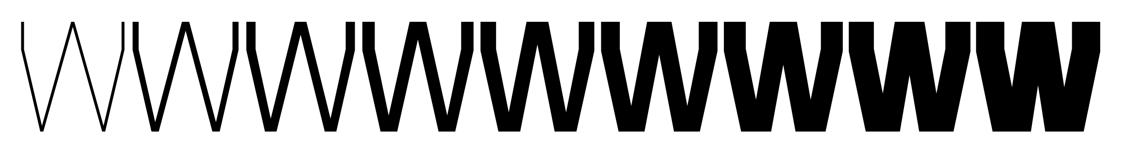
Thank you for that. I thought it might be helpful to tell you a little bit more about the font in question. My font is a display/branding font that I intend to be used at large sizes. The file is 1100UPM and the thinnest weight has a stroke width of 20 units (screenshot attached).
If you were making a similar font, would you thicken up the thinnest weight or leave it as it is?
That’s entirely a design question. In any case, I would consider that weight a hairline font. I have yet to see a sensible use of a hairline font anywhere. I agree they’re really fun to draw, but nobody uses them.
You can still offer it, of course, nothing wrong with that. If your question is a out which weight class you should assign to it, I would say 50 or so (you can simply enter custom numbers into the weight class field). Make 100 correspond to what you really consider Thin, 200 Light etc.