I’m a novice type designer, looking for some advice on a typeface made from common modules or building blocks. I have to limit myself in some way, since I’m not a pro (and I’m doing this in my free time) ![]()
I’ve read through Gunnlaugur SE Briem’s resource on type design, specifically the section on module typefaces. Very helpful.
http://66.147.242.192/~operinan/2/2.3.4a/2.3.4.03.curve.htm
One part of my typeface that I can’t decide on is the fluency of the curves on basic geometric shapes. Have a look at this to see what I mean:
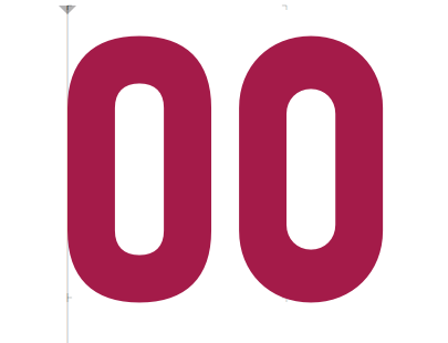
A simple O made with rounding corners. Left is with “visual correction” on in Glyphs.
I understand the value of smoothing out the curves so that they are not so hard (especially for complex highly detailed faces), but it’s also hard for me as a novice to determine what looks appropriate or too much smoothing. I also want to keep this typeface pretty geometric, or at least create a system of parts that I can reuse easily for other letters.
Here is the inspiration for my face (first image)
It’s hand painted, so I’m also considering how to best reflect the imperfect geometric shapes, and not make everything completely based on math. For example, smoothing out the curves of the O vs. just using basic shapes like a semicircle and a rectangle. Aside: it also looks like the horizontal stems are slightly thinner than the vertical stems.
Maybe there’s a method to slightly smooth out the curves, yet still keep the basic geometry intact?
Any help would be greatly appreciated!
Here a screenshot of some of the work I’ve done so far. A lot to do! (second image)