Does Glyph Construction language work in Glyphs?
Not really. Glyphs has a bit simpler system that defines compositions in the GlyphData. That includes what components are needed for that glyphs. And you can define to what anchor it should attache to. Then the automatic alignment will do the actually positioning.
Is there a specific feature that you need?
Mostly positioning features such as controling the components with local/global guides, calculated reference positons and font dimensions
Can you give an example? The construction code and what it should look like in the end?
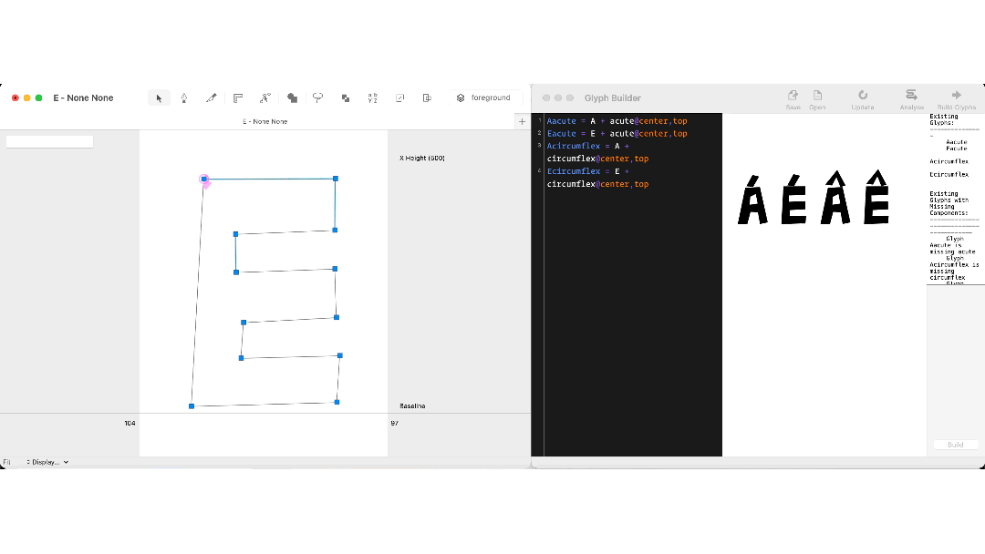
aacute = a + acute@center,top
agrave = a + grave@center,top
acircumflex = a + circumflex@center,top
adieresis = a + dieresis@center,top
egrave = e + grave@center,top
eacute = e + acute@center,top
ecircumflex = e +  circumflex@center,top
The “center” is the centre of the aforementioned glyph’s bounding box; the “top” is the global guide. Whenever I adjust the global guide positions of accents change. If I want to separate the "top"s for each base glyph I can add a local guide or anchor and name it as “top”

(Typeface IBM Plex Sans)
The glyphs are already build from components if they are available. Glyphs will use the combining accents. So you need to have acutecomb …
And the components are positioned using the anchors.
So the workflow is:
- in the font view sidebar, right click all entires that you need (e.g. “Latin” > “Basic” and “Western European”.)
- draw all base letters (A–z) and make sure you hit Cmd+U in each.
- draw all marks. Again, hit Cmd+U.
- select all accented glyphs and run Glyph > Create Composite.
- just the anchor positions in the bases and marks until all accented letter look good.
Yes, thank you for explaining.
What I was trying to say is that to be able to control the positioning of marks/components with multiple options would be a nice thing to have. Instead of adjusting the _top anchors one by one for all marks, linking the position to a local/global guide, or a calculated point(top, centre, left, right, bottom) would enhance the consistency and speed.
The Cmd+U shortcut will already center the anchors already. There are to many exceptions to warrant a special case like this. And the glyph construction implementations I know of do not link, they just place it centered initially. Keeping them in sync is much more work than setting some anchors.
As you can see in this quick demo it’s not only about centring the anchors. If you add a global guideline and name it as “top” you can position your marks according to it. If you delete the g. guide named “top” anchors will be linked to the top of that glyph’s bounding box. You can even manipulate by adding a guide called “center”. It doesnt have to render the adjustments in existing glyphs you can rebuild the glyphs quickly.
The benefit of this language is that you don’t need to change every mark’s position when you change one of them because you can simply move the global guide and it’s done.
As much as it’s understandable that coming from other font editors it can be uncomfortable getting used to Glyphs’ logic of things, in this case (as much as I can see it being very handy to work in that way), I would bear in mind that this kind of anchor positioning is not very sturdy. In Glyphs, you insert anchors at cap height for capital letters, and at x height for lowercase letters. In the anchors, you do the same, and draw the anchors accordingly, so your .case accents are drawn above the capital height, etc. – there is no need for varying accent height by anchors, at least there shouldn’t be. If you wish to move your accents, simply select all your accents and use Transformations to shift them up or down.
In your example, what’s the difference of shifting the top anchor up and down in the E?
If you want to shift the top anchor for all (capital) letters, there’s something wrong with your design, meaning you should either edit the cap height metric and align the anchors accordingly, or re-positioning your accents as previously described.
There’s also mekkablue’s Anchor Mover script to batch-move anchors.
I remember this part of Robofont being demonstrated (when both Glyphs and Robofont were being introduced to Fontlab-dominated community), this grid line approach was touted as something innovative. I never found it superior though; Glyphs’s anchor approach was basically the same as that of Fontlab, and was were perfectly functional. Moreover, the grid approach doesn’t make sense outside Latin, or for generating mark/mkmk feature.
I’m not switching from other font editors to Glyphs. I have already created accented letters multiple times with Glyphs’s method. I’ve been using Glyph Construction lately, finding it very handy. This example is just one of the many features of Glyphs Construction. Combined with its other features, it is a very powerful tool. I was just curious if this language can be supported inside the Glyphs so users would have many options to control building accented letters.
The difference is when I move the guide called top A is affected too instead of moving the top anchor for E and A separately or changing the anchor positions in the marks. Meaning I can control the accents with a single variable.
I’m not sure if I understand correctly but isn’t it where Glyph Construction becomes handy? So I can adjust it easily.
I think it gives you multiple ways to execute the same thing. Also, you will have an incredible amount of control over the positioning of your marks because you have the recipe. As far as I know, this language also works in Fontlab in addition to the “regular” anchor approach.
Controlling your marks with a single global guide may not make sense in Arabic Script because of the variety of heights of your letters. But as I said above this Controlling with a Global Guide is just one of the many features of Glyphs Construction.
Let’s say you built dad, khah, thal, zain, zah, ghain, feh and you’re not happy with their design (maybe some of them are tall/short or dot placement is not good etc). Whatever you change you also need to adjust the anchors accordingly.
If you put your anchor 100 units above the highest point of that glyph, you should keep this distance when you change the design. It might be easy to repeat this for a few letters, but isn’t it more likely that you will get confused if you have to make these changes along the way? In such a scenario, having a recipe and having the letters built under your control no matter what you do might be a better help.
I think it is worth reiterating that the anchors are not just used inside of Glyphs to construct composite glyphs, they are also used for OpenType features such as mark attachment.
So, your font should have the anchor points anyway for the mark, mkmk features to work. Using the same anchor points for precomposed glyphs as well as for mark attachment ensures that your accented glyphs look consistent.
3 Likes