I try to make one thread for the issues occurred with the named Glyphs Version, so we can address them in a rather collected way.
I just found one:
The PreviewPanel does show all instances, even if they are not set to active.
A) Is this wanted? It feels contradictory to what the user might expect.
B) I got a filter on some instances:
Which now leads to a strange Bug: the previewPanel [when set to »Show all Instances«] applies this filter each time I select anything in a glyph or switch masters. This causes the displayed glyphs in the previewPanel to come closer and closer each click.
If I’m zoomed in (2245pt) and have nothing selected, when I swap masters it jumps to the centre, this is not always desirable… i.e. when I’m working on a comma, it flips out of my view…
Glyphs shows inactive and active instances in preview panel (I’m talking about “Show all instances” option). Glyphs 2.2 used to show only active instances: in 2.3 I don’t have control over it.
No. Turned off all view options and switched to TT Instruction tool. It worked, but when I was activating each view options back, the app crashed at Show Info. Activating all preinstalled view options except for Show Info is still fine (i.e. lets me switch to TT instruction tool), but when I turn on the info box, it crashes.
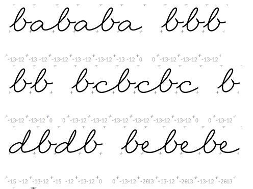
I use ligatures in my calt feature.
To get automatic substituted ligatures, I turn on the feature in edit view (works just fine).
Now I’m trying to move the cursor through the text by pressing arrow keys.
The cursor behaves weirdly:
On the first key press it does not move at all, on the second the cursor moves to the right of the ligature (makes still some sense).
With the following ligature(s), the offset of the cursor gets bigger.
In the end the cursor is here: [b_e] [b_e] [b_e] [space] [cursor]
Now, when i type something, the newly typed letter appears in the middle of the third ligature: [b_e] [b_e] b [new_letter] [cursor] e [space]
I don’t know, if this is new in 2.3.
When ›arrowing‹ through ligatures in Indesign, it places the cursor right in the middle of the ligature. I think this behavior would work fine in Glyphs as well.