Hey!
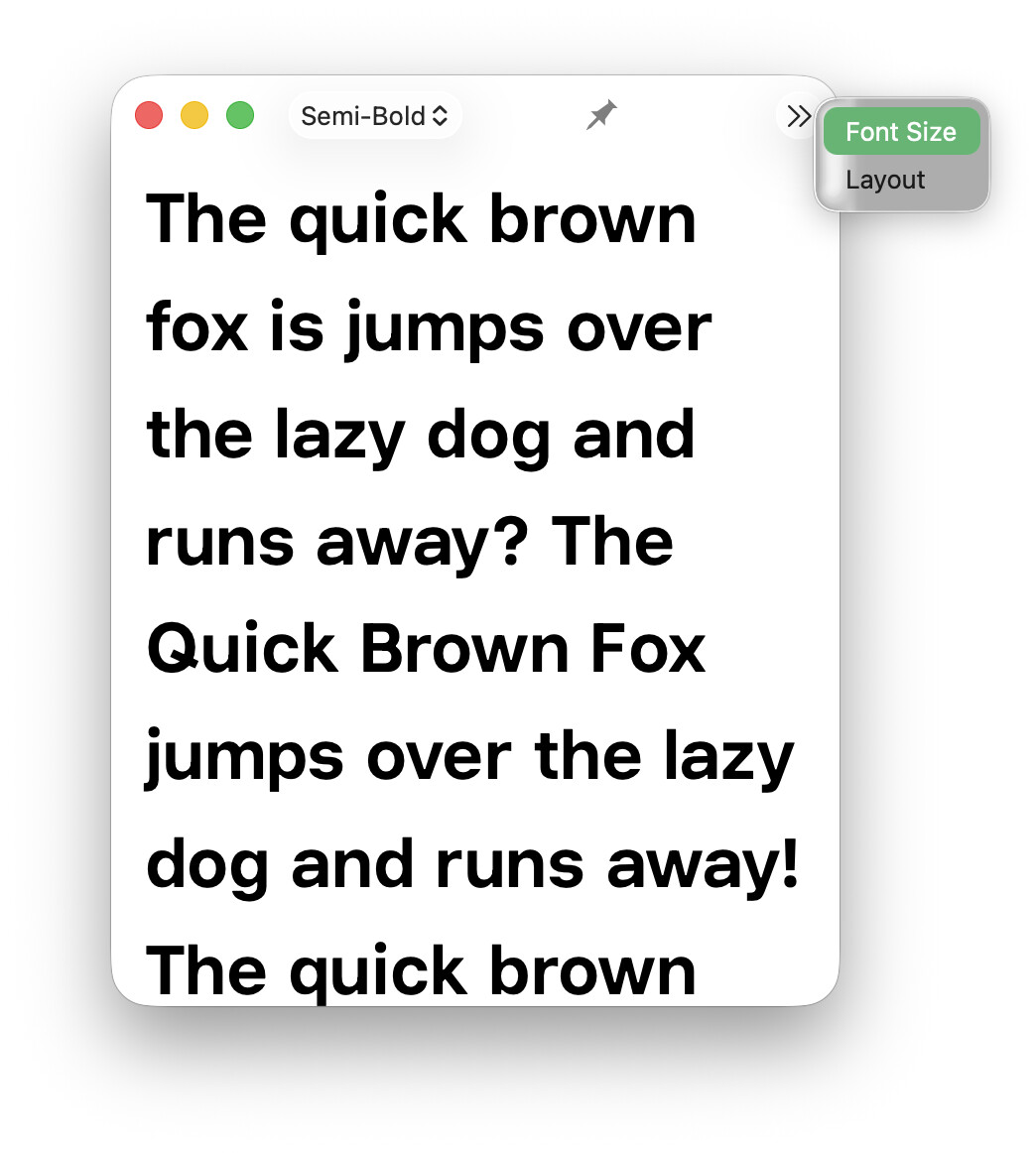
I love the new Glyphs 4 Text Preview features; however, there are some issues when the window is narrow, as you can see in the screenshot. The top-right buttons do not work when you click on them in this view (screenshot), either in split-screen (fullscreen window) or in windowed view.
—
Also, I think the right panel could be more polished; it seems everything is placed there randomly. It’s working, but the UI could get more attention, I think.
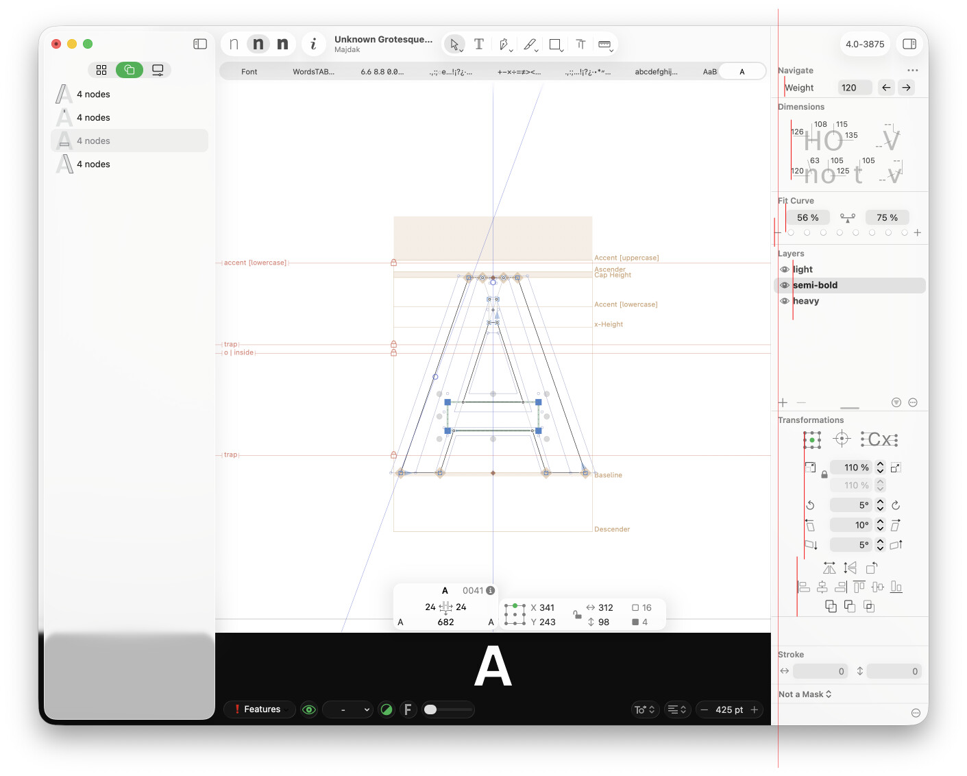
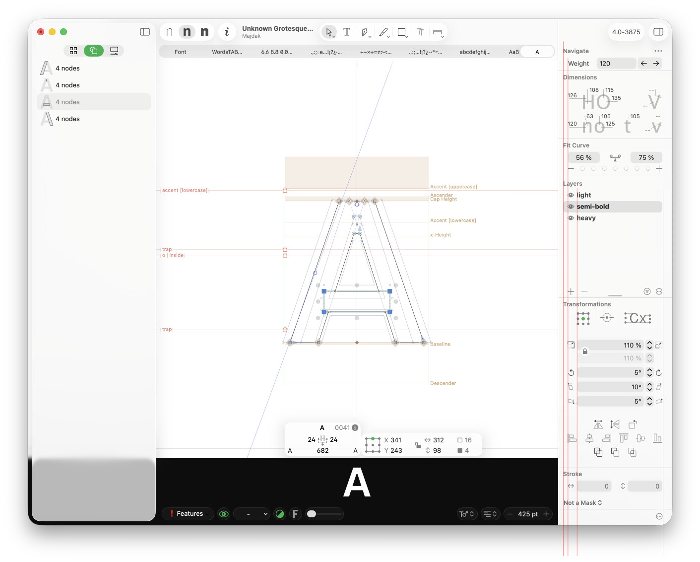
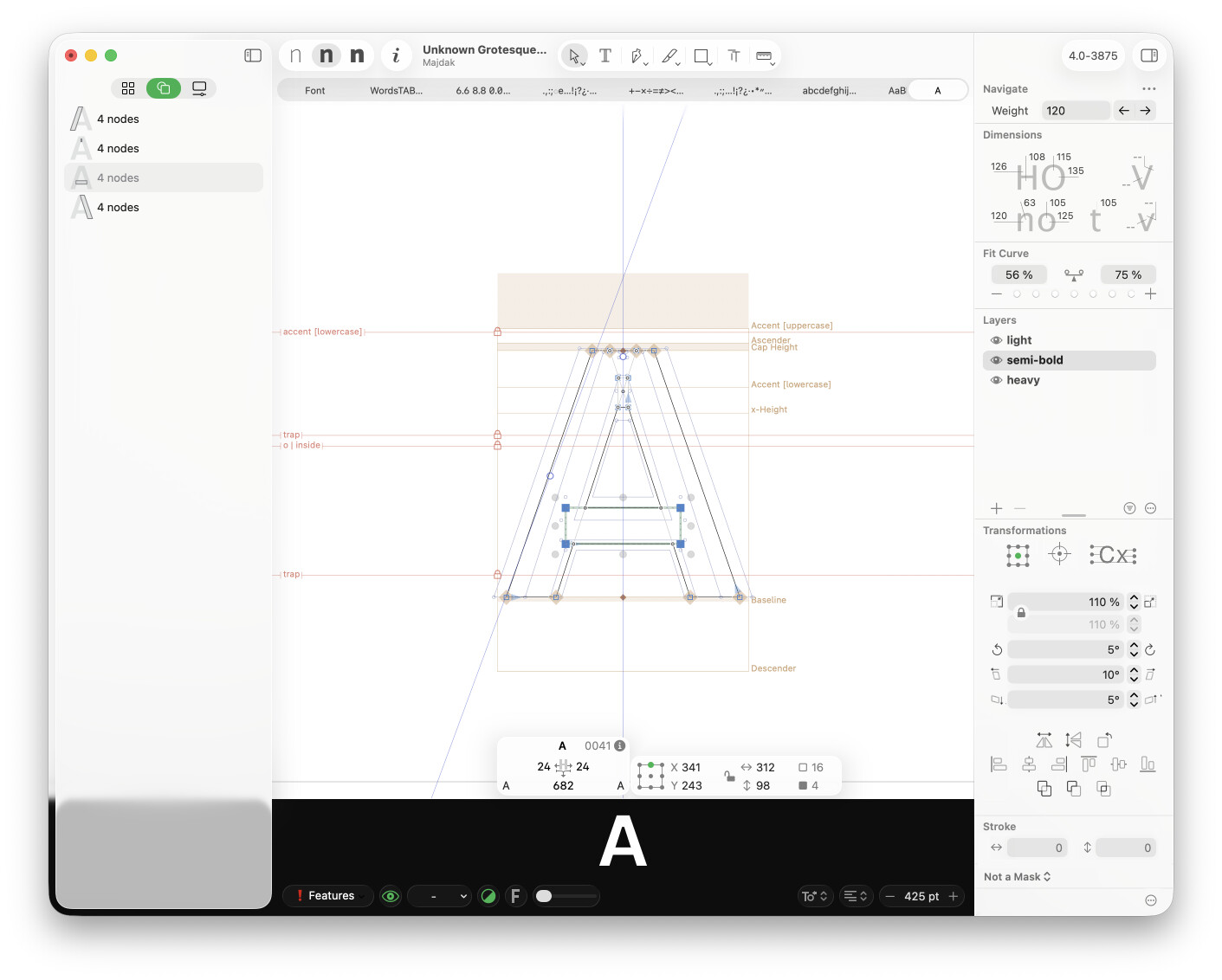
In the screenshots below, I sketch how the vertical spacing could look with some refinements without changing the existing design much. It’s still not perfect; just a quick sketch. The whole layout could get more love in my opinion, but with just a few improvements it at least looks more intentional and professional.
Cheers!