somehow after I export a font, some glyphs change their shape. I have tried everything to fix this, from reinstalling the app, updating my Mac, trying on my old one… and nothing has been helping. I haven’t changed anything, didn’t do any updates prior… I have been making fonts and using the app for 4 years now without problems.
I have the newest MacBook Pro with the latest Monterey. The Glyphs App is version 3.0.4.
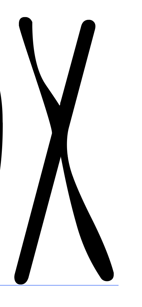
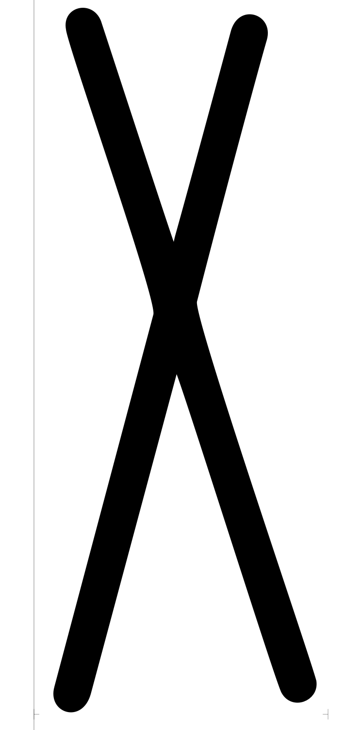
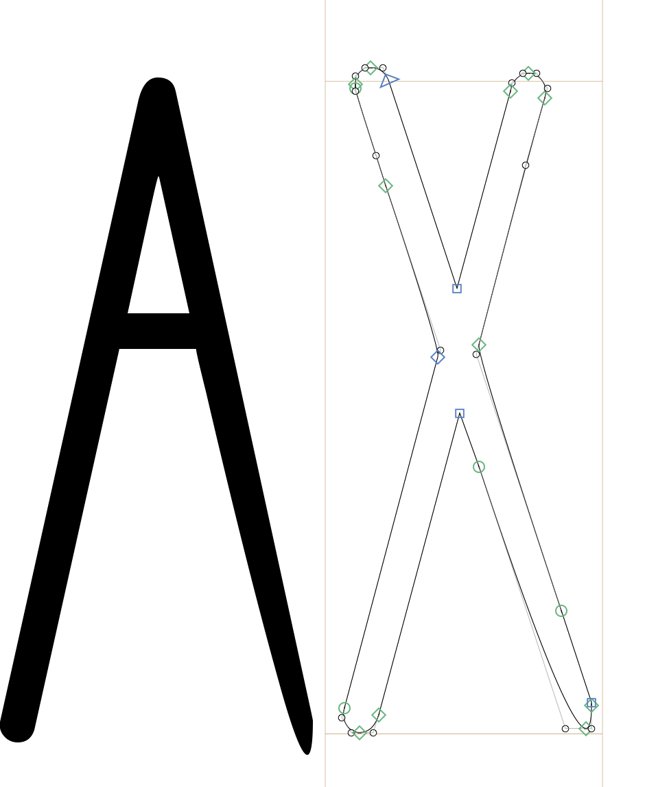
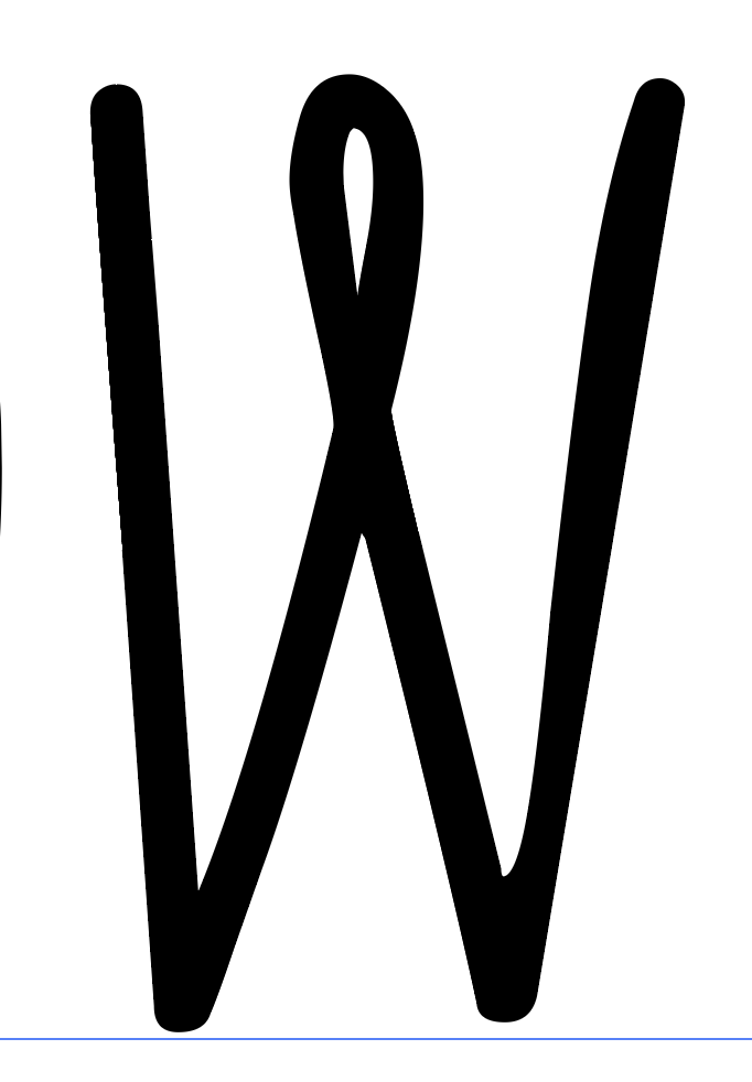
Unfortunately, I don’t have the original outline for this super strange X (I already kind of fixed it, but then it came out like this):
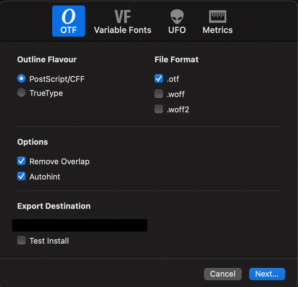
Also my export settings are the default ones. Images below.
I have someone test both ttf and otf files in the Glyphs App and Design Space software - it’s for cutting machines.
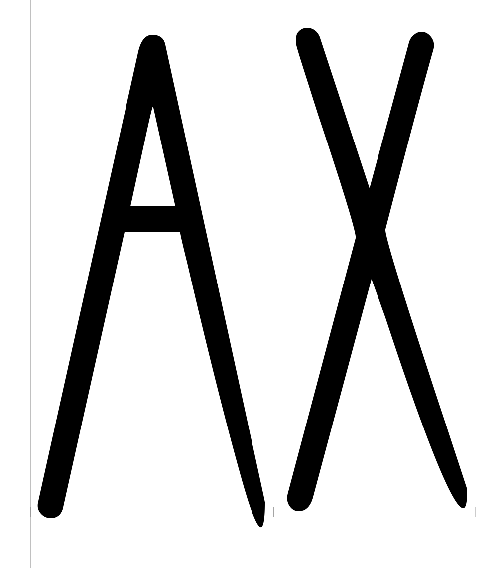
They look perfect in Illustrator and when I bring them to the software. Something must be happening after I export the font.
This is what they told me for two of the fonts:
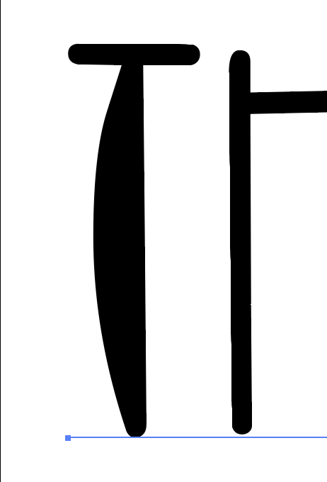
“Something weird happened to both of the OTF and TTF in “Font Name 1”. The original issues are fixed but new issues emerged. I am attaching screenshots of the issues below.”
“Something weird also happened to the TTF in “Font Name 2” (screenshots below) but when I tried to use the OTF (that looked good) to save a new TTF, it fixed the issues I was seeing but reverted back to the original issues with the N and the S. I have no idea why.”
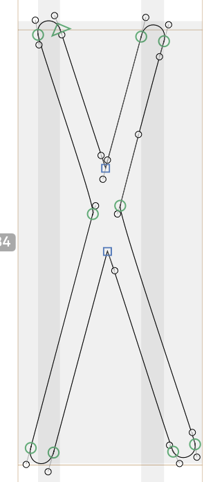
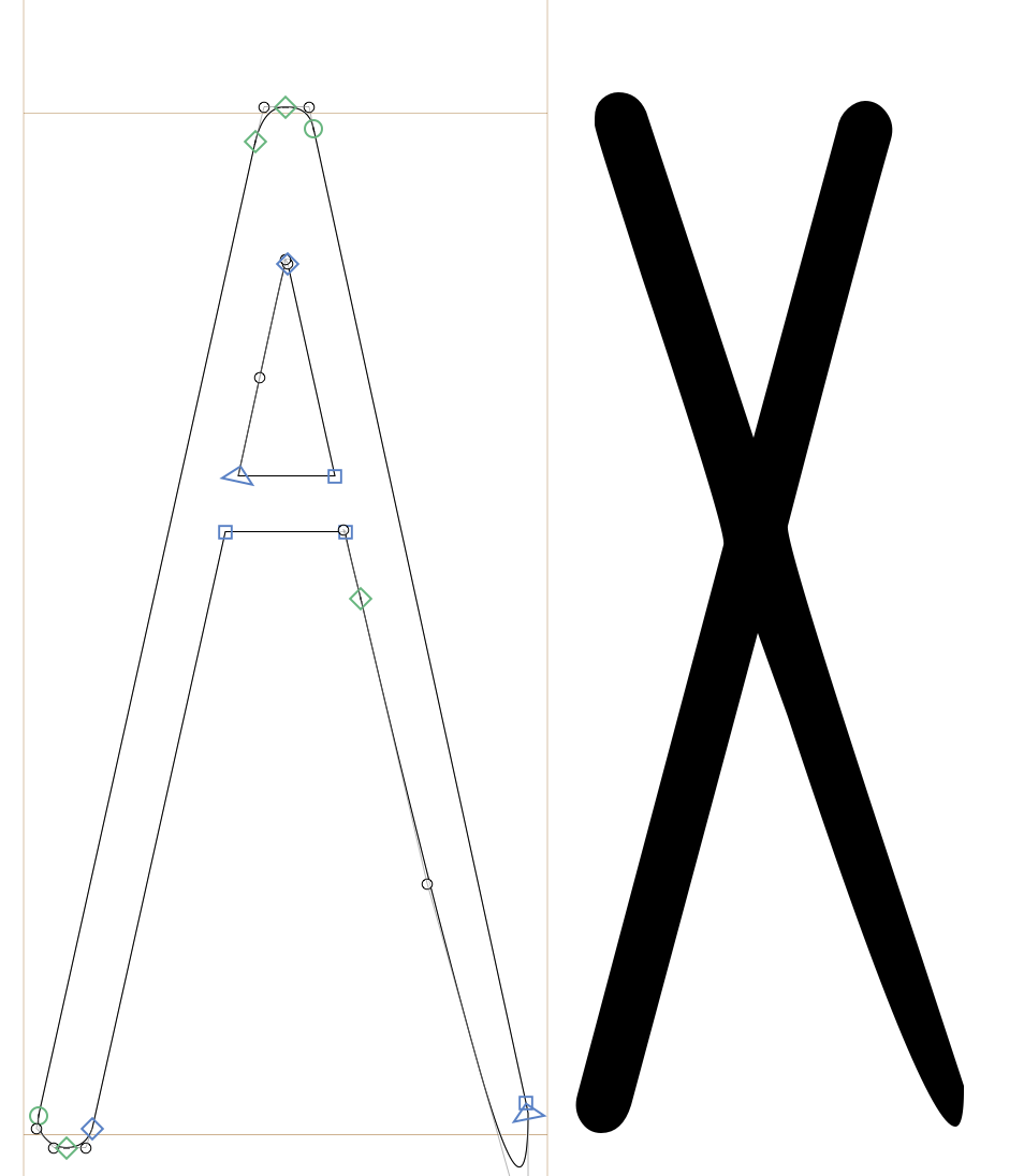
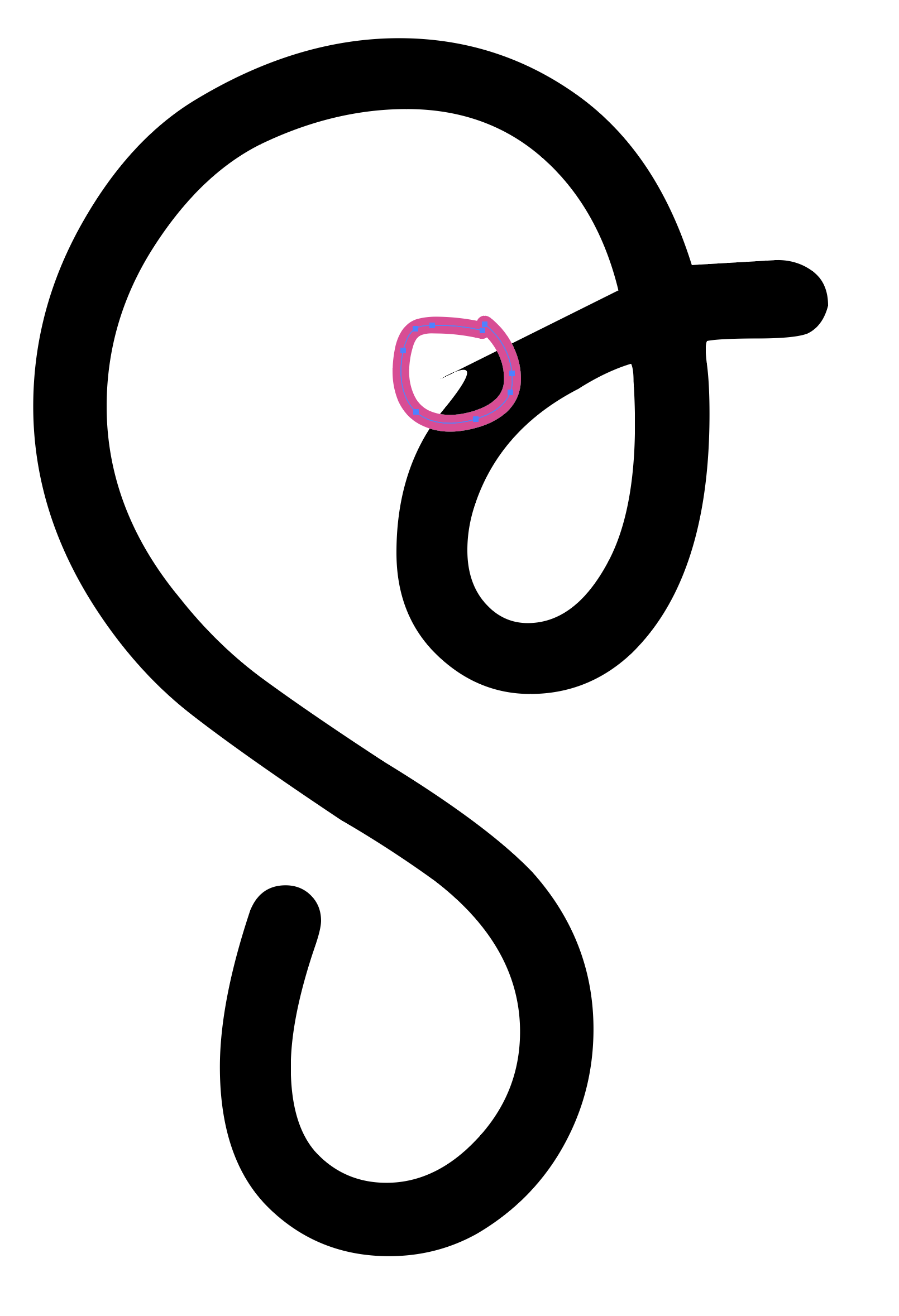
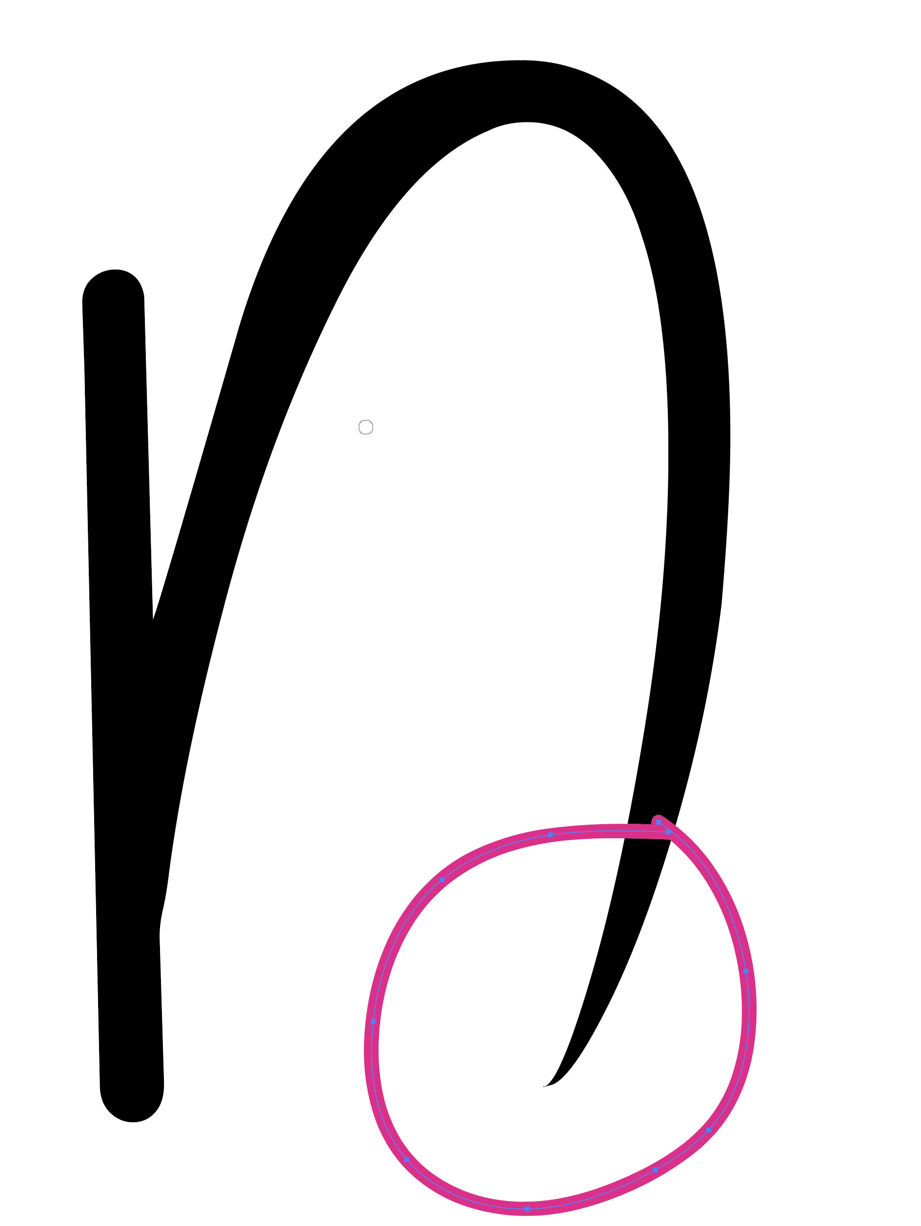
I saw some strange placement of offcurve points in the top left arm of the X. And an several places where you curve segments that look like flat line segments.
Can you try exporting without “Remove Overlap” and “Autohinting” activated in the export dialog?
Can you send me the .glyphs file that shows this when exporting? I should be able to fix this.
You seem to have exported as TrueType. The conversion into those curves needs better structured outlines. But exporting as OTF will work fine.
You still need to clean up your outlines.
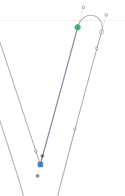
The four selected nodes belong to one segment. Not only is actually a flat line but also the one handle is longer than the line itself.
When you make a mono linear font like this, you could try a center line and applying the stroke thickness in Glyphs. That makes it easer to edit the glyphs and should give you better node structure (extreme points).
Thank you so much for looking into this. I’ll read through the linked article and I think I understand what you mean by “it needs a better node structure”. I’ll test more, but I get what I need to be mindful of regarding shapes and nodes of a glyph.