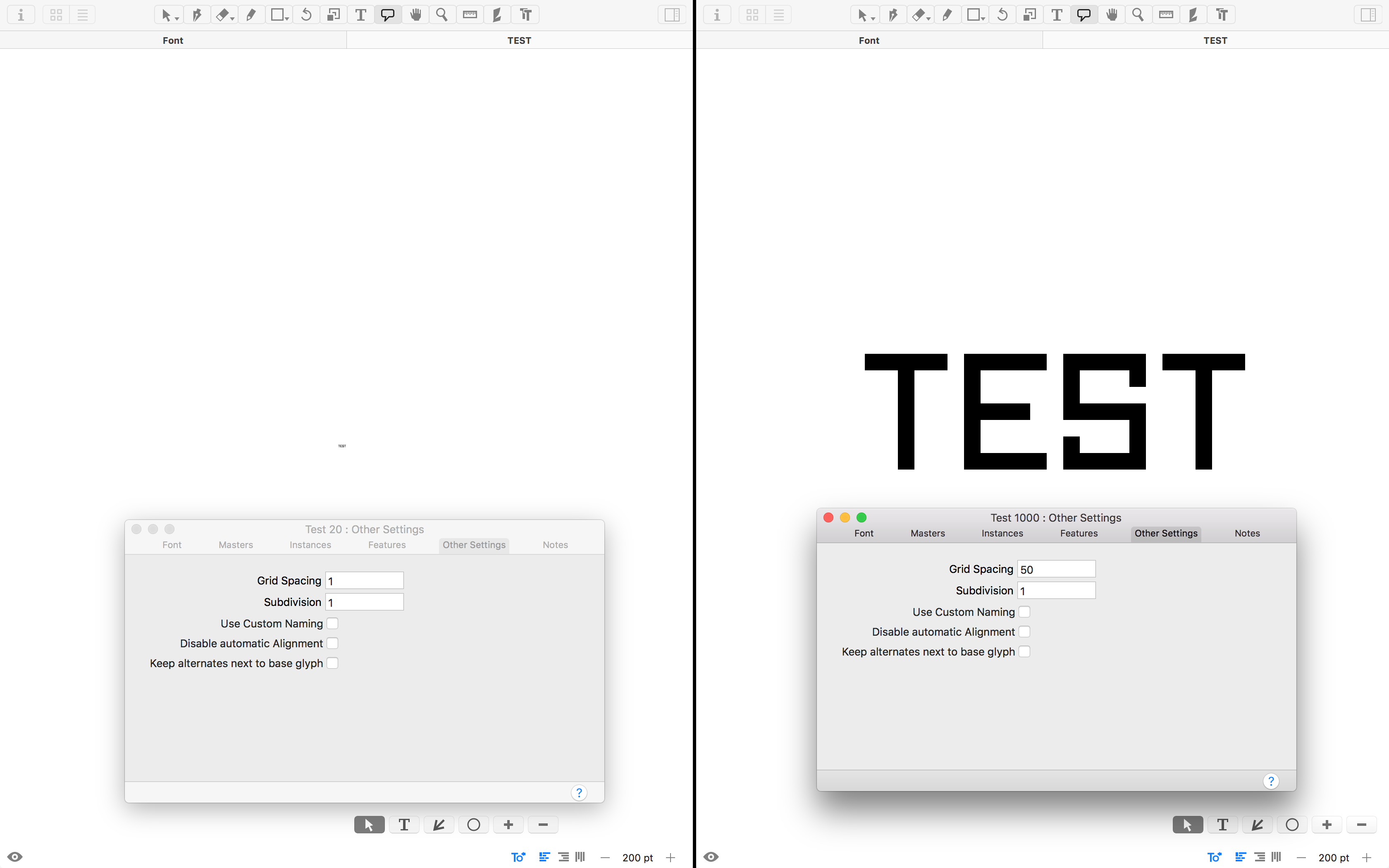
If you were to make a bitmap font for 18 points, one could keep the grid spacing at 50 and then set the upm to 900. This renders perfectly at 18 points in other applications, but Glyphs assumes the font is to be rendered at 1000 upm, so the division produces 20, and that’s the size that is rendered correctly.
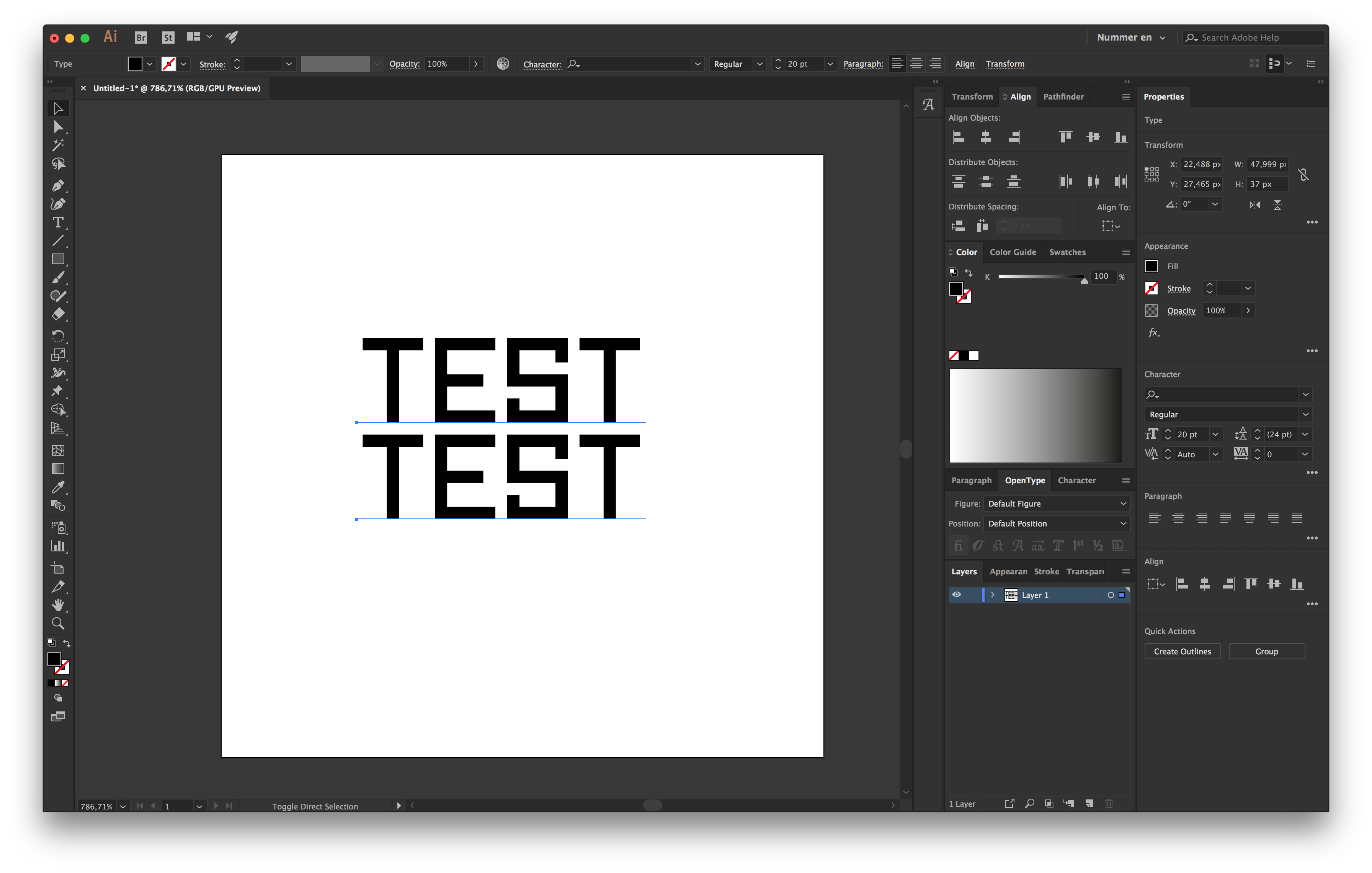
I have attached an illustration using Susan Kare’s San Francisco.
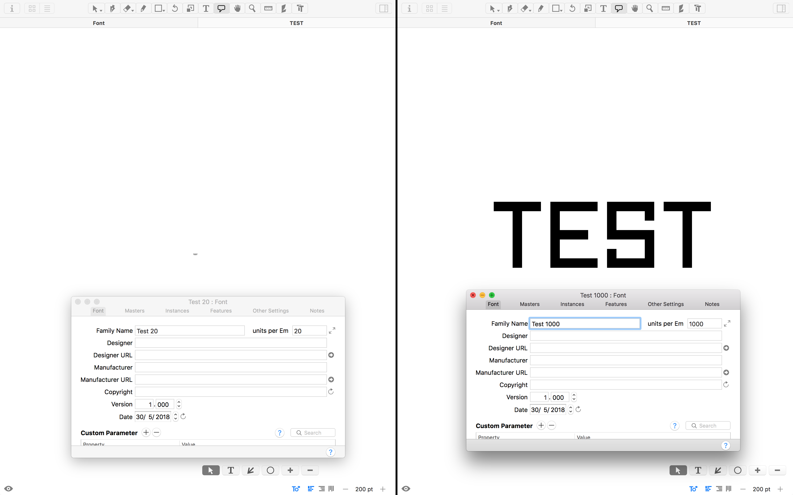
Take a look at this. In a pixel typeface like this, the goal is for the font to render correctly at 20 points. One has a 1000 upm with 50 grid spacing, the other 20 upm with 1 grid spacing.
These two are supposed to be rendered identically at the same size, but in Glyphs they do not. The last screenshot is from Illustrator where it functions perfectly.
The Edit View scale in the bottom right corner is not supposed to be the font size. It is what 1000 units are scaled to, which makes more sense for editing. 1 pt is 1 pixel on (assumed) 72 ppi screens, and 2 pixels on Retina screens.
The Preview (which you open with the Eye symbol in the lower left corner) respects your setting for ascenders and descenders.
I recommend you set sensible ascender and descender values and use shortcuts like Cmd-0 for fitting in the screen.
Alright, I understand.
The convenience of the edit view scale is that you may set exact point sizes, and in the case of pixel fonts, you can check that it rasterises correctly without having to export.
Anyways, thank you for your detailed answer, Herr Scheichelbauer.