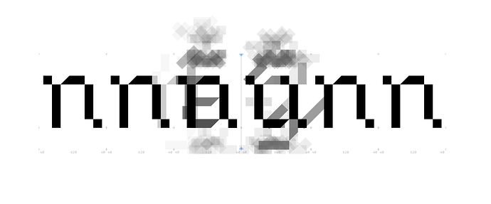
Hi. Maybe somebody know if there are some hidden settings that reduce the saturation of Group Members? To my eye, this array of gray translucent diacritics tends to be too dark when there are many members. This makes it somewhat difficult to see the original black shape, and as a result, it is difficult to judge the kerning on its process. The Group Members itself are very helpful, so I would not like to turn it off completely. But just make it a bit lighter (when there are too many members).
There is no setting for it. But I’ll have a look. Can you send me a screenshot as reference?
Hi @GeorgSeifert !
Here a sample I’m currently working on. It’s a kerning of right n group to left u group. The problem is right n group also contains a lot of similar shapes (the same side shape but another body shape), as well as left u group. I suppose there are at least 40 members in each group, so it’s become too dark.
Can you try in the latest cutting edge version?
Just checked.
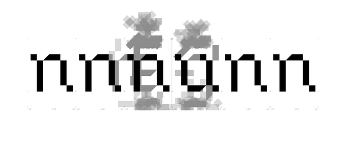
It works better because now my eye visually separates black and gray, and the black shape is more recognizable. A group members can be even more lighter, but in common this is what I wanted. Thank you.
As a side effect, the gray group members may looks a bit messy because now they are glued together in the same opacity.
I wanted less difference between a single shape and all on top of each other. If I would simply reduce the opacity of each shape, the areas where there is only one shape would be barely visible.

