I’ve hit a huge roadblock in the creation of my first font and I’m wondering if anyone can help. I’ve created most of the set at this point save for K, X and V because I’m having a huge problem coordinating the height, width, end caps and stem width of the letters (the font has rounded corners, sans-serif, mono line and all caps). The caps on the stems are rounded rectangles, not perfect circles, so this complicates things. I just can’t find a way to do it so the ends are all rounded the same, everything’s symmetrical, and the characters are the same height and width of the rest of the set. New to Glyphs and I know there’s probably an easy way but it’s eluding me. Any help is greatly appreciated…
It looks like you transformed the upper rectangle after expansion and rounding. But if you want the rounding to be the same, these two steps must come last.
Consider using parameters for expansion and rounding?
And have you read the tutorial:
https://glyphsapp.com/tutorials/monoline
Thanks @mekkablue, I did read through the monoline tutorial but I’m not sure that it helps me with this particular font. I’ve already created most of the font save for M W V X and K and even when trying to create the characters with rectangles before rounding, the math needed to keep the characters the same width / height and rotating the right no. of degrees to have them intersect symmetrically seems near impossible.
I’m using the pythagorean theorem to calculate the length of the rectangles before rotating, but I still have to factor in 30px radius rounded caps aligning both with the cap height, baseline and guides for the standard character width and I’m still not sure how to use the rotate tool precisely to rotate from an exact anchor (is there a way to snap it to the grid?). The characters are wide and made within rectangles not squares, so 45 degrees doesn’t really work…
I am not quite sure what exactly you are trying to do. What do you consider a symmetrical intersection? Can you show me what you want it to look like?
What I see in your first screenshot is that the two rectangles have first been rounded and later sheared and distorted. Bad idea. Have you considered starting from a monoline, then rotating and distorting it before expansion and rounding? You can take care of all these steps in custom parameters, even.
Also note that there is a unit grid that will cause small kinks in tiny curves, so you may want to experiment with a different subdivision setting in Font Info > Other Settings.
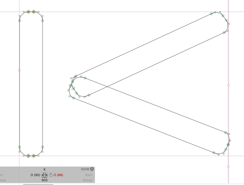
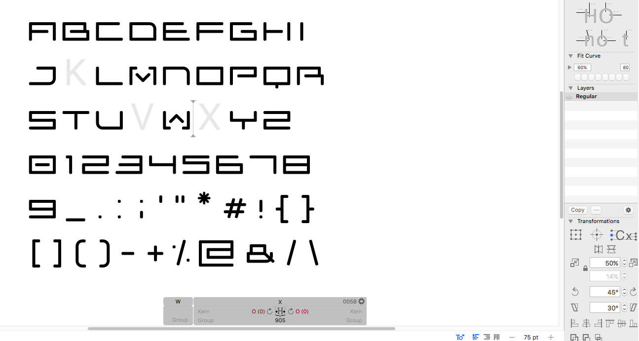
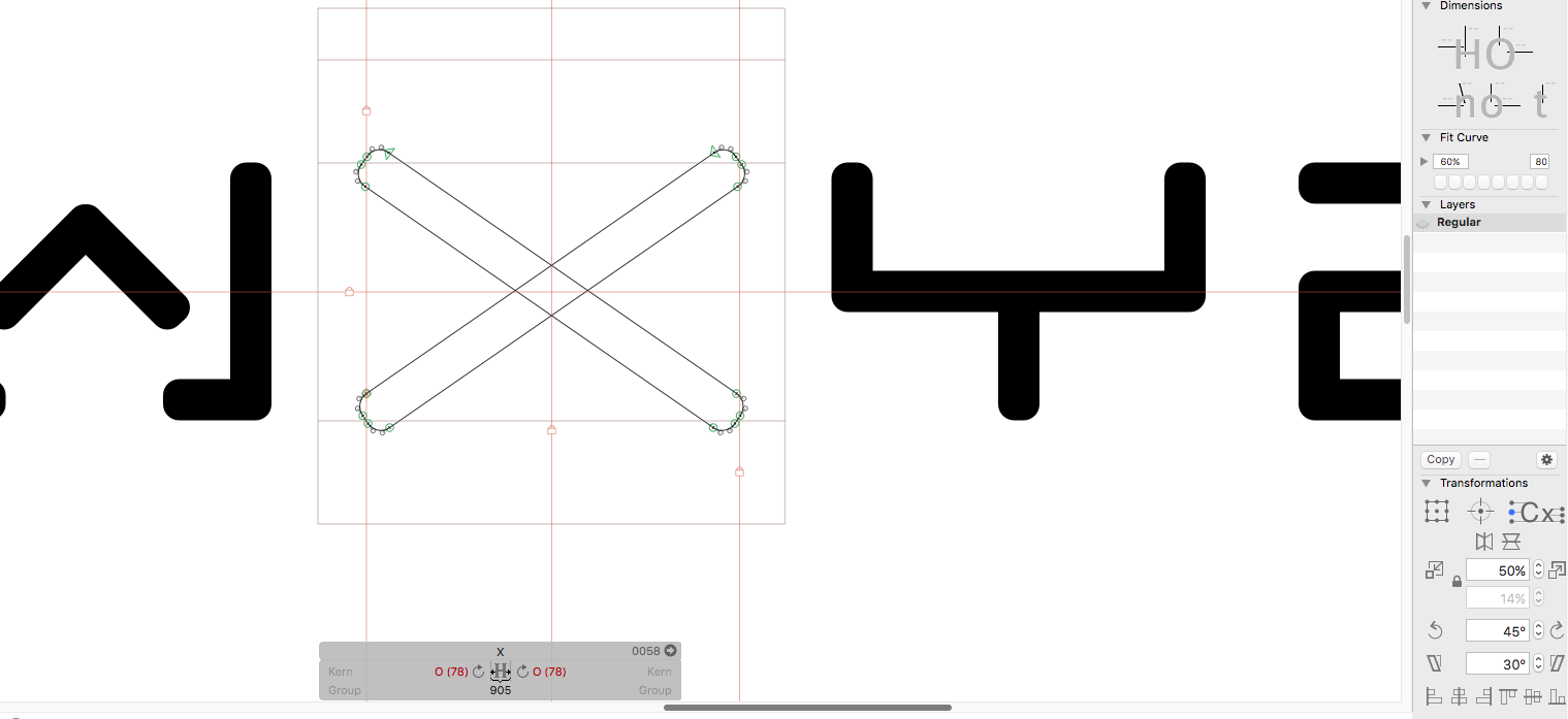
Sure - I’ve attached a screenshot showing essentially what I would want the “X” for example to look like. What you see is a result of creating a rectangle with an 80px wide stem (same as rest of font), using Pythagorean theorem to calculate length needed to span standard character width once rotated (all characters except “I” and “W” are 725px with 90px spacing on either side, spacing will obviously be tweaked later) and using rotate tool to rotate stem counter-clockwise until roughly hitting cap height (x-height for my all cap font), baseline and width guides. I then duplicated and mirrored the stem so that both stems cross in the exact center (what I meant by “symmetrical”). I added the 30px rounded corner radius after rotating to avoid distortion (although in the future, parameters seems like the right way to go with filters).
The problem is that even though this is close to what I want, the edges of the characters are not perfectly aligned with the baseline, cap-height or guidelines for width. I need everything within the bounds of the other characters in the font and I’m not sure how to accomplish this. Needing the corners rounded complicates the measurements needed for everything to fit within set boundaries. Does this make sense?
Well, obviously you need to make it shorter than what the Pythagoras formula gives you for the skeleton line, because you need to accommodate the expanded and rounded shape.
As transform origin, do not use the cap height center for mirroring, but the center of the selection.
Why would I make it shorter if the 30px rounding takes pixels off the rectangle’s length? Wouldn’t I need to add to compensate and get the edges to touch the baseline / x-height?
Because that would not accommodate the height of the rectangle. It looks like you calculated the center line, not the actual outline of the rectangle.