Hey guys, I’m new to type design and have recently bought Glyphs to try it out.
My workflow includes copying Illustrator to Glyphs as there are certain shapes I find it easier to control in Illustrator. However, as I zoomed it closer I find that some of my paths have moved despite I have adjusted the same pixel on illustrator.
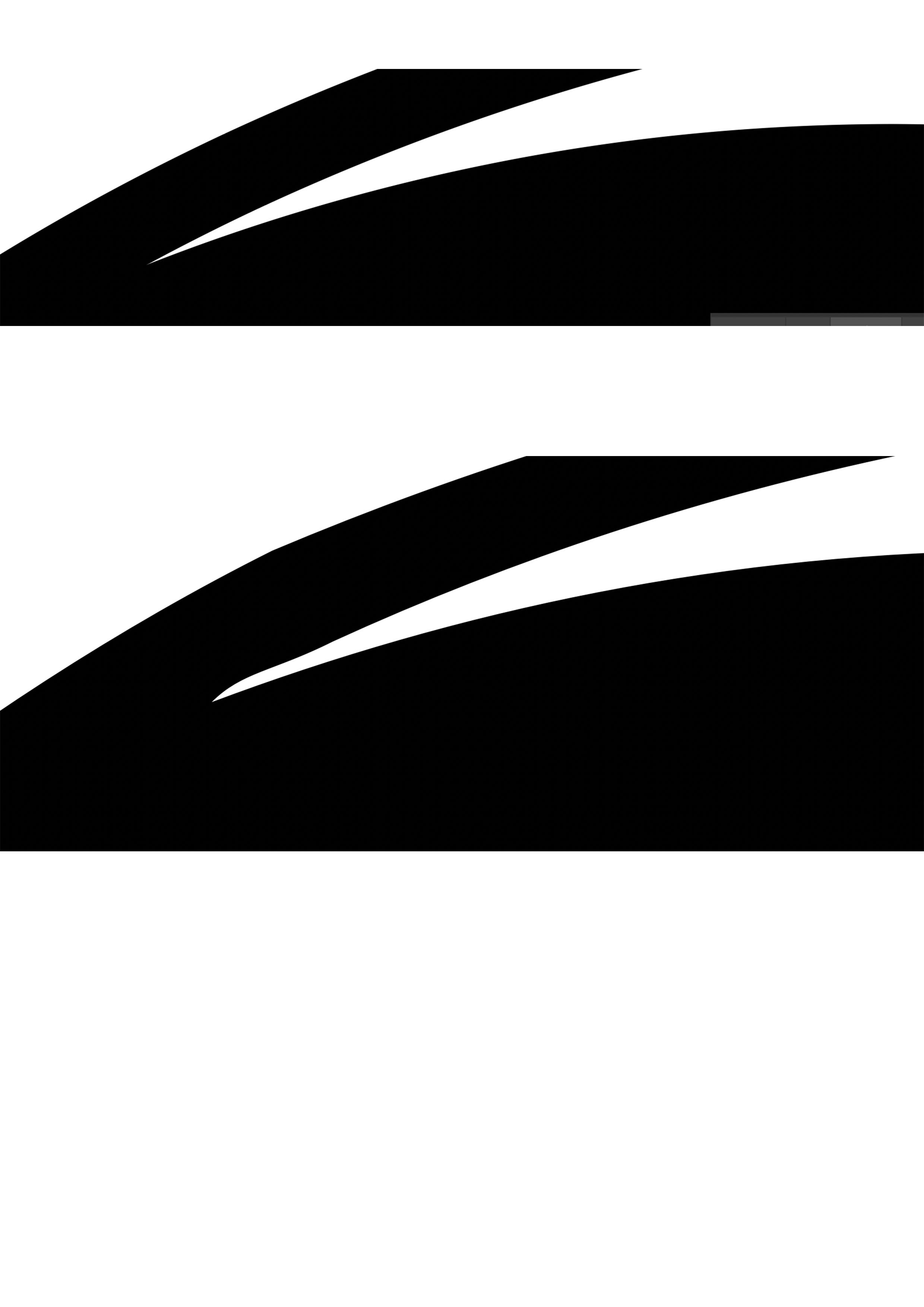
I really do need your expertise to help me with this matter! (Top is illustrator and bottom is glyphs)
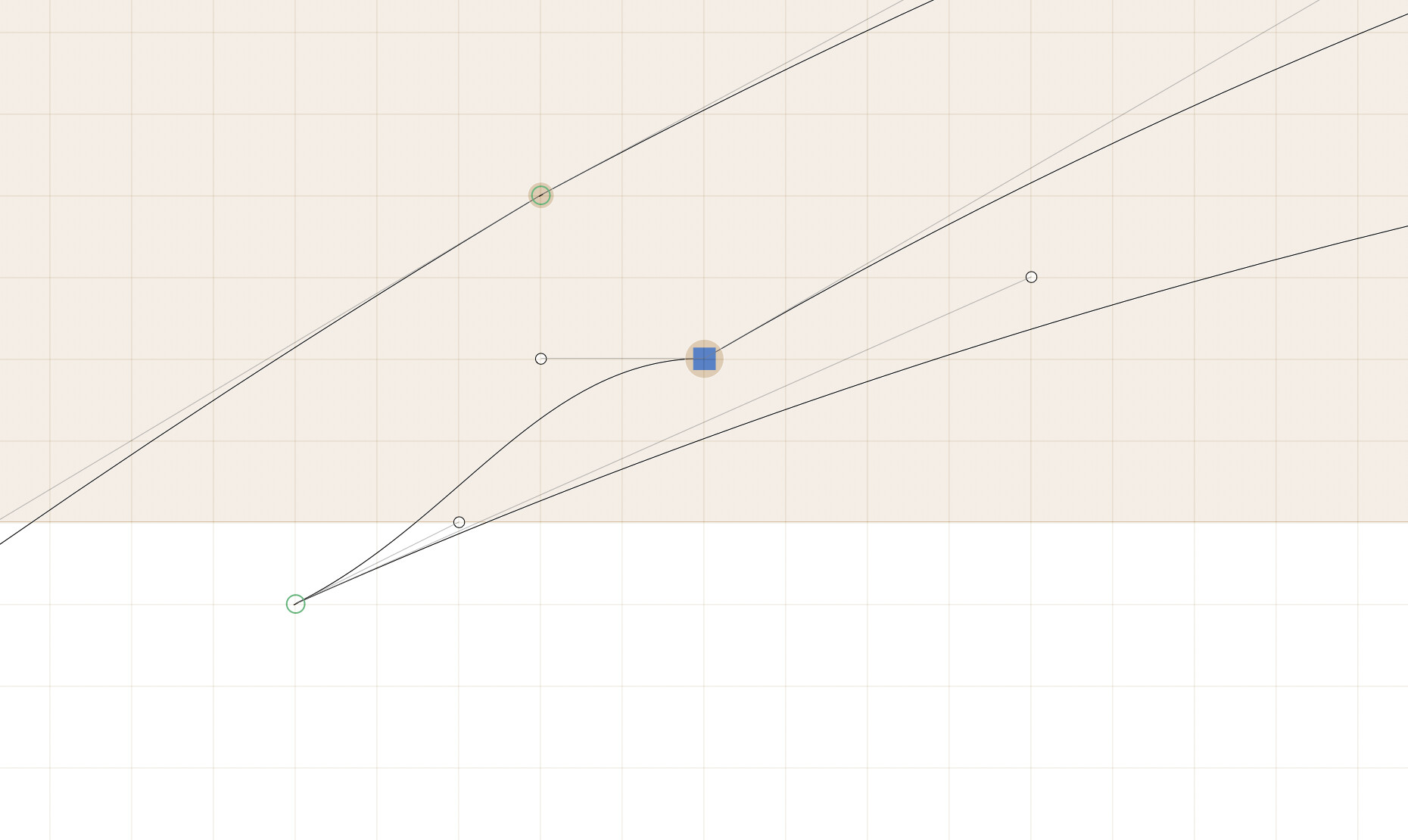
Put the original shape in the background (Path > Selection to Background), then delete the point and then it should be easy to reconstruct the shape.
Right after you pasted from Illustrator, the coordinates are not rounded. If you remove the extra nodes before anything else, the automatic shape will be much better.
As you can see I deleted the nodes the and it completely changes the shape.
Also my concern this isn’t just one letter. If I have to repeat, I’m gonna end up repeating for the other letters which may make the typeface look inconsistent.
I’m going to repeat some of Georg’s comments, but fonts are typically drawn in a coarse grid, and this kind of approximation is bound to happen when you paste from Illustrator (this is not Glyphs, rather any font editor). The breakage in the outline is most visible when you have a very small line segment like this or you have lots of segments.
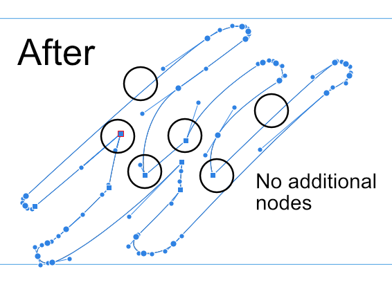
Attached is my Glyphs file after cleaning up a bit. You can see that the curves are drawn with fewer nodes. New Font.glyphs (3.8 KB)
While it’s certainly doable with this resolution setting (we call it UPM: Units Per M) and a good type designer should always revisit their outlines in such a process, a simpler solution that doesn’t involve correction is to increase it to a higher number like 2000 or 3000. You can change that in the Font Info.
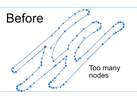
Can I chime in here. It has been my experience that too many nodes are too many nodes. Remember a perfect circle is drawn with only four nodes. I import my fonts from vector images at times, but before I do I delete all un-necessary nodes. This is a case of less is more. I get work created by others and i delete a lot of nodes on their art ( not changing the shapes ) so i don’t have this problem. I hope this reminder helps.