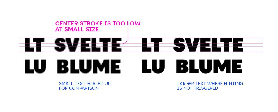
Hi all - I’ve hit a snag trying to iron out some hinting issues with the center stroke of the cap E. Right now, the autohinter is shifting it downwards at certain pixel sizes so that the top counter is noticeably larger than the bottom when it should be the reverse (bottom a little larger than the top counter).
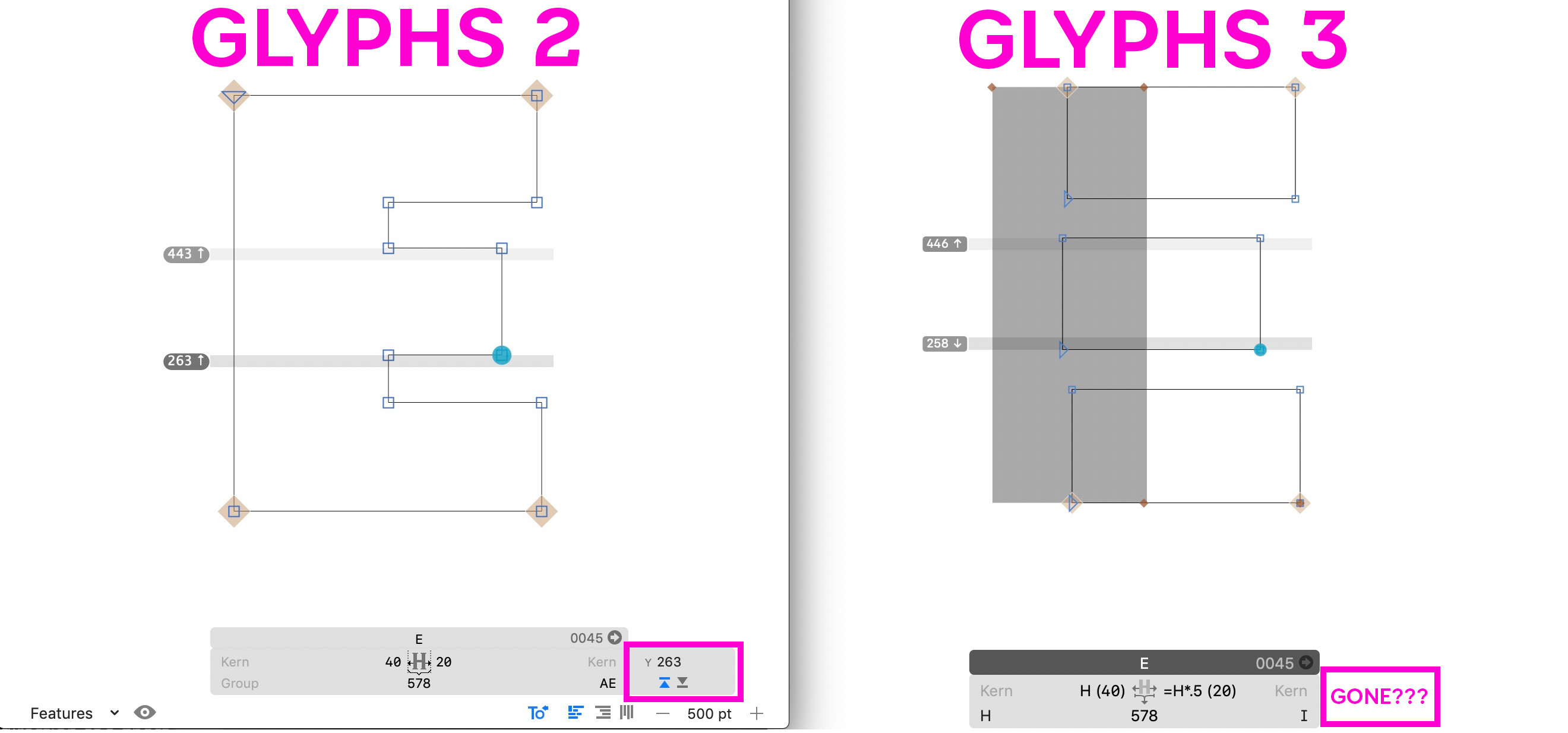
I’ve tried adding hints manually to the center stroke but then the top and bottom change when exported and no longer match the proper base-line & cap height… In Glyphs 2, I used ghost hints (on the top and bottom edge of the center stroke both hinting in the upwards direction) to work through a similar issue, but it appears you can no longer change the direction of a ghost hint in G3 (see side-by-side of G2 vs G3) and the result is the same as a standard hint across the entire horzontal stroke.
First of all it is normal that a hinted stem sometimes snaps to a lower and sometimes to a higher pixel edge. A stem hint will typically cause the rasterizer to unify stem thickness, while a ghost hint will align to the nearest pixel edge. It will only move it if the (ghost or stem) hint is reaching into a zone.
Not sure if a zone is intervening, perhaps in interpolation or through BlueFuzz.
The upscaled screenshot appears blurry, I cannot tell how many pixels are in between. It is possible that for the given stem thickness and scale the rasterizer has no other choice than to snap down. You may need to decide if position and fidelity or snapping and uniform stem size are more important to you.
Position and fidelity: Consider not hinting the middle stem at all if you want it closer to the original outline.
Snapping and size: Add a ghost hint perhaps only on the bottom edge. Or turn it into a horizontal stem hint and experiment with the standard stem values: make sure you only have few, perhaps even only one will do for this design. Then increase (making the rasterization bolder) or decrease (making the rasterization lighter) slightly.
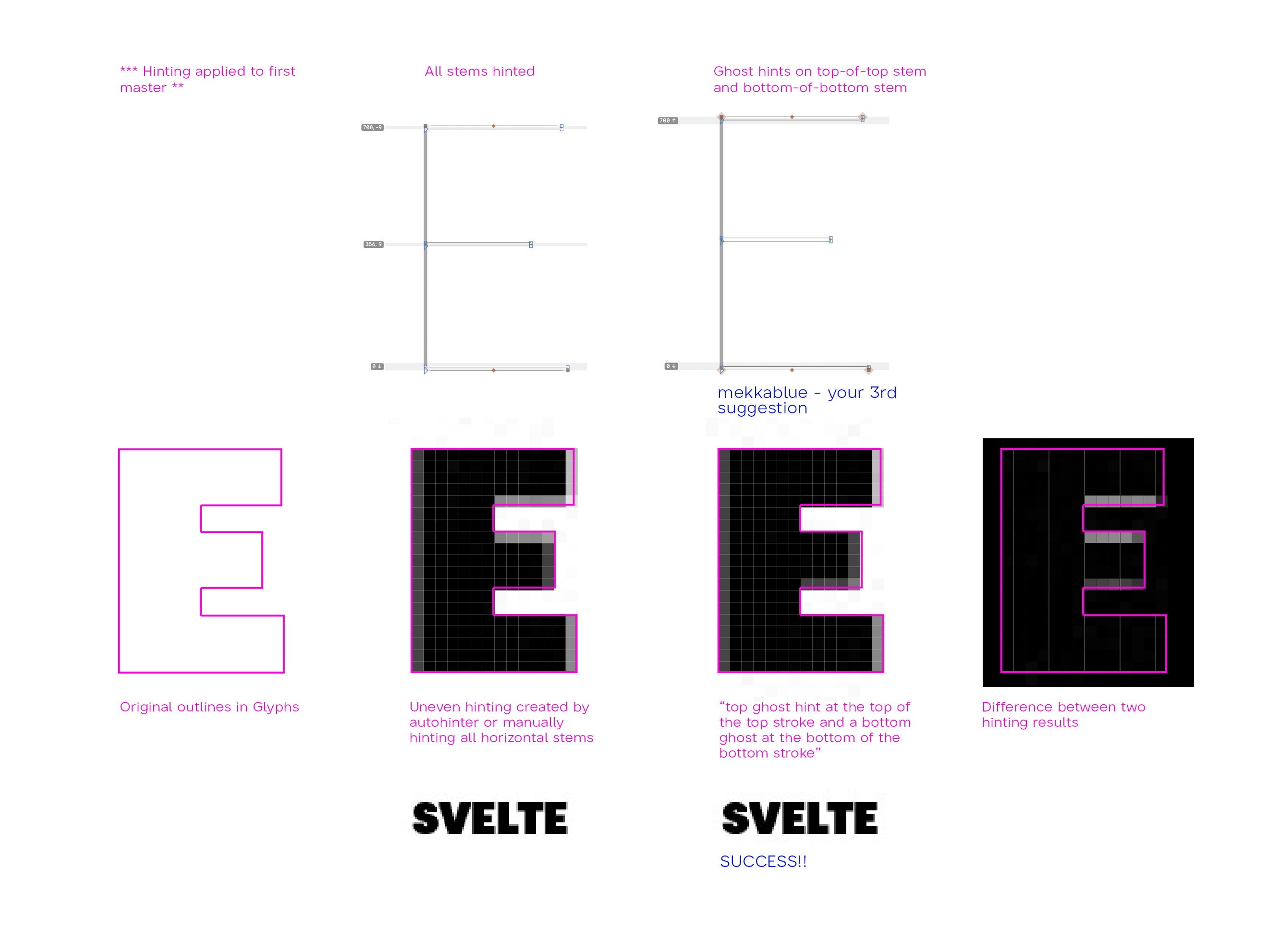
What I would not do is put a bottom ghost hint on the top of the stem. That is not what they are designed for and may cause an extra push down. Consider a top ghost hint at the top of the top stroke and a bottom ghost at the bottom of the bottom stroke, and no hints in between. That may give you maximum shape fidelity while still snapping the outer edges.
The up/down setting of the ghost hint has nothing to do with the direction where-to they are hinted. It just says if it is attached to a top/bottom end of a shape. And ghost hints are only effective when they are inside a zone. So you’d usage will either do nothing or will mess things up.
Thanks @mekkablue and @GeorgSeifert for the explanation and advice!! I think I’ve found the solution (using your third suggestion @mekkablue ) but also appreciate the extra information. Here’s a breakdown of the solution and comparison before vs after for anyone else who may find this useful.
I wasn’t aware that normal stem hints aim to unify thickness while ghost hints are intended to modify position/snapping during the rasterization process - very helpful to know!
Regarding standard stem values, I do only have one horizontal and one vertical, but it seems that without ghost hints at the very top and bottom of the letter, the center stem wasn’t aligning as evenly - I don’t think it would have been interference with the x-height alignment zone as that is substantially above the center stem of ‘E’ - so I’m still not quite sure why the autohinter & manually hinting all three horizontal stems was producing an uneven result.
The last thing I’ll mention @GeorgSeifert , I understand the line of logic behind using an arrow or something similar to indicate the ghost hint being applied to the bottom or top of a shape but, from my experience as someone not as familiar with the details/limitations of specific hinting types, misinterpreted that as the direction the hint would shift outlines during rasterization rather the its relative position on the shape it’s attached to. Ultimately, this is likely a point of confusion only a small number of designers will run into (ones who know enough to use ghost hits, but not enough to know that they are directionless) but thought it worth mentioning in case future UI changes are made.