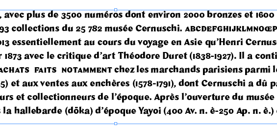
The auto-hinting does not seem to work very well with my new otf typeface, here is a screenprint attached:
I tried to fix this in different ways, my alignment zones are set, I tried to add manual hinting but it did’nt change much.
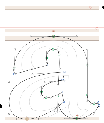
For example, b and a, that have the same alignment zones, but jump on two different “baselines” in some sizes.
You can tell the path directions just by looking at the screenprint? What is the secret?
Otherwise I don’t think my alignement zones are wrong though:
I actually added a few hints manually and a “ghost” point on the lower curve of the a, and it is getting slightly better but I still have alignement problems, I don’t know what to do…
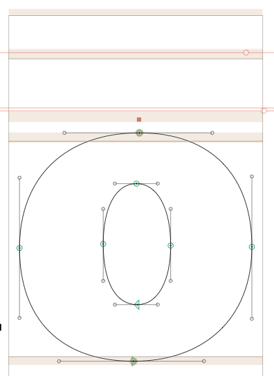
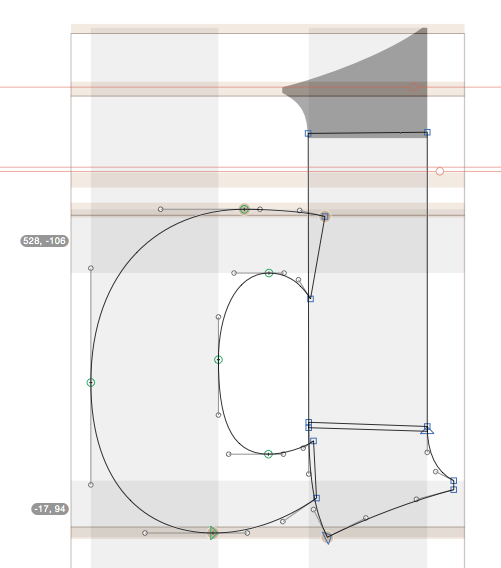
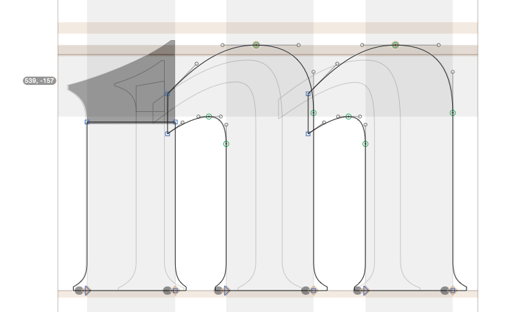
The path direction in the a is fine. The overshot in at the xHeight is quite big. That can cause jumps like that. Can y0u post a screenshot of the o and d?
The manual hints in the d will produce wrong results. The overshot at the xheight is quite different than in the o. Attache the lower horizontal hint to the bowl instead of the outstroke…
Thank you all for your answers, and especially Rainer for your email.
I tried a bit of this and that and it is starting to work better. Actually, the manual hints help a lot in the end.
I want to keep that top left serif (in n, m, r, u) going higher than the curve to maintain the optical balance, but then it disappear in small sizes. The problem gets fixed if I set the x-height alignement zone at 38. As you advice not to go over 25, would that cause a problem somewhere else?