Hi Florian. I already saw those, but I was specifically inquiring about how to do it practically speaking in Glyphs, in the setup I described. If nobody knows, then nobody knows.
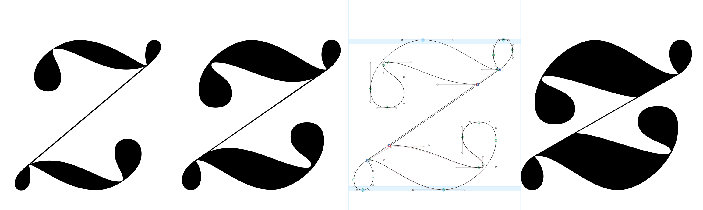
I think I sidestepped the issue by creating a bracket layer, and then having a distorted layer switch with the other layer where they each break.
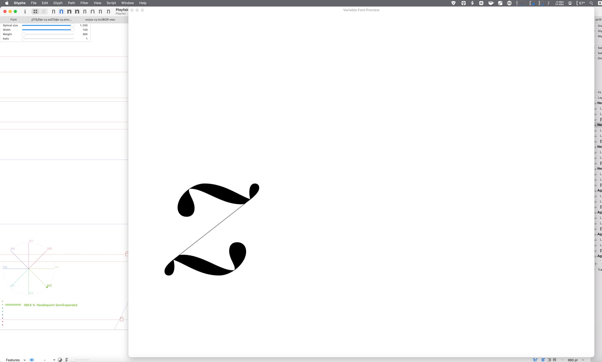
Just that I can’t test it because Glyphs’ font generation of switching glyphs is broken on Intel Macs. But it looks close in Variable Font Preview, but I can know for sure because there is no way to zoom in the VFP window (that I know of) and the click-to-loupe is the same scale as the window.
I think it’s not a “classic” HOI problem. Topological changes are always tricky. But I think it can work with brace layers which move multiple points and handles to the same position in one step.
Master 100, Intermediate at 550, Intermediate at 551, Master at 1000
NB. you can make the VFP window or panel zoom in somewhat by enlarging it with the mouse, but I don’t know why the glyphs are displayed so small to begin with.
Hi Jens. Yes it’s something like that I ended up doing. I just need to fine tune it some more.
NB: I can’t though. It seems there is some strange limit to how large you can get it, no matter if I use the separate window or inline preview area it’s limited at the same size.
I see what you did in your Glyphs file. Intermediate layers probably is a better solution. I was using brace layers switching the optical size axis. Very hacky.
I’m reading up on intermediate layers Handbuch pp. 195,196
And I see that there is also Virtual Masters where I can define ad hoc masters on a single glyphs basis. Could be the nuclear option.