I am currently reading about making oblique fonts. I came across an official tutorial on glyphsapp.com titled “Easy oblique.” The tutorial says the following about the Cursivy feature, “It simply makes use of your standard stems for calculating curve corrections. So do make sure you enter appropriate, average horizontal and vertical stem values in File > Font Info > Masters (Cmd-I).”
If I remember correctly, a stem refers to the backbone of specific letters (K, F, L, etc). Moreover, I wasn’t aware that a stem could be horizontal. Could somebody clarify (perhaps with a visual example) what is meant by horizontal and vertical stem values?
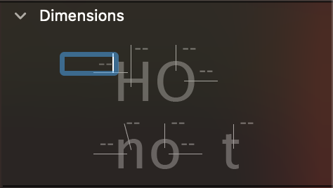
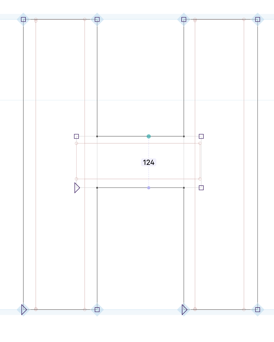
I see the dimensions tab but I don’t see any numbers. I only see a diagram where values can be entered manually (I attached a screenshot). How do I derive the values I need using the dimensions tab?
Sorry, I wasn’t being clear. I meant that you can get a picture of what are considered different stems in type design by looking at the Dimensions panel.
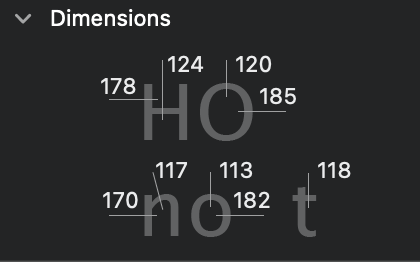
I don’t find the diagram helpful at all. The white lines seem to point to negative spaces. I still don’t understand what exactly a stem is and how to find the average stem measurements I need to use the Cursivy feature. I am still new to type design and I don’t have much prerequisite knowledge to draw from. Are you able to assist me in understanding what I’m looking at and how to interpret it?
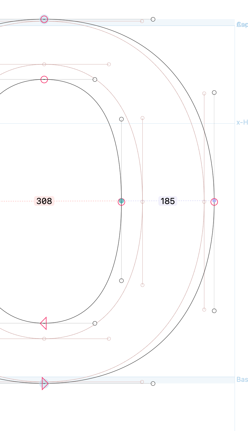
The diagram is extremely useful. The lines indicate the cross-sections of glyphs which are considered stems. To aid your design process, you can enter values there, for example:
The Dimensions palette is merely a notepad to remind you of the stem measurements you are using to design. The values you enter here are not linked to the stems in the masters you are talking about, although they might well be the same values. I mentioned the Dimensions palette because it clearly indicates the spots in glyphs that are most commonly used as the stem values.
Ah! I think the terminology used is what made me confused. So stem measurements refer to the width and height of your vertical and horizontal crossbars, correct?
For example, if most of my vertical bars are 220 units wide and my horizontal bars are 200 units tall:
Average Vertical Stem Value = Approx. 220 Units.
Average Horizontal Stem Value = Approx. 200 Units.
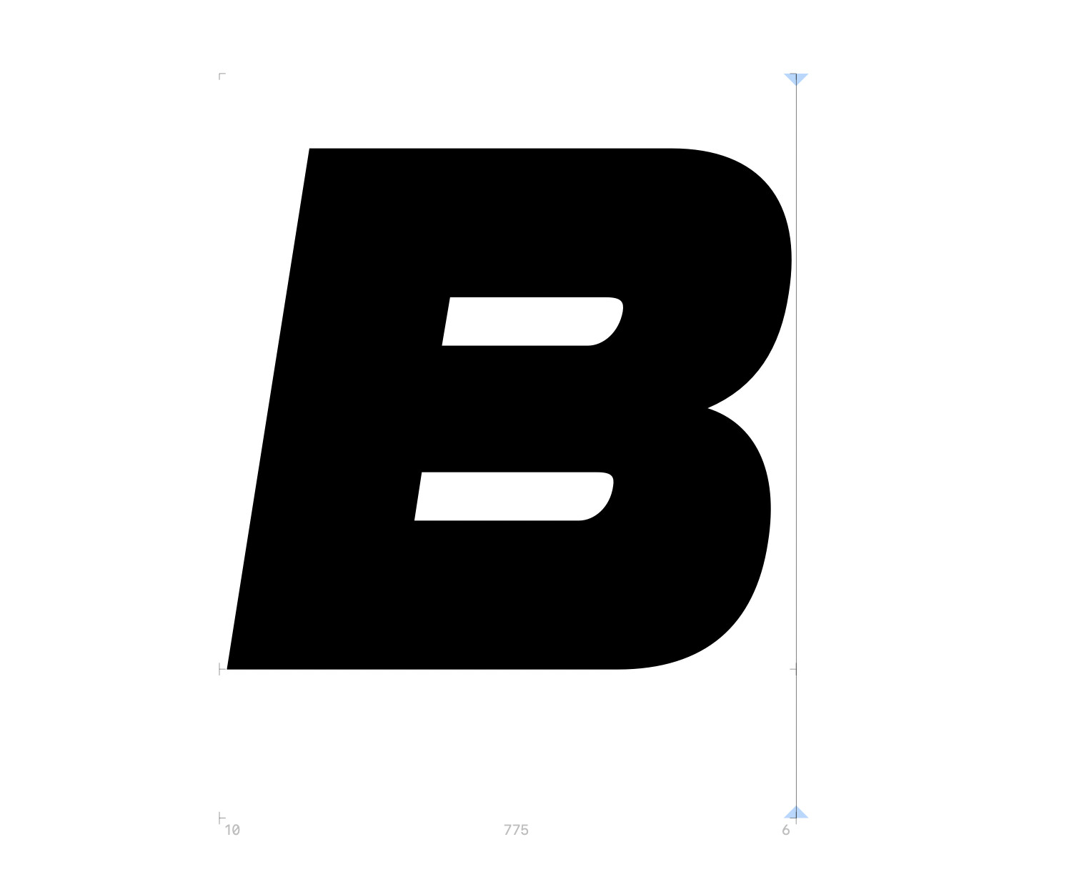
Hello, I entered the correct stem values for my crossbars. However, my letterforms become very distorted and look incorrect when I use “Cursivy”. It appears that the subsection “Fixing extremum points” in the tutorial “Easy Oblique” addresses this. However, most of the language they use is beyond my comprehension. What do you suggest I do about the problem in the screenshot attached to this response?
For those very heavy glyph, there is not much space to do the corrections. What you can do is to put the original (upright) outlines in the background, slant it normally (without cursify). Then use Path > Interpolate with Background to get something between the two versions.
If I don’t use “Cursivy” with the correct stem values, how can I be sure my glyphs remain optically correct? Sometimes I can’t tell the difference between a faux/bad oblique and a proper oblique because I’m still inexperienced and find it hard to tell the difference.
Moreover, the “Slant” feature doesn’t distort the counters of the letters (it seems to behave exactly the same as the Cursivy feature without any specified stem measurements). If this is the case, why would there be a need to interpolate with a background glyph when you could just copy a path and slant it?
Glyphs can’t do this for you, no algorithm can. That’s pure practice. You can use the Cursify and Slant options for rough approximations, but I would always recommend doing the bulk of the work manually. This will also train your eye and develop your taste.