I can follow the tutorial but I would like to look at how are those things related, more insightfully.
Are the standard setting for vertical metrics taken into account while exporting if i have custom parameters defined by hand? Or are the standard setting used only inside Glyphs for viewing the metrics box and calculating the line height in edit view?
Would it be ok to have ascender + descender higher or lower than UPM? What would be the reason to do so?
Software that uses your font may expect this relationship between the values. Therefore, I do not recommend it. Read the recommendations by Microsoft if you want to dig deeper, and go through the OS/2 table specs, too.
I don’t think it is crucial to have ascender and descender to sum up the the UPM. Using bigger or smaller values might change the relativ size of the rendered glyphs.
And there are two important use cases for those values. First is that they are important guides while drawing.
And then there are the values that are written into the fonts. You should alway set the former to match your drawing. The latter are calculated by Glyphs or can be set by custom parameters.
I’d like to follow this up with a slight detour: it would be terribly useful to be able to display the vertical metrics (hhea ascender & descender & winascent & windescent) in the edit view. This would not only allow to gauge how these settings affect the possible rendering of tall glyphs (thinking of mark positioning etc) in various apps, but it would be a didactic tool, illustrating in a much more tangible way the influence of these settings.
Maybe this is already possible or there is a plugin which I haven’t been able to find?
Thanks to everyone involved for this great thread and all the links here. Very interesting, but unfortunately I still aren’t that convinced in what I’m doing.
I created a pixel font with Grid Spacing 100 and thought the metrics would be easy …
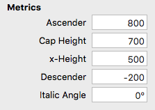
My x-Height is 500 (5 px), Cap Height is 700 (7 px), Descender is –200 (2 px), and Ascender is 1100 (11 px) due to Cap Height (equals lowercase ascender height) plus space for all different diacritical marks.
As OP thought initially, as well as I did, the value of Ascender + Descender should be Units/Em … that’d be 1100 + 200 = 1300 … easy, isn’t it.
But it seems that 1300 is not a proper value for Units/Em, so … what should I do now?
1300 is a proper UPM value. But if you want to line up font pixels with actual screen pixels, you may want to default to something that divides easier. Perhaps 1500 or 2000 or 1000. Experiment and see what you like best.
Trying to figure out what difference it makes to use 1000 or 1500 Units/Em without changing the Vertical Metrics … I’m not quite sure I get it.
In any case, so it would be totally okay to use Units/Em 1000 even if the difference from Descender (–200) to top of Ascender (well, diacritical marks) (1100) would be MORE than 1000, literally 1300?