How does Glyphs treat _top vs. _top_1, _top_2 etc?

Hi everyone,
Thanks so much for all your help in the past and sorry for not thanking the last replies I got - I have been busy with work away from font making for some time!

So I am working with marks using anchors. I found their behaviour confusing and found no solution with the tutorials but finally I worked some things out by trial and error. But now would love some input on the hurdle I have encountered.

I have found that marks (even if ligatures) need only one anchor, eg. ‘top’.
The glyph they are marking (mine are all ligatures), need three top anchors (at least - even adding the set of automatic anchors was not enough for some, so I have 3 top and 3 bottom on the ones that work - whether all the bottom ones are needed, I know not - but minimum of 3 top anchors seems pretty sure, didn’t work with 2 or 1). And even if one of those is called _top while the mark’s only ancho or top, this only works in the special preview marks in Glyphs. It does not work when exporting (on Mac with Pages and Textedit for example).

To make it work for exported font (which stops it working in preview), I have to position top_3* to where I want _top from the mark to align to. If I do that, it works fine when exported.

So it seems that top in marks automatically align to whatever _top in the target glyph is of the highest number. Is that correct?

What I want to do next is to know how it deals with multiple marks. How can I utilise _top_1 and _top_2? Is there a system where I can use them to position the next marks, if there are multiple marks? Such that adding the first mark would make the top in the mark go to (_top_1 or _top_3 depending on what logic the app is using?), then adding another mark would make that second mark align to _top_2, and so on.

But in order to do that I need to know what principles the anchors are treated with. And so I ask if someone here knows?

Many thanks!

This is decided by how the Layout engine deals with the character stream, and probably does not make sense to influence on the glyph level. Since the idea of the _1, _2, etc. extensions is for positions in ligatures, the mark positioning should simply be determined by the order of the characters. If you use it for something else, say alternate positions (e.g. the top anchors on top of circumflexcomb), I would use an alternate extension for clarity, e.g. top_viet, not numbers.

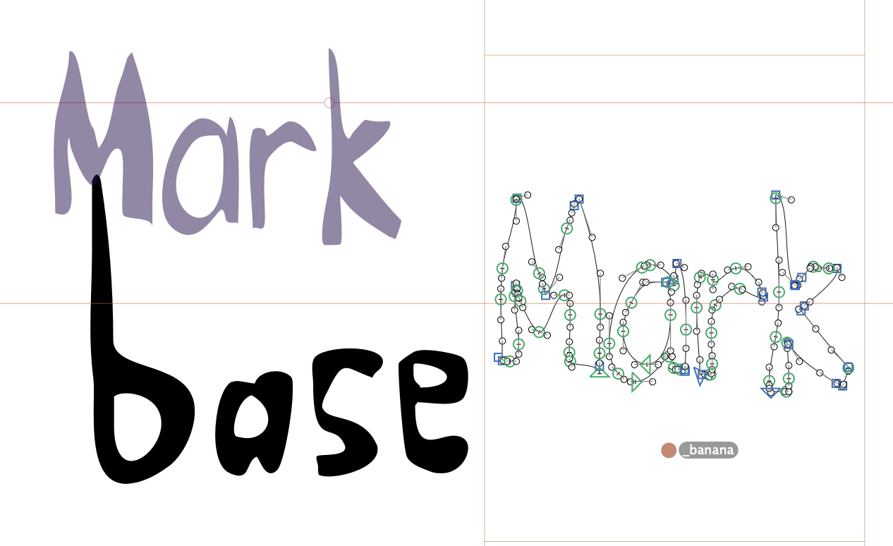
Thanks @mekkablue. So with that in mind, I went ahead and made many ligatures and marks - some marks are themselves ligatures, some not. I’d find by trial and error which ‘top’ would be ‘active’ (i.e. actually take a mark with anchors being functional) where the mark comes after the ligature.

Here is what I found, from my personal notes:

  • Marks just need ‘_top’ or ‘_bottom’ anchor.
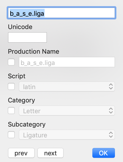
  • Target glyphs to me marked, need 3 top and 3 bottom anchors, and ‘_top’ in mark attached to ‘top_3’ for some reason.
  • But to see them in preview here in Glyphs app you need to name it ‘top’. Then when aligned, rename it ‘top_3’ (same for bottom) for it to work when exported.
  • When the target is a comma (maybe other punctuation also?), the mark aligns to the ‘top’/‘bottom’ anchor, not highest number.
  • Weird behaviour. Most target gylphs to be marked can have just ‘right’ anchor but need ‘left_3’, though don’t need ‘left_1’ and ‘left_2’. hayuri is one such liga. And seem some ligas where I’m actually using ‘bottom’(/'bottom_3) won’t work without there being top_1 top_2 and top_3 in there too.
  • Liga ni needs 3 top, and single right_3 and left_3 to make left and right marks work. Don’t know why they need both for one to work.

So this all seems quite unpredictable. Even ligas made from just two letters sometimes behave differently from each other, with different requirements regarding needs for ‘top’ vs. ‘top_3’ for example, as explained above. This means that I have to export and check with a section of text every time I alter one glyph! Sometimes more than once per glyph even, one anchor at a time. And often multiple tries to get one glyph’s anchors working. That’s how it seems - perhaps there is a pattern but I have not been able to descipher it, so if you know the rules I’d love to hear them! If there is a way to make this process more predictable, and therefore faster?

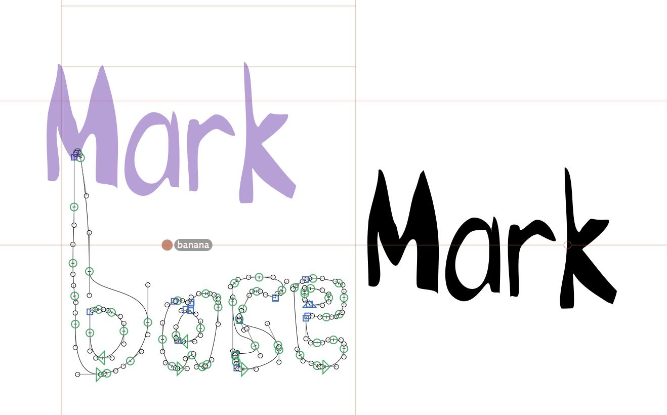
And one more huge problem - yesterday I went through this process and got one by one many glyphs working. My text was looking great. Then after I edited one more ligature ( what I call a ‘target’ glyph that gets marks to attach to it - again a two leter ligature like the majority of mine are), something went wrong. When I exported, many other letters stopped working properly! Even though I had not changed them at all!

So I tried ‘undo’ - but there is an issue which I have been aware of for a long time with ‘undo’. Intead of undoing the last actions I made on the app in sequence, it seems that undo is also fairly unpredictable. Sometimes clicking ‘undo’ and then ‘redo’ works as expected, while sometimes you end up in a very different place than you started. And on top of that, undo seems to also depend on what you are currently clicked on. So if you do something by accident, but don’t know what (for example in font view), it can be super hard to undo it. And if you click on a glyph to highlight it, it seems it will undo whatever last change you made to that glyph, even if it was many days ago (or longer?) This can result in accidently undoing work that you did and it can be very hard to identify what you have undone, and how to redo it. Especially if you don’t know what was highlighted when you clicked undo.

Anyway aside from that undo difficulty, I did manage to undo all the changes I had made to that ligature in this case. And yet the behaviour was unchanged when exporting - the other glyphs I had spent so long making good, are still dysfunctional. And I have no idea how to fix them, or to prevent this happening again.

I wonder for example, when we make anchors, is there any code in the file that it changes ,that can affect anything other than that single glyph? If so, can I change that back? Or even make the code such that anchors are predictable and I can have a reliable way for creating functional anchors?

Help would be mus appreciated!

And now for a little extra detail in case it helps:

To make my position more transparent - I am wanting 4 functional anchors per ligature, to receive different anchors in different marks. Up to now I chose:
-top

  • bottom
  • right
  • left

I have not got to using ‘bottom’ yet but have them in there in some I think where they did not function otherwise, but I will anyway need to be using them.
An example of a two letter ligature that works (/worked!) for one top and one right functioning:
top_1; top_2; top_3; left:3

An example of another with also functional right:
top_1; top_2; top_3; right_3; left:3; bottom_2

Could this be a solution? Are there anchors we can use which we need only one of, and can work in any glyph? For example, the anchors for standard European accent marks - can we use them in any glyph? Or can they only be used with glyphs which are conventionally used for those accents?

If we can, is there a list of them somewhere? I have so far been unable to find any list of anchors for Glyphs - I did search the entire handbook and the tutorials here on this site also.

Also if we can do that, will they function on their own, or do we still need to add 3 ‘top’ anchors to the ligature glyphs in order for any other markers to work? And if so, then what exact markers do we need in a glyph for any other anchors to work? I explained above about some apparent needs in that respect from trial and error but knowing the actual rules would make this much simpler.

Or, can we name anchors anything we like, such as ‘banana’ and _banana’ and they’ll still work?

Thanks!

So I did a test to see if we can just name anchors whatever we like - I chose ‘banana’ as a random example. Here’s the result:

Works great in the mark preview in Glyphs! (This is not my real font, just made an example to test the principle, using m_a_r_k.liga and b_a_s_e.liga).

But on exporting (here in Pages on a Mac), it does shift the mark to be above the base, but it doesn’t use the actual position I made in Glyphs - as you can see it’s much lower.

So, still seaking a solution so I can make 4 different anchors that will behave predictably! Eager and grateful for any guidance!

37

In case it helps to see more details on the ligatures:

07

30

[Edit: I just renamed the anchors in those as ‘top’, and another try as ‘top_viet’, to see what would happen. Both work the same as ‘banana’, so it seems the banana name was not the issue. Perhaps there is something else about these glyphs that cause the alignment error… I will try to see if banana works on my normal good glyphs and get back to you, or keep checking to see if anyone answers with a solution]
[Edit 2: Tried adding ‘top_viet’ / ‘_top_viet’ to a base liga and mark liga that I had working great until the catastrophic change while editing another glyph as I described above. I changed the anchors that were (until that failure) functional, to those names (one respectively to each glyph). It didn’t work when exporting, only in mark preview in the app did it work.]

Also I don’t know how to follow this idea really. But it sounds like could maybe solve the issue? Are there other kinds of ‘top’ I can use? And does it matter if top is on the bottom? Like, does the actual name do anything or can I position anchors wherever I like?

Basically as you can see I just need 4 functioning anchors that I’d like to position wherever I like but if I’m only allowed to put certain ones in certain zones then that’s fine so long as I know the rules. :slight_smile: And just need to know what 4 I can use and whether there are other predictable requirements such as having those 3 top markers in there even if not being used, etc.

An example of a glyph that was working before the catastophe but is not now:
It is a ligature of four letters. It has these anchors:

  • right
  • top_1
  • top_2
  • left_3
  • bottom2
  • caret_1

left_3 makes a mark with _left attach to it correctly. N.B. using left does not work but does in preview in the Glyphs app.
caret_1 I do not use, left it there after it was added automatically.
right was working for the mark with _right anchor. After the disaster when editing a different glyph, this is one that stopped working, so far as I understand.

Previously I had this working using top_3 instead of right (all other anchors were identical to the above described). That would correctly take a mark with _top anchor. When I found out we can also call anchors ‘left’ and ‘right’, and managed to make these with just right not needing to make numbers, and thus also being able to see them in preview, I changed top_3 to right, and _top to _right in the mark. Exported fine. Was great while it lasted.

So the top_1 and top_2 were never being used, only there to make the others work. I left them there when changing top_3 to right, I do not remember if that was because I witnessed that removing them stopped the others from functioning, or if I was afraid they might.

The left_3 worked without needing left_1 and left_2. That worked with the mark with anchor _left. I do not remember with this one spcifically but in general left, left_1, and left_2 did not work, which is why I ended up having to use left_3. Renaming it left allowed me to see it in app in preview, then I would rename it for export so it would work (otherwise it would not). This is still working after the catastrophe.

Sorry if this is too much info. Just trying to provide as much as I can since it might help to understand the situation and be in a better position to advise. Many thanks!

I had a look at your file.

There are two things that might cause your problems.

First, normally, punctuation is not positioned by anchors. You should use mark glyphs for it (e.g. acutecomb).
Second. For each anchor type (e.g. “right”) you need on per base glyph in that ligature.
So in a “r_e” ligature you need “right_1”, “right_2”, “left_1”, “left_2”. In the mark you need one “_right” or “_left” anchor (lets say we use “_right”). The “top_X” anchors that are added by default are not needed (unless you just use them instead of right and left).
You can choose where the make goes by putting the mark after the right glyph. So if you type “r”+“acute”+“e”, the “acute” will attach to the “right_1” anchor. If you type “r”+“e”+“acute”, it will attach to “right_2”.

I would recommend to not test in Pages. Either use out testing app TextPreview (it doesn’t support vertical setting but do debugging the mark positioning, it is OK. Or FontGoggles or a web browser.
More details: https://www.glyphsapp.com/tutorials/eliminating-font-cache-problems

Does ‘one per glyph’ mean one per component? Or one per … letter… as in like r_e.liga being r+e? I ask because I thought a ligature just one glyph.

Then, did that work in my file? Before cutting edge version at least, I tried that but for example in r_e.liga I had to use right_3. Also it did not require the presence of any other right anchors. Similarly it required left_3.

At least pre-cutting edge update, other anchors would stop functioning unless specific top anchors were there. That’s one of the anomalies I was trying to explain. That’s why there are top_1 top_2 and top_3 anchors in r_e.liga . If that is not the case anymore I’ll experiment with deleting them…

So now I have tested this in the cutting edge version. r_e_.liga now takes _right marks (on semicolon) with right_2 - no need to make it right_3 anymore, cool! Seems more logical.

Then I deleted top_1 top_2 and top_3 as you said no need for them. That stopped the right_2 anchor working - same behaviour as pre-cutting edge version.

So I undid that and now right_2 is not working. I really thought it was before - maybe the file code changed somehow?

Also I know you said normally semicolons are not used as marks. But even s_u.liga will not work with its _right anchor to r_e.liga’s right_2. However if I make right_3, then both of these marks work when exported. And again, if I delete top_1 top_2 and top_3, both stop working. This was the same also with pre-cutting edge version as I described.

So the rules seem to be different to how you describe them.

If I have to continue to work them out by trial and error that’s not the worst situation in the world but hopefully my details here and you having the file will help in working out what the rules are?

Then since I need 6 different anchors, are there two more I can use freely like left and right, perhaps obeying the same or similar or simpler rules and top/bottom/left/right anchors? So far I have no idea what other markers I can use in this way.

OK I will try to look them up. But since every test I run is done on a newly exported font with a unique font name, I seem to have had no problems with cache and it is after all the app I need to use the final product with so it has seemed the most logical choice. I am not aware of why that is not a good idea but open to learn if so!

Many thanks!

One per part that the ligature is made of. So 2 for r_e, and five for a_b_c_d_e

You need a “right_1” and “right_2”.

Setting the “Mark/Nonspacing” property seems to work. I wasn’t expecting this.

Please check the file I send you. It works fine.

I don’t understand what you mean by “6 different anchors”. Are we still speaking about the “r_e”? That needs 4 anchors. You can add more anchors but always need the _1 and _2 variants.

I don’t know why it worked the first time and then stopped working when I made and unmade another change as I detailed above. But I did not save that edited file so cannot investigate it further. Starting again, that does in fact work now. If it reverts back to needing right_3, I will let you know.

Yeah it’s really handy.

Because I have 6 categories of marks. And they all need to work when the mark is placed at the end of the ligature. This is due to the input method, otherwise it would be incredibly difficult for anyone to use my font, including myself. The equivelent of having to write words garbled together with mixed syllable order.

I don’t mind if they are conventionally used for a different purpose, so long as they work. I thought that there are many different anchors so hoping there are more to choose from? Though I’ve been unable to find any list of them. I read that there are some for some accents for example - maybe they would work?

Thank you! :slight_smile:

@GeorgSeifert I found this sentence in a utorial:

In the marks, they have the same names, except for a preceding underscore, i.e. _top , _bottom and _ogonek :

So can I use ‘ogonek’ anchor wherever I like? And if so, is there one more, to make the total up to 6?

There are no rules where you can use anchor names. As long as the match the name in the mark (1). And ligatures need one for each letter it is made of. So you can use names like “ThisIsAValidAnchorName”

1: the rule for anchor names apply. No spaces, A-Za-z0-9

I detailed several of the rules in my evidence-based reports here on this thread and in our private conversation, and how these sometimes differ from glyph to glyph, and can also change system-wide at times. That is regarding rules for glyph names and the necessary presence of specific anchors to make other anchors work. However if you mean there are no rules for where the anchors are positioned within a glyph, that’s another matter. And, that’s great if we can position them anywhere!

Thank you, this is very useful information. I would like to say that as a random user, I would find it very useful for this information to be included in the tutorials on this topic, and in the handbook. It may be obvious to people who are already well versed in font making, but I personally came to font making directly through this wonderful Glyphs app. I was starting from scratch. And it took me many hours of searching through the handbook and tutorials and finally posting this forum question and waiting through 6 days of repeating the question, to get this answer. This is not a complaint. It is just to point out that if one did not know this, it’s very hard information to find out. And others may likely find themselves in the same position as I was in.

I’ll also say that I’m very grateful for this forum. It took me only one month to go from knowing nothing about font making, to making a fully functional and highly specialised font, thanks to this app, the tutorials, and this forum. And I am now on my 4th font, the most complex of all I have made. And it’s going great! Just a few more hurdles to go, and all help deeply appreciated. For my own sake and also for the tradition for which I am making these fonts, for which no good font (by which I mean even properly functional, not even considering asthetics) has ever been available.