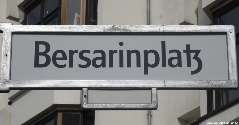
As far as I can see from threads like these, the German digraphs ck, ch, sch, and tz used to be set tighter than other letter combinations – sometimes even ligated (as in this example). As with the long s, this is an archaic practice and should only be used in historical typefaces. So my question would be, should these forms, let’s say the tz ligature, be implemented within hlig, or some other feature perhaps?
I guess you could add them all as liga. I wonder whether the context of a blackletter typeface would make it advisable to abandon hlig altogether and only use liga.
1 Like
As with the long s, the digraphs are subject to spelling rules and only appear in native German words (excluding stems of compound words naturally). Implementing them as liga would have them not only appear in every occurrence such as loan words and compound words, but also in every language. I guess it is thematically fitting, although not necessarily correct.
If we think really technically, I guess it could be justified to put them in loclDEU (as I have observed in a few fonts previously), and use zero width non-joiners in compound and loan words, but this requires a lot of technical knowledge on the users part to even be remotely applicable – we are talking really advanced users here, so most likely out of the question.
Anyways, thanks for the input. I find these sorts of questions quite interesting.
Deactivating or suppressing ligatures is standard procedure in typography. Sure, not every user can do it, but no matter which solution you come up with, there will be someone who cannot handle it. What is more important is to accommodate (or at least not hinder) the advanced users who want to use the font’s potential, possibly not caring about or transcending the ligature and language rules you mentioned, because he/she wants to use the font in a different context.
Technically, you have two options: either off by default and the user should turn them on where he needs them (dlig or hlig, but the latter is not supported as well as the former), or on by default and the user is expected to disable them where necessary (liga).
(Possibly stating the obvious: Don’t try to make the font outsmart the user, by trying to build in a dictionary. That fails almost certainly and is not the job of a font in the first place.)
1 Like
I’d guess these should always be on for German. Perhaps liga with script/language tags so they’re on only for German? It would work, I’m pretty sure, in InDesign, Word and LibreOffice, but I don’t know how many other apps would support it.
1 Like
(Possibly stating the obvious: Don’t try to make the font outsmart the user, by trying to build in a dictionary. That fails almost certainly and is not the job of a font in the first place.)
Yes that is very true. Just take a look at Dipl.-ing Helzel’s Mars Fraktur. He has included hundreds of lines in calt to accommodate as many words as possible, substituting the round s with a long one.
If we consider for example the rrotunda, it is a different story. This form was exclusively a stylistic choice, and therefore not subject to spelling rules. Appearing after round letters like b, o, p etc. you could easily make contextual substitutions that handles all those use cases.
You could probably debate whether the rrotunda even has a place in unicode at all. The only reason would be as is with the Germandbls, for visual representation where OpenType is not available (think Twitter display names for example).
I would perhaps even go as far as to say that the Germandbls should only be encoded with a unicode point and not be implemented with calt to appear after or in between two capital letters, as this is the job of the software: To figure out which capital letters substitute the small ones when the all caps feature is switched on.
Yes, I agree. Sometimes you have to use features that is poorly supported to incentivise the wider support of said features.
I would not limit the substitutions to German language. Until mid-19th Century, Czech language was printed using Blackletter typefaces. And the typesetters basically followed German rules, they treated longs the same way, they used the same „quotation marks“, they used “ch” ligature etc. So when I imitate historical typesetting of Czech language, I need to set language to Czech (because of hyphenation) and activate historical features.
1 Like
Ah, that’s interesting! You are very much correct, I guess I need to rethink the entire issue.
Update: The new Bradley DJR from David Jonathan Ross, released a few hours ago have the digraphs located in dlig, hlig, and a named ss01. Probably one of the better approaches.
The point about Czech is interesting. I wonder how many languages have similar rules. I tend to think that this kind of thing should be automated as much as possible, since many users will never figure it out on their own. The ch and similar digraphs are historical from our point of view, but in the context of a historical font they are normal–that’s why I’d put them in liga if possible.
But I see the complications.
In traditional Fraktur type the digraphs ⟨ch⟩, ⟨ck⟩, ⟨ſch⟩ and ⟨tz⟩ indeed were (are) commonly available as ligatures. When typesetters used ‘Antiqua’ faces (i.e. non blackletter regular/roman founts), these digraphs also were offered as logotypes (two or more graphemes cast on a single body of type), the individual letters more tightly spaced, but without ligation. I’d argue that the latter case merely is a substitute or Ersatz for what German typography had come to expect from Fraktur.
From a type design perspective, in Fraktur (and, for that matter, any other blackletter, like Textura, Rotunda, Schwabacher, e.a.) ligatures for ⟨ch⟩, ⟨ck⟩ and ⟨tz⟩ do make sense. In the case of ⟨ch⟩ and ⟨ck⟩, the tighter spacing (to the point were both letters touch, hence ligate) better solves the distribution of white space which otherwise, due to the large open counter of ⟨c⟩, would cause a glaring gap in the tight gitter fence rhythm which typically distinguishes textura/blackletter type. The same goes for ⟨tz⟩, with reduced/regularized white space between ⟨t⟩ and ⟨z⟩. In Antiqua (roman) and Grotesk (sans-serif) typefaces, where the base rhythm of vertical stems is less tight, there is no problem of balancing white space to be solved, and so ligatures for ⟨ch⟩, ⟨ck⟩, and ⟨tz⟩ make less sense.
From the perspective of a traditional typesetter though, i.e. someone selecting single pieces of foundry type by hand, logotypes (regardless of the face being ligated or not) make sense, in any case, both in Fraktur, Antiqua and Grotesk, simply because it reduces handling, especially so because the combination ⟨c+h⟩, ⟨c+k⟩ and ⟨t+z⟩ are extremely common in German. Logotypes/ligatures thus were very practical to have. In the era of digital typesetting and OpenType fonts, there is however no such practical need, and so I’d argue that ligatures for ⟨ch⟩, ⟨ck⟩ and ⟨tz⟩ only are required in blackletter.
Then there also is the linguistic perspective. In German the digraphs ⟨ch⟩, ⟨ck⟩ and ⟨tz⟩ represent single phonemes, and may thus be treated as individual ‘letters’. Similar to how ⟨Æ|æ⟩ and ⟨Œ|œ⟩ are orthographically used as separate ‘letters’ in other languages, ⟨ch⟩, ⟨ck⟩ and ⟨tz⟩ are then indispensably required for German, but their application is governed by rules of linguistic morphology (spelling): they may be used only in those case where they represent a single phoneme, i.e. virtually always in German words, but not always so in loan words. The linguistic requirement for ⟨ch⟩, ⟨ck⟩, and ⟨tz⟩, is not limited to German, but, as mentioned before in this thread, in other languages too, which use them to represent single phonemes, such as in Czech, Danish, Dutch, Norwegian, Polish, Swedish, e.a.
When developing OpenType fonts today, in the case of Antiqua and Grotesk, one may forgo ligatures for ⟨ch⟩, ⟨ck⟩, ⟨ſch⟩, and ⟨tz⟩. Unless one would want to offer these as historical alternates, in which case I would put them into the hlig feature and restrict them to loclDEU, loclNDL, &c. When you are developing a blackletter typeface, though, I’d say ligatures for for ⟨ch⟩, ⟨ck⟩, ⟨ſch⟩, and ⟨tz⟩, are indeed very much required, as much as a proper implementation of ⟨ſ⟩ vs ⟨s⟩ is obligatory, their respective application being governed by rules of orthography. As mentioned above in this thread already, proper implementation in fact is all but trivial and very likely not something which can be solved with OpenType features only, due to the fact that OpenType does not handle linguistics and has no access to hyphenation dictionaries.
Gerhard Helzel’s implementation of “ſ-/Ligatur-Automatik” (v.1.9, May 2018), with dictionaries built into OpenType lookups is impressive indeed, but may get unpractical to manage.
Another approach is that by the UniFraktur opensource project and its Maguntia and Cook fonts: http://unifraktur.sourceforge.net/maguntia.html. Their approach indeed lays the burden upon the user to insert Unicode zero-width non-joiner characters (ZWJN) into the text where orthographically applicable.
2 Likes