Hi there,
If you could post some good handwritten examples of Germandbls I would be gratefull ![]()
Thanks,
Michał
Hi there,
If you could post some good handwritten examples of Germandbls I would be gratefull ![]()
Thanks,
Michał
You mean as in a handwritten cursive script?
Not neccesary cursive. Rather informal script fonts. Like these of Laura Worthington:

Not sure if it makes much sense to include the capital ẞ for „handwritten“ typefaces! Because it’s unusual to set them all caps and there are no nouns starting with this letter.
I would agree, then again, it really depends how you intend your typeface to be used. If it’s supposed to be in handwritten style, I personally can only say that, even as a German, I have never written a ẞ in my life, at least not when writing normal text.
In any case, Ulrike Rausch’s fonts come to mind, at least her two newest releases include the ẞ.
Good point! Thank you. ![]()
If you are serious about doing this, consider making entirely different design for all-caps (using contextual alternates, case feature, whatever). Zapfino Extra has small caps font, and your Laura Worthington example also has a separate caps style. My Tabulamore Script does it too, but within the same font using contextual alternates. I have a standalone ẞ in Tabulamore but do not expect it to be ever seen unlike the small caps variant.
Ah, there might be a misunderstanding going on. Are we talking about Germandbls or germandbls? ẞ or ß?
ẞ is the capital form of ß. ß is used a lot, and a font should definitely include this. ẞ was only recently officially introduced to German typography, you could argue that its use is so rare that a font can live without, but if you do include it, of course make it a visually completely distinct form.
The form(s) Toshi chose in his Tabulamore are a great example of how these forms can be distinguished.
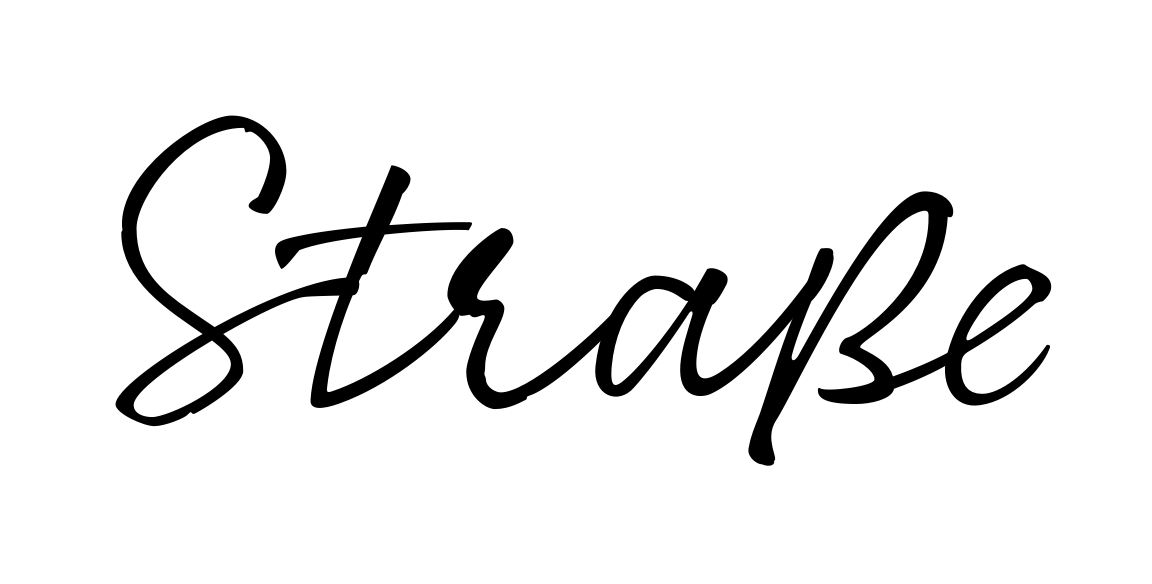
That looks very good. Do you have a capital ẞ as well?
Given the casual look of the font, to a German speaker it might be apparent, but to an English-only speaker it looks too much like a /B. The top needs to be a bit smaller and drawn more in the manner of the Dresden-style of the letter, which is the most common.
An English only speaker really won’t care, and I doubt it will ever be used anyway.
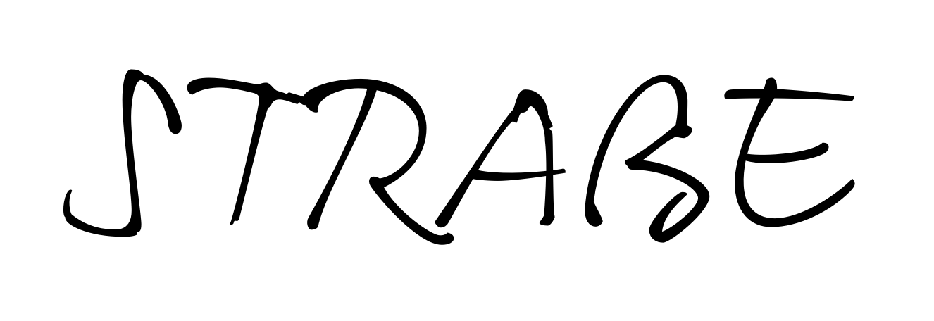
It’s good enough for Apple’s text-in-image recognition ![]()
Although it recognized the letter as a lowercase ß amidst capitals.
It think it’s fine, but I would also prefer a flatter top.
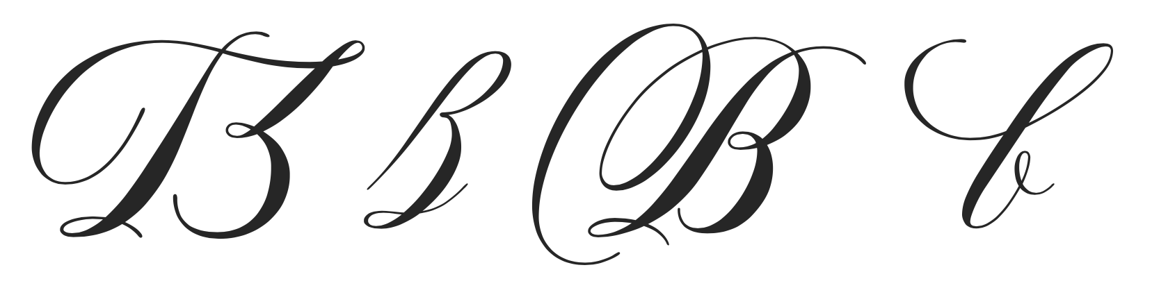
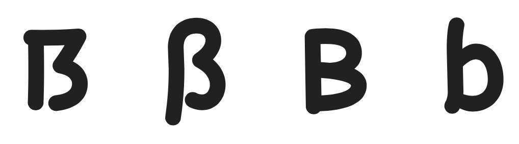
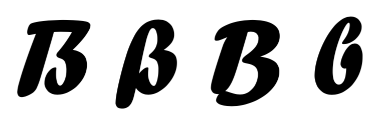
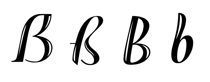
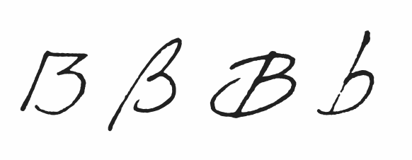
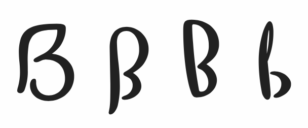
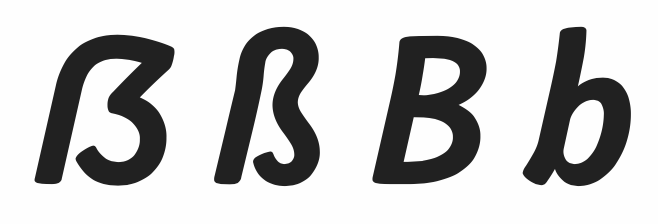
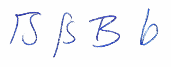
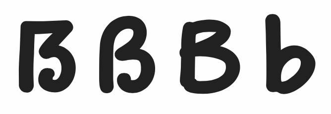
I like these renditions of “ẞ ß B b” (picked randomly from many):
For reference, at LucasFonts we have published a long article about the ẞ with numerous examples.
The preferred look is still contested among type designers. My take on this: