Hey type designers!
Does any one have tricks or techniques when creating the tilde/asciitilde glyph? Is there a way to borrow from other components? It’s been challenging so wondering if someone has a method?
Hey type designers!
Does any one have tricks or techniques when creating the tilde/asciitilde glyph? Is there a way to borrow from other components? It’s been challenging so wondering if someone has a method?
Just look at a lot of tildes in various styles. Things you can pay attention to in order to achieve consistency with your font:
terminal angles (so how stems are usually cut off in your font)
contrast (the tilde is thin-thick-thin, so the diagonal middle is the thick part and the ends thin, this is where the contrast is created)
You can often get away with making one half of the tilde, rotating it 180° and pasting the two shapes together. A point-symmetrical tilde usually works perfectly fine.
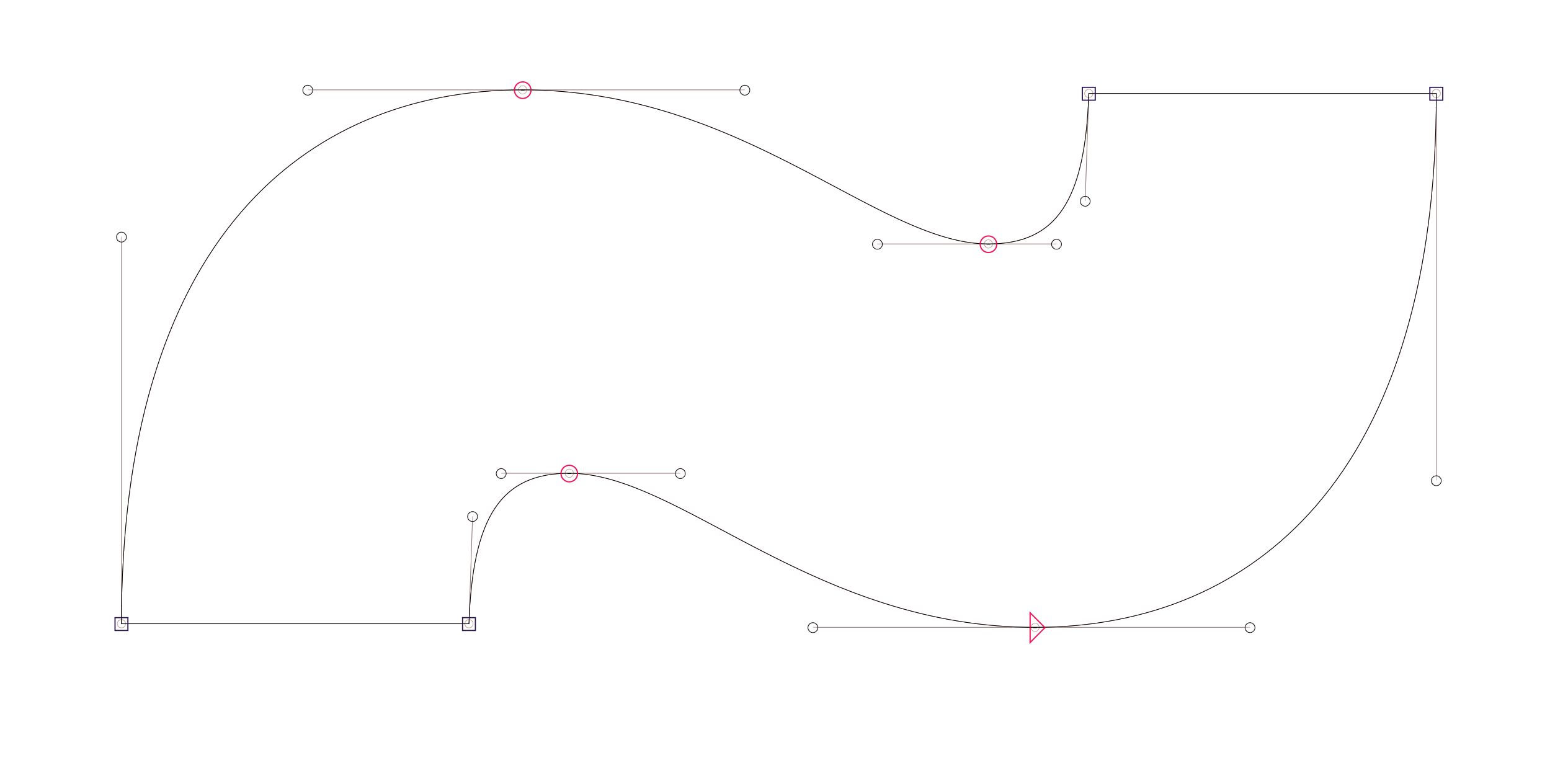
Here’s how I would construct a tildecomb for a low-contrast sans, would work for geometrics grotesque. This can be your base construction and you can adapt it to most other styles from here:
The Fit Curve feature can be useful to keep keep the handles balanced, especially for the first draft.
In this case, the article doesn’t provide a lot of information, but the site ist a very good starting point for any diacritics, I think. Especially when one is not used to these marks ![]()
Amazing! Some great tips there, thank you. Creating a single line, duplicating it as a component reference and flipping it 180 saves lots of time, especially keeping the thin-thick-thin feel balanced and consistent
Another trick to achieve point symmetry (advanced):
This is so elegant! Great idea! I just use the Mask to Master script to copy one half to the foreground (this retains the shape of the “original” half).
Yeah mine is an averaging technique. I use it when both sides are just as good as each other.