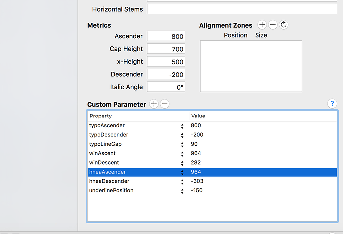
How do I fix some of the longer letters being cropped in word? I have a font who’s Y and G are getting cropped and if I transform them to not have it cropped. other accented capital letters get cropped.
check your winAscent and winDescent
Okay guys, I went through it but I’m just having one of those days where my mind isn’t working at all. Can you tell me what numbers to change exactly? Thank you in advance!
@mekkablue Can you help?
On Windows, some apps use the winas/decend to measure the line height and the cropping. So you need to measure the talked and lowest glyphs and use that measurement as win-metrics values. The problem is that you than get very large line spacing, too.
This has just confused me even more.
Wasn’t there a windows compatibility option somewhere? I read it in an article but I can’t find it.
I had a look at your file.
The uppercase Y and G are getting cropped? I was rather suspecting the lowercase because your winDescent value didn’t reflect their depth. What I did: I deleted all custom parameters in Font Info > Font and Masters, exported as OTF without hinting, and installed in Windows:
Nothing cut off in Word. I cannot reproduce the problem. Did you perhaps export the font with hinting on? Don’t. The drawings do not lend themselves for hinting.
What exactly was confusing in the wording of the tutorial? Perhaps I can improve the text.
Hey I’m sorry, I didn’t mean Uppercase Y and G. It’s the lowercase letters that get cropped. How did the WinDescent value not reflect their depth? I’m sorry, I don’t understand. Aren’t those values same for all letters, as seen in Font info? And no, I did not export it with hinting. Almost all my fonts seem to have the same issue. I tried doing what you mentioned. Deleted all the custom parameters. It still is being cropped. I’ll send you the .otf file that I exported and maybe you can get a better idea then.
How did you export?
The OTF you sent me has hints. Make sure you have no Hinting in the font. (Read the Complex Paths tutorial to find out why.) The Autohint option must be off in File > Export.
Consider the Custom Parameter Autohinting in Font Info > Instances and set it to off. The parameter overrides the export dialog setting.
Your winDescent does not encompass the descenders of g and y, which is why they can be cut off under certain circumstances. The winDescent value in your file was approximately 280, but g and y in your font go way below -300.
You can visualize your vertical metrics with Window > Plugin Manager > ShowVerticalMetrics.
Yes. The problem is that the values are not chosen in a manner that they fit all letters in your font. The j is also cut off a little, by the way. Your winDescent value is approx 280, but j, g and y reach below -300. If you want to avoid cropping in those letters, you need a winDescent value that is at least as big as the descenders of the letters.
So you can either:
- redraw the letters to not go as far as your winDescent values. In your case the lowest node of j, g and y should not go below -280.
- Or you measure the lowest point of your letters, and set your winDescent value to at least that number. In the case of j, g and y, you can see the y is the lowest-reaching letter, and the lowest point in the y is at approximately -390. So you would set you winDescent value to -390.
Hey,
Thank you so much.
Really dumb question coming your way. How do I measure the winDescent values? How did you figure its 280 and what it should be? How do I measure the lowest point?
Many ways.
- Go into the glyph and select the lowest node, then read the y coordinate in the grey info box.
- Use a plug-in like ShowTopsAndBottoms (also in the Window > Plugin Manager).
- Use a script to measure your glyphs, like Test > Report highest and lowest glyphs from my script repository (installation instructions in the readme on that page).
