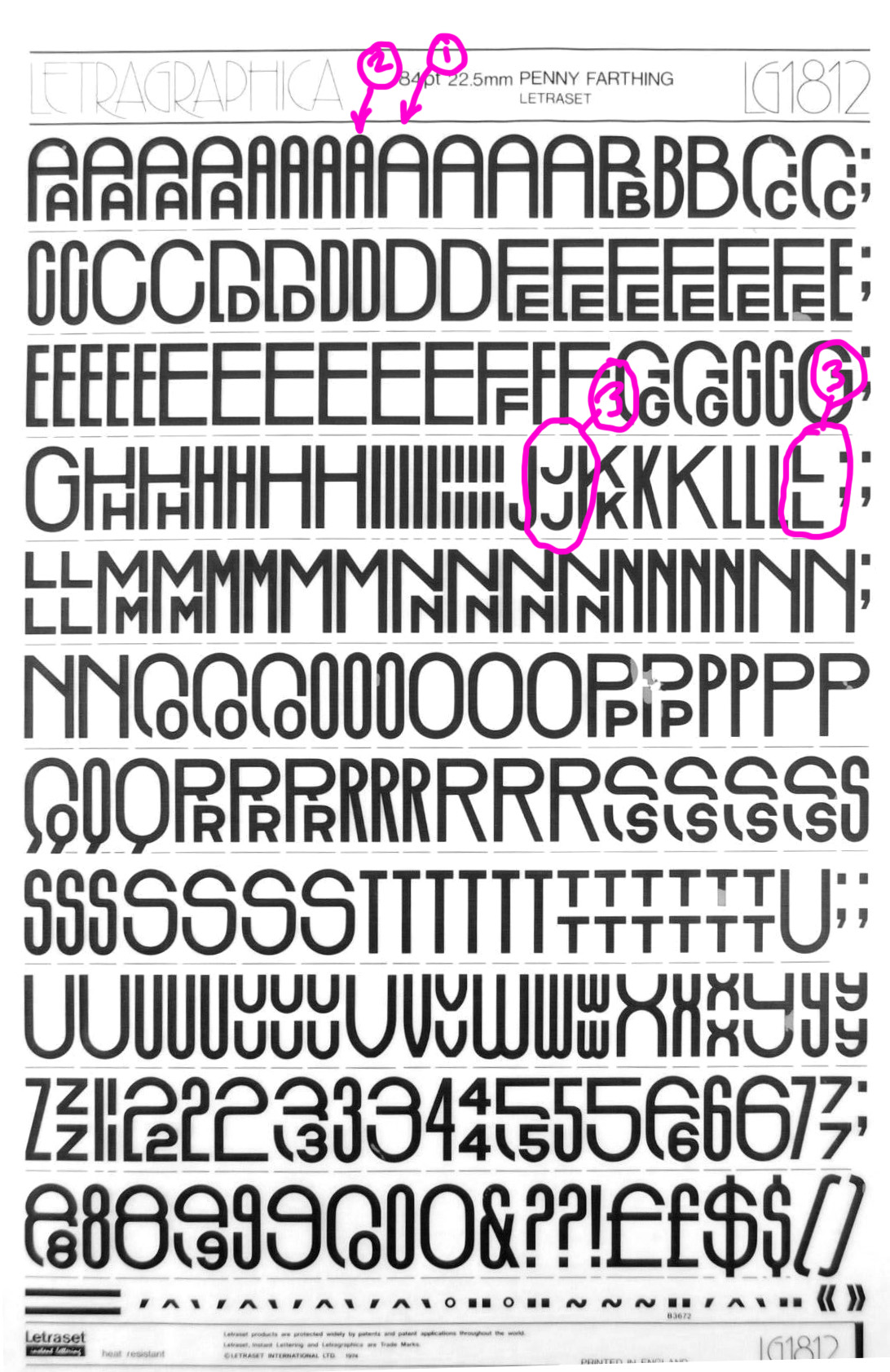
I’m scratching my head as to how this kind of font might be programmed. Of course you could create every possible combo as a ligature, but that seems untidy. The necessary functions would be a kind of “If-then” syntax, I’d imagine. So, one-letter words would only use versions 1 or 2 (randomly or alternately), two-letter words would use two version 1 or 2 letters OR two stacked letters, as at 3. Three-or-more-letter words would use a combo of the above, but never have a space at the end or beginning - ie, always either start or end on version 1 or 2, or a version 3 pair one above the other (never just a top or a bottom letter with a space above or below). Init, fina, isol and medi don’t really cover all the options, as we could possibly have types 1, 2 or 3 in any of those positions - all that maters is that they fit together and don’t leave a space. And randomise nicely. Any ideas gratefully received.
A further wrinkle might be to add in/out anchors — as in Arabic where the baseline goes up or down — so you don’t need both high and low positioned versions of the half-height letters, just one set which positions high or low depending on where they need to be.
This is similar to an alternative method of creating ligatures that (I’d imagine) is possible, but I’ve never used. Instead of drawing each 2-letter combo, you’d draw just the single ‘combining’ or ‘connecting’ version, then somehow add a list of which letters (and only those letters) that specific version should connect to.
1 vs. 2: Isn’t that better as a stylistic set, so the user can decide?
3: Contextual alternates for creating pseudo-ligatures. tThat way you can combine any top letter with and bottom letter. I would use the liga feature for that, because they will appear as ligatures to the user. And you can make the context pretty complex, e.g. make sure that not all glyphs stack like this but at least one or two full-height letters are left before two stacked letters appear.
Hi Rainer - Stylistic sets would be a nice option, though I was thinking that it would be more fun if it was automatic.
.calt looks like the way to go.
How does one make sure one or two full height letters appear first? BTW, this is not a requirement - you could start on two stacked small letters, for example, and two-letter words like IN or AT may even look better that way - the only requirement is that you don’t have one lone stacked letter (either top or bottom) at the beginning or end, which would not happen with pseudo-ligatures. What is a requirement is that the ‘stacked’ versions and the full-height versions vary throughout - ie we don’t just get stacked ligatures, but a mix of stacked ligatures and full-height letters.
How does it work if the same letter string can be divided different ways into different ligature pairs? Does the first ligature possibility in the letter string get preference, or the first ligature possibility in the substitution code?
Thanks for your help - I’d actually forgotten about .calt since I used it for randomising a ‘hand-made’ style font a few years ago.