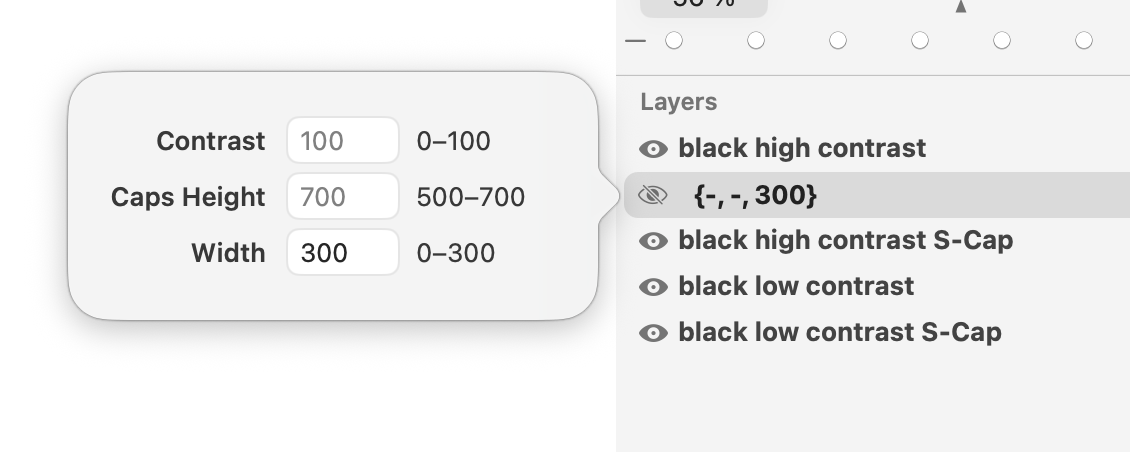
I’ve been just playing around to see if I can bring some interesting topics to with LTTR/INK and TypeJockey workshops for Glyphs 4.
I know, don’t blame me but it could be fun to explore that.
Anyway, smart compontents seems to be quite striaghtforward when working only with one master.
Let’s say 4 intermediate layers for smart component that could be used for all the stems
thick long
thick short
thin long
thin short
But as soon as I’ve add new master and another axis I am getting confused.
Do I need to have again 4 intermediate layers?
thick long
thick short
thin long
thin short
And then do I need to set up additional exis for the smart component layers?
And as soon as another axis is comming I’ve got lost.
In the Axes sidebar (third tab in the left sidebar in an Edit View tab), click the plus button in located the the bottom left. This creates a glyph axis (what used to be a Smart Property). Give it a descriptive name (will not be exported) and set a default coordinate value. This default coordinate is where master layers of the glyph are located. You can edit or delete a glyph axis by right-clicking it or clicking the info icon that appears when the mouse pointer moves over the axis in the sidebar.
Next, create an Intermediate layer in the Layers palette. Give this layer a different coordinate value for the newly created glyph axis. Adapt the layer content as needed. Now, you can use the slider in the Axes sidebar to smoothly interpolate along the axis. It works like using Intermediate layers with font axes.
Assuming the drawing on the master layer is thin and short, you just need two Intermediate layers: one for thick and one for long.
Now, say, you add a Weight axis to the font and in addition to the Regular master there is a Bold master. Then, you just need an Intermediate layer on the Regular layer.
All of this is the minimal setup. It works, but you have more control over the outlines by adding an additional Intermediate layer that defines thick and long. And you get even better results when also adding Intermediate layers to the Bold master.
Technically you only need one extra layer per axis (e.g. one Bold and one Condensed). But to make it look good you probably need the Bold Condensed, too.
You could have an Intermediate layer that serves regular font axis interpolation (as was the only use of Intermediate layers in Glyphs 3) and also serves glyph axis interpolation in a Smart Glyph (like Smart Properties on an Intermediate layer in Glyphs 3).
The glyph axes are extending the space for that glyph. Then all new layers behave the same for font and glyph axes. There is a small shortcut that you don’t need to specify the font axes coordinates if they match the attached master. You can check the setup with Window > Master Overview.
 but it could be fun to explore that.