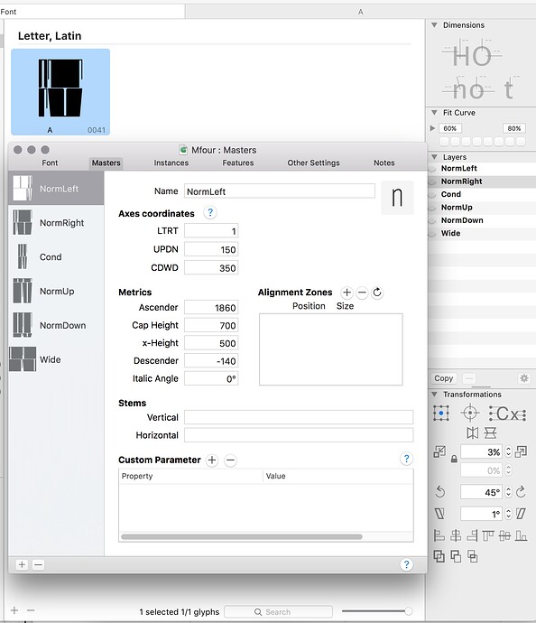
One-glyph file, changing the shape to fit the page-size. Wider-taller — dimension One.
The Two is the vertical centerline in the shape — it moves left-right. The Three is movement of horizontal one to the up and down.
Six masters for all of them is enough, isn’t it?
Minimum number of masters = number of axis plus one. So four in your case:
B
|   C
|  /
| /
|/
A--------D
Any extra masters must be in a rectangular arrangement with the masters, so maximum 8 masters:
    E--------H
   /|       /|
  / |      / |
 /  |     /  |
B---|----F   |
|   C--------G
|  /     |  /
| /      | /
|/       |/
A--------D
Only add the masters you need. Test first if it works without, only add if necessary. If only a few glyphs need it, consider a Virtual Master. See the Variable Font tutorial for details.
Awesome three-dimensional typing! ![]()
Thank You! Rainer! (Still impressed by Your Talk in Paratype))
Yes, I’ve seen the tutorials and these schemes too!
But I’m confused))) What the numbers do I have to put. And I still do not understand how it could work if none of four masters contain the all points I need. I attach the pic there is the all points I need, and each of them I set as a master.
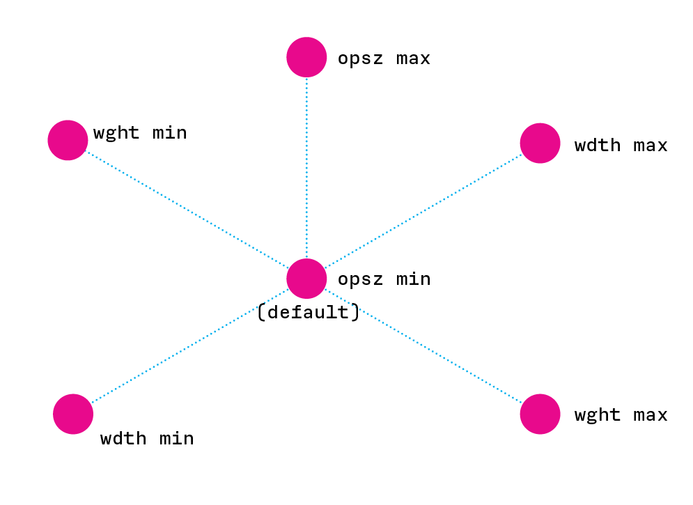
3 axes? 7 masters.
Then the magic cube happens… 7 masters if the default is amidst the three axes, that is the power and Ui of variables?
Use Design space to interpolate to the middle instance 0f your 3 axes, make that 7th master the default, make the other 6 the extremes of 3 axes.
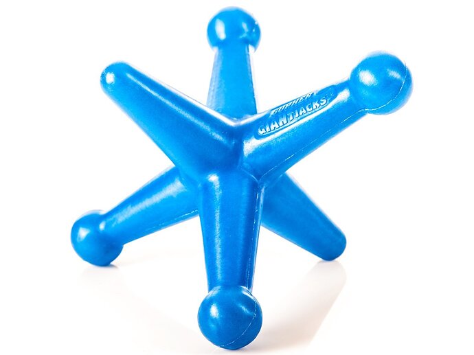
Cube.
6 masters is for when one axis is 1/2 an axis,
Meekkablue: why do you want want the middle of the design space to be found with sliders, instead of being the default?
Both strategies are possible, both have advantages and disadvantages. I discussed them in the Variable Font tutorial.
Thanks to the Font Bureau!
Thanks to everyone
I saw I didn’t react directly to this back then.
You can do it either way. In the illustrations I extended the axes only in one direction, to keep it simple.
Your question assumes that the (perceived) default is in the middle of the design space, which may not necessarily be the case for many designs. Think of an italic axis, or a width axis even.
Not doing a middle master has advantages too, I give you two:
- Adobe menu ordering. Granted, Adobe’s implementation is buggy, but I am afraid that is how most paying customers are confronted with OTVar fonts. Adobe orders the default at the top of the font style menu, and everything else in the correct order below it. So if a type designer wants to avoid a bunch of support mails, they will pick a default that should be at the beginning of the menu one way or the other. Typically the light condensed upright version of the font.
- Webfont size. Having a master in the middle will typically result in a larger file. In webfonts, that advantage usually outweighs the imprecisions through interpolation.
We’re not in July anymore, that’s for sure;)
I understand, and I don’t disagree that there are multiple possible models for the design space of vfs. I do believe, however, that developers need to recognize and select the best model for the typography that are capturing. So, I do not think, and am not suggesting you meant this, you can do it either way in a particular case. One way won’t work as well as the other. I have practiced both ways since Decovar in the corner, and Amstelvar in the middle.
So, an opsz axes from 8 to 144, is not going to work for most fonts with 8 pt or 144 pt in the corner. Neither is a wght axes able to go from a thin corner to a ultra end, without at least one other master to control contrast. And I see wdth axes that need intermediates to control the difference between the expansion and condensation, of round, vs square, vs diagonal shapes.
How far are your axes going and what’s going on?.. vfs have a lot of ways that axes’ variations can change, e.g. uninterrupted interpolation, intermediates, avar, and rvrn. and type design has layers of variation ranging in granularity from the whole font, thru character groups, to specific glyphs and ending in specific parts of glyphs.
On your last two points, what an Adobe app does with a vfs default, if its the middle, is what it has showed in the menu forever, regular, so I can’t see how that’s an issue. For web users and file size, if the requirements of the typography offered in the variable font needs no middle, then it shouldn’t be there taking up space in the first place. If some kind of file size issue steps into the picture, and the font is too big because of the additional master in the middle, and that is part of the design, then the user would want to pick another font, perhaps;)
I’m reviving this topic ![]()
If those 3 axes are weight (Thin <—> Black), width (Narrow <—> Wide) and opsz (Small <—> Large): in what weight would the extremes of width and opsz have to be drawn?
Hey Artur, great question. My goal, when including opsz in a family, is to remove the user’s need to change from one wght to another, in order to achieve a smooth progression of weights through a range of sizes.
For years, I’ve been seeing type specs where the style changes to wght 500 at smaller sizes, and or to wght 300 at larger sizes in order to achieve what metal type did, which was to provide a “regular” that “scaled” down without become light, and “scaled” up without becoming bold.
So Amstelvar and Roboto flex, and any other fonts we’ll make including text sizes and smaller, where the default is in the 10-16 pt range, will be made default opsz wght 400 first, then opsz min wght 400, and opsz max wght 400. Then the width axis’ min and max, at wght 400, depends on how much they change in width, as we know, with narrower styles losing a little wght, and wider style gaining. But there, if the goal is the same as in opsz, then all the widths of any wght at each size, are to appear the same weight.
Then what matters is how far in values vs. changes to metrics from eg. opsz14, wght400, wdth100, that one goes along opsz, wght or wdth, determines what happens next to the amounts of weight and width added to or removed from the default, depending on what the size will allow. So, e.g. to make a “Thin”, I.e. wght 100, you can remove a lot more weight from the regular at 144pt, than you can remove from the 14pt regular’s wght100.
So in essence if you’ve already done the extremes you just have to pin the values on them while watching carefully to make sure the resulting design space does what you want for users.


