Is there a way to restrict or disable the letter/word spacing within a text box when a word is hyphenated?
Can you give an example (mock-up picture perhaps) of what you want to do?
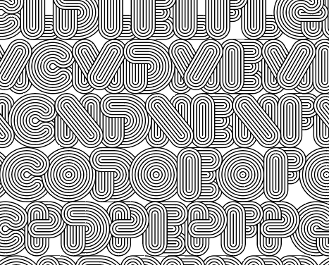
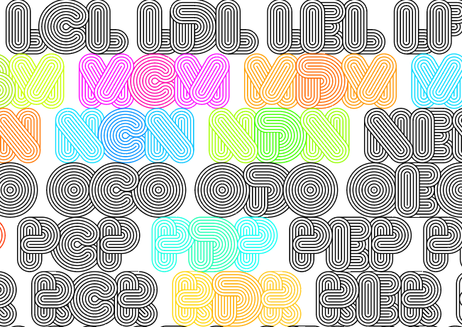
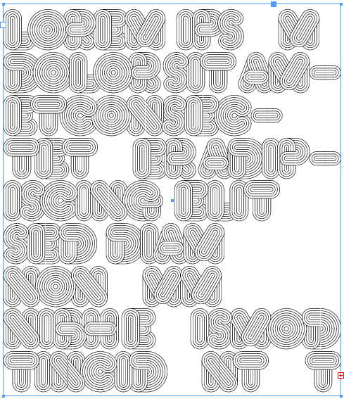
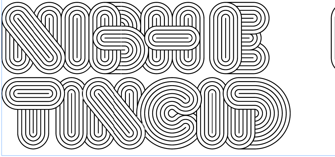
yes, i’m still fascinated and/or obsessed with this typeface. I’m positive there is a more elegant and easier way to do it, but whatever i’ve figured out has gotten me this far - around 900 individual glyph halves at this point…
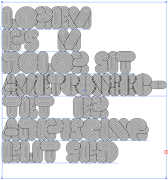
in the last screen shot, when this is set within a text box and a word break occurs, the width of the hyphen adjusts the word and letter spacing to accommodate the hyphen. I’ve tried setting #entry and #exit anchors, but since i’m not using components they don’t work.
thank you for being so available, knowledgeable and generous with your time for all of these forum posts. It’s remarkable, impressive and refreshing. i really love your app.
again, thank you in advance,
Have you checked the letter spacing options.
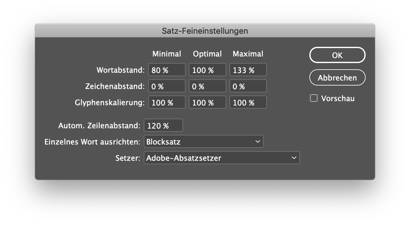
The second line (Zeichenabstand == letter spacing) should be all 0%.
If the setting is correct, then you found a bug in Indesign.
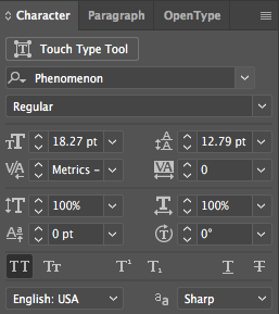
i’ve been setting/testing everything in illustrator - these are the character palette settings:
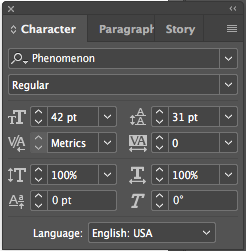
but, i just tried it in inDesign and it works!
(inDesign character palette settings:)
does this mean there’s a bug in Illustrator?
- What about your paragraph settings?
- In AI, the field value is not fully visible, it says “Metrics –” and then probably something else. Can you verify?
- And have you considered a color font solution? You can have a solid white background. It would only overlap the other way around I’m afraid. But that could be solved with typesetting.
-
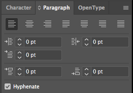
Here are the paragraph settings:
-
In the AI field, the value says “Metrics - Roman Only”. The other options are “Auto”, which doesn’t effect the appearance, and “Optical”, which definitely effects the appearance, but in the wrong way.
-
I did think about a color font solution, because I think that would allow for different tracking values, but as I was thinking about it, I got hung up on how to have some of the ‘strokes’ on different ‘layers’ so that individual pieces of each letter could overlap the surrounding letters in different ways.
As I’ve been looking through the forums, both here and on typedrawers, and reading different posts (including ‘/afdko/OpenTypeFeatureFileSpecification’ you put up @mekkablue), i keep finding myself wondering if there is a line of code i could put somewhere that is something like ‘kern=0’, or ‘trak disabled’ or ‘advance width inactive’, but i really don’t understand enough about any of these to do something like that. I’m wondering if there is some way to trick applications into only allowing zero as the tracking value, or maybe anchors every sidebearing…(How do non-Latin typefaces handle this?)
The only other thing I can think of doing is just having a big ‘read me’ in the font file folder, so whomever wanted to use this face would know that there are things they aren’t able to do with it.
could a ‘nonspacing’ value work somewhere in this?
You can’t influence what the app is doing with your glyphs. If the app decides to mess things up, there is nothing you can do.