Ideas about a better vertical mode of the Edit view

I’ve been trying to come up with a scripting solution for designers to comfortably design Mongolian-script fonts:

https://github.com/lianghai/mongolian/tree/master/glyphs-app/scripting

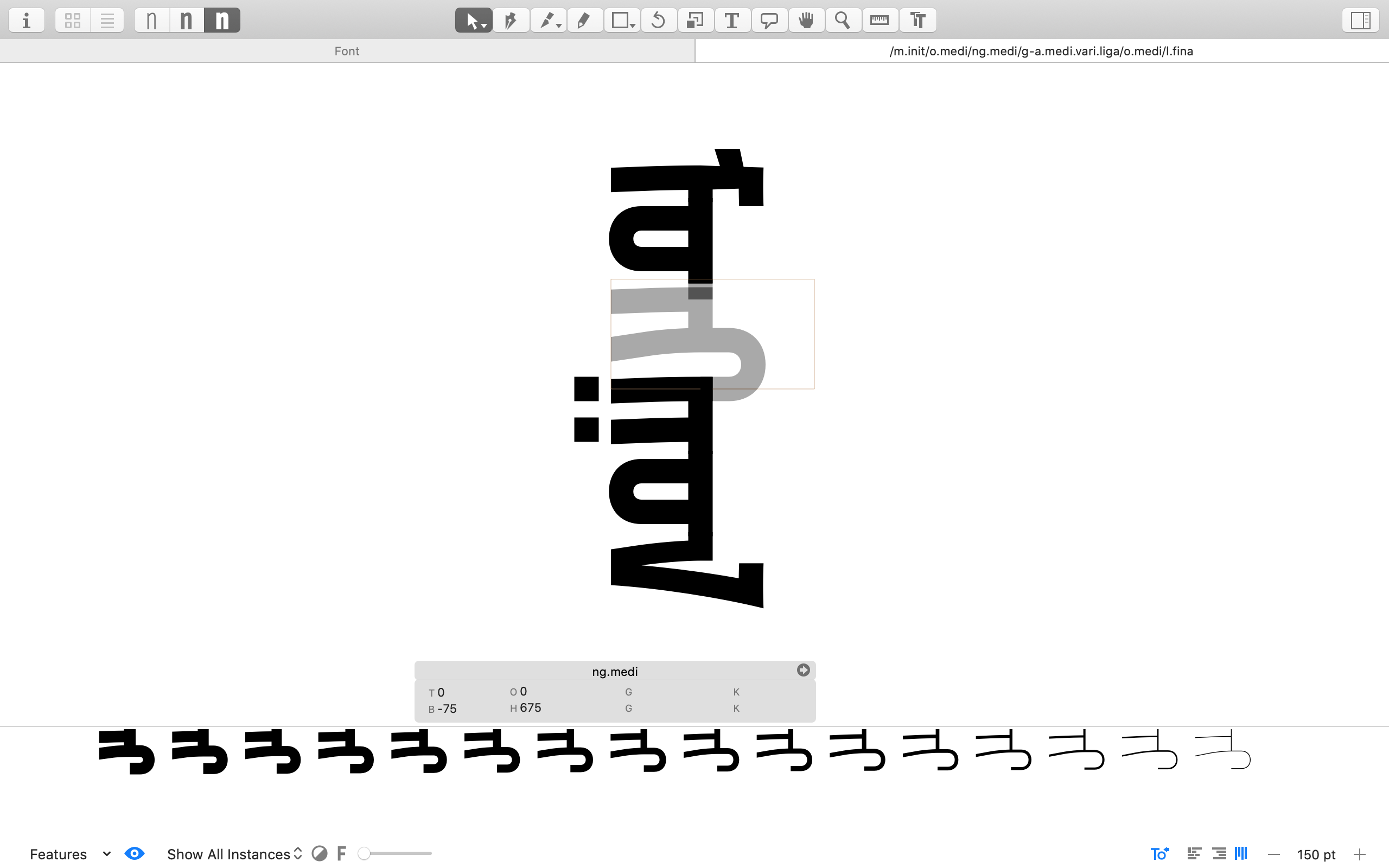
Currently the rotate_to_vertical.py and rotate_to_horizontal.py scripts allows a user to rotate an existing font drawn in the LTR way to TTB, and rotate back to LTR. The export_instances.py script rotates a TTB font to LTR in the background for exporting. (The following screenshot is taken in Tengis’ work-in-progress project.)

However, many architectural limitations of Glyphs make it painful and sometimes a long shot to find reliable workarounds.

Therefore here I’m writing some ideas down. I understand the improvement for Mongolian scripts won’t be a development priority (3type and Tengis already have enough contact with the Glyphs team—I’m not really here to add pressure), but I hope such analyses provide some valuable review of Glyphs (and other editors)’s architecture nonetheless.

The Edit view’s current vertical mode

  • Totally designed for upright glyphs in vertical text.
    • Without rotation, all the vertical metrics (ascender, cap height, x-height descender) are useless and only cause confusion. Plus there’s even the obscure vertical origin.
    • I had to zero the three above-baseline vertical metrics to avoid showing them in the Edit view, and set descender to the original ascender - descender to keep the sum height intact, so glyph thumbnails and the preview panel is not messed up. The four sides of the metric square you see in the screenshot above are actually: x = 0, horizontal width, y = 0, vertical width.
    • It is possible for me to write a reporter plugin that rotates glyphs to sideways in the Edit view’s vertical mode while not messing up with other functions like outline editing?
  • Line-to-line progression direction is determined by heuristics on the glyphs’ script value, and script values like “mongolian” and “han” lock the direction to either LTRTTB or RTLTTB.
    • This is okayish but probably not a necessary magic behavior.
    • Even the constants LTRTTB and RTLTTB’s names seem to suggest some architectural confusion, as the line-to-line progression actually has nothing to do with the horizontal direction LTR/RTL. Fyi, CSS writing-mode values vertical-rl and vertical-lr are a good example of a proper abstraction from all the mathematically possible inline direction and line-to-line progression.

Proposals

  • The vertical Edit view should be built in a way that it assumes sideways glyphs by default. Treat upright CJK glyphs and emojis as special case.
    • This will align with today’s mainstream layout engines’ default behavior.
  • GSGlyphInfo should have a new property specifying how a glyph should be by default placed in a vertical Edit view.
    • The minimal version would be a boolean for sideways/upright, like what UAX #50’s U vs R values do.
    • Considering that even UAX #50 is facing a potential need for extending (because certain historical RTL scripts are apparently expected to be set TTB instead of BTT, therefore their glyphs need to be rotated 90° anti-clockwise instead of the usual 90° clockwise), it’s probably better for this property to be prepared for all the four orientations.
    • The default values can be derived from UAX #50’s data.
  • The Edit view can have two toggle buttons for inline text direction (LTR vs RTL) and vertical mode (off, vertical-lr, vertical-rl).
    • In a vertical mode, LTR becomes TTB, and RTL becomes BTT.
    • Glyph rotation is done on a glyph-by-glyph basis, based on each glyph’s new property for its expected rotation in vertical mode.

There are some additional issues I’ve run into when dealing with GSFont’s vertical kerning data. Will open a separate thread.

1 Like

Thank you for your valuable input. We are discussing it internally.

Thanks for the detailed description.

Here some notes from me:
Some of the issues come from the fact that the visual writing direction is top to bottom but the glyphs in the final font need to be horizontal LTR rotated glyphs. There are several steps in that process where the vertical metrics are messed up (and I probably guilty of some of them).

From my point of view, I would draw as proper vertical glyphs and rotate them on export. To do it otherwise I would need to adjust about every tool in Glyphs to be aware of the rotated glyphs.

So there are two places that need the most fixing: The display and handling of the vertical metrics and the export.

The LTRTTB and RTLTTB are maybe a bit confusing. The LTR/RTL means the line progression, not the actual writing direction. So vertical-rl does make a bit more sense. So Mongolian visually is vertical-to-left? As I said UI wise, I would (mostly) treat it like that and deal with the (faulty) implementation in layout engines only on export (and maybe even hard code the rotation so that the user doesn’t need to deal with it (maybe with a switch to disable that if needed). But when I think about it, it might not be such a good idea. In a future version of Glyphs, there is a writing direction property per glyph defined in the GlyphData. That supports ‘LTR’, ‘RTL’, ‘netral’, VerticalToLeft’ and ‘VerticalToRight’. It needs another value: ‘VerticalToLeftRotated’. Can you elaborate on the historic vertical RTL script?

That future version of Glyphs also defines vertical metrics per script. So what metrics would you think are useful for Mongolian (xHeight is not that useful I suppose).

The script rotates the glyphs hanging on the baseline. All other vertical scripts are drawn down from the ascender. That is what the vertOrigin is used for. It defaults to the ascender but can be changed for glyphs that are used for horizontal and vertical (e.g.: common in Japan) and where you can’t just move the outlines. for Mongolian that should always kept at the default.

I deal with that when we implement a scrip that actually needs that.

Some of the issues come from the fact that the visual writing direction is top to bottom but the glyphs in the final font need to be horizontal LTR rotated glyphs.

And that’s the result of the layout engine convention that glyphs in vertical text are rotated to sideways by default (although TrueType/OpenType’s low-level vertical text support is based on some very different mindset).

There are several steps in that process where the vertical metrics are messed up (and I probably guilty of some of them).

Not sure what you were referring to here, but I don’t think Glyphs has “messed up” any vertical metrics. It just plainly doesn’t allow sideways glyphs in the vertical Edit view. All the metrics in the vertical Edit view are all for upright glyphs and have nothing to do with Mongolian (or, really, any need for previewing sideways vertical text—eg, Latin book spines or vertical table heads).

From my point of view, I would draw as proper vertical glyphs and rotate them on export. To do it otherwise I would need to adjust about every tool in Glyphs to be aware of the rotated glyphs.

Fair point. Introducing rotation into the Edit view would certainly complicate things. The only disadvantage I can think of now is that, without rotation, CJK (and Mongolian) type designers won’t be able to directly manipulate sideways Latin, etc, glyphs in vertical lines like how those glyphs are supposed to be typeset in vertical texts.

So Mongolian visually is vertical-to-left?

Yes, Mongolian is conventionally written in vertical-l(eft-to-)r(ight) (LTRTTB), which is also what the Edit view’s vertical mode currently enforces for script = "mongolian" glyphs.

As I said UI wise, I would (mostly) treat it like that and deal with the (faulty) implementation in layout engines …

Note the layout engines’ behavior/implementation is really not faulty. This current mainstream behavior ensures texts in any script have a reasonable appearance in vertical lines, and CJK are opted in for staying upright. Otherwise the glyph-by-glyph stacking would by default deliver useless rendering. Even if one analyzes cases like English book spines as the whole text block being rotated instead of being in a vertical text mode, layout engines’ “rotating by default” behavior is still vert important for ensuring any possible scripts can occur in vertical CJK text with a reasonable appearance.

… only on export (and maybe even hard code the rotation so that the user doesn’t need to deal with it (maybe with a switch to disable that if needed).

I would prefer an opt-in solution, such as a built-in filter for normalizing glyphs designed in the upright-in-vertical way to their rotated-in-vertical forms.

But when I think about it, it might not be such a good idea. In a future version of Glyphs, there is a writing direction property per glyph defined in the GlyphData. That supports ‘LTR’, ‘RTL’, ‘netral’, …

“‘LTR’, ‘RTL’, ‘netral’”—Mmm, getting into the bidi business sounds concerning…

It needs another value: ‘VerticalToLeftRotated’. Can you elaborate on the historic vertical RTL script?

Did you mean “VerticalToRightRotated” actually? I really suggest decoupling the line-to-line progression direction (top-to-bottom for horizontal lines, left-to-right or right-to-left for vertical lines) from the inline text flowing direction (LTR, RTL, TTB…), as the former is a text layout level thing (and is often flexible, eg, many mainland China users don’t find vertical-lr wrong for Chinese text) while the latter is more an intrinsic property of scripts.

The following RTL scripts are known to require TTB layout (and the RTL vs TTB requirement breaks the current architecture of layout engines):

  • Old Sogdian (see section 4.5, Vertical text, in document L2/16-312)
  • Sogdian (see section 4.10, Vertical text, in L2/16-371)
  • Chorasmian (see section 8, Vertical text, in L2/18-164)
  • and also Old Uyghur (see section 4.2, Directionality, in L2/20-003), which is the Mongolian script’s direct ancestor. It is still in the process of being encoded in the Unicode Standard.

That future version of Glyphs also defines vertical metrics per script. So what metrics would you think are useful for Mongolian (xHeight is not that useful I suppose).

I would need to first understand what are the intentions of those “vertical metrics”.

The conventional vertical metrics (in terms of horizontal lines) are pretty useful for Mongolian, as it does involve ascenders, descenders, and has a main body area, and inter-script alignment and scaling with Latin, Cyrillic, and Han is important for Mongolian. It’s just its “vertical metrics” are only vertical in the horizontal fallback rendering, while are horizontal in vertical lines. Using a term like “orthogonal (to line) metrics” may be clearer.

The script rotates the glyphs hanging on the baseline. All other vertical scripts are drawn down from the ascender. That is what the vertOrigin is used for. It defaults to the ascender but can be changed for glyphs that are used for horizontal and vertical (e.g.: common in Japan) and where you can’t just move the outlines. for Mongolian that should always kept at the default.

Yeah I understand this. I complained the vertical origin only because it makes the already confusing metrics panel in the vertical Edit view even more obscure to most users. Plus I need to zero all the vertical metrics (the ones for horizontal lines) so they don’t show in the vertical Edit view for a Mongolian designer.

Because the horizontal baseline, ascender, descender, etc, don’t make any sense for a script like Mongolian that has a real vertical baseline (the CJK vertical baseline is a different beast), currently what I’m trying to achieve with the macro scripts is that Mongolian glyphs should use y = 0 as the original point (instead of y = ascender), and design in the y < 0 space. While x = o is used as the vertical baseline (and will be aligned to the y = 0 horizontal baseline when the font is rotated and exported).

That is only partially true. It is true for sideways latin and Mongolian (and maybe some more). But all vertical ideographs are not rotated. For the latin part, you don’t to edit it in vertical mode, if it looks good horizontally, it will work just as well vertical mode. Older fonts from Adobe include rotated latin glyphs but that is not recommended any more. So the rotation for vertical is manly intended and useful for Latin because there is a set of glyphs that are meant and mostly used for horizontal that can be reused. Using the same model for a pure vertical script is a hack not a feature. I suppose it early Mongolian (before the support for vertical setting in apps) fonts where made like this to be set horizontally LTR and then rotate the whole text box. When apps (browsers) started to implement vertical setting, they just made it work with the existing fonts instead of waiting for properly setup font.

That it’s what I meant with the mess. But that is fixed in the next version.

When I said metrics, I mean some lines that are parallel to the baseline. Soon the used can define whatever line he needs. And if you do so, you don’t get the Latin line. We are trying to define default metrics for each script. If you have suggestions. For example two lines to define the center line. And some lines at default “tooth” (what are those strokes that stick to the left called) length. Those are more like global guides to help the designer as they are not going into the final font.

Again, that is one of the messes I mentioned above. That is fixed.

That is only partially true. It is true for sideways latin and Mongolian (and maybe some more). But all vertical ideographs are not rotated.

I did emphasize the importance of having the default behavior of rotating then opt in upright characters. When it comes to text layout for the multi-script world, it’s a more useful and robust strategy to default to rotation in vertical lines.

Older fonts from Adobe include rotated latin glyphs but that is not recommended any more.

Those were there exactly because layout engines in early days didn’t have the aforementioned default behavior of rotation (and fonts had to opt in sideways glyphs for vertical texts). Now the mainstream layout engines are in a better shape.

So the rotation for vertical is manly intended and useful for Latin because there is a set of glyphs that are meant and mostly used for horizontal that can be reused.

As I explained in my last reply, the “rotation by default” behavior is especially helpful being a reasonable fallback for any arbitrary scripts, so text is simply rotated to the vertical orientation and is messed up by stacking glyphs one by one.

This is also extremely important for scripts that are vertical, such as Mongolian. Because this behavior ensures their fallback rendering in horizontal texts is also rotated and readable, instead of broken up to glyphs side by side.

Using the same model for a pure vertical script is a hack not a feature.

See my last paragraph. It’s important to design internationalization architecture with strong focus on reasonable fallback behavior. It’s easy to tell the single desired form, but when things have to get compromised (Latin in vertical lines, and Mongolian in horizontal lines), it matters to be flexible.

And it’s actually very important for Mongolian to be rendered in a readable way in horizontal text, because English, Chinese, Russian, and the Cyrillic Mongolian all have a preference of being horizontal, and it’s impossible for all software UIs to provide vertical UI support. Thus Mongolian texts are and will forever be often displayed horizontally.

So Mongolian glyphs are expected to be rotated when the line direction switches between vertical and horizontal, then it’s the only sensible choice to make the fonts for horizontal text. Otherwise all horizontal layout will need to opt in the rotation behavior for Mongolian fonts in which glyphs are upright, which is not practical at all.

It’s really not just a “hack”. Fonts are just a small part of this whole ecosystem of texts, and they need to be responsible for the whole ecosystem’s considerations.

I suppose it early Mongolian (before the support for vertical setting in apps) fonts where made like this to be set horizontally LTR and then rotate the whole text box. When apps (browsers) started to implement vertical setting, they just made it work with the existing fonts instead of waiting for properly setup font.

No. Many early Mongolian fonts were actually made with upright glyphs, because, 1) early layout engines tended to lack the important “rotation by default” behavior, 2) many designers and developers thought in the CJK way. Now you can these fonts don’t provide any readable rendering in horizontal texts.

I still think the glyphs should be placed in the font as that are intended to be used. Rotating them by default makes it impossible to hint them reliably.

Latin is meant to be written horizontally and so all glyphs and hinting and stuff is tailored for horizontal layout. And in the rare case, were you need it in vertical text, it is rotated. The same logic should be applied to Mongolian.

But as I can’t do anything about that, I stop now.