I have this great Illustrator file set up where each unit on the grid corresponds exactly to the same point in Glyphs … this means that I can draw a letter in Illustrator and copy it into Glyphs so that it is exactly where it needs to be and requires no repositioning.
However, every so often Glyphs will choose to paste the letter onto the descender line rather than the baseline. This is seemingly random. Usually letters that sit entirely on the baseline will work fine and ones with descenders will give me problems, but not always. In the font I’m currently working on I’ve had around a 90% success rate.
However I’ve just added a new width to the font I’m currently working on and all of the upper case letters are being pasted in the wrong place. I’ve tried a thousand things and nothing seems to work.
Is this a known issue? Is there anything I can do to fix it? It’s causing me a lot of extra work. The only solution I’ve found is to set the descender line at zero, but this is obviously not a long-term solution.
There are several options that influence the placement. But the safest is to draw a box in Glyphs that reaches from the descender to the ascender and copy that to Illustrator and place it over your drawing. Then copy both to Glyphs. It will use the box as reference. That way you have full control.
Thanks for getting back so quickly. I’ll try that as a workaround. I’m interested in the different factors that affect placement, mostly because I haven’t yet been able to see a pattern in when the import works normally and when it doesn’t. I’ll keep trying different approaches and tests and hope I can sort something out, but hopefully the box solution will work in the short term.
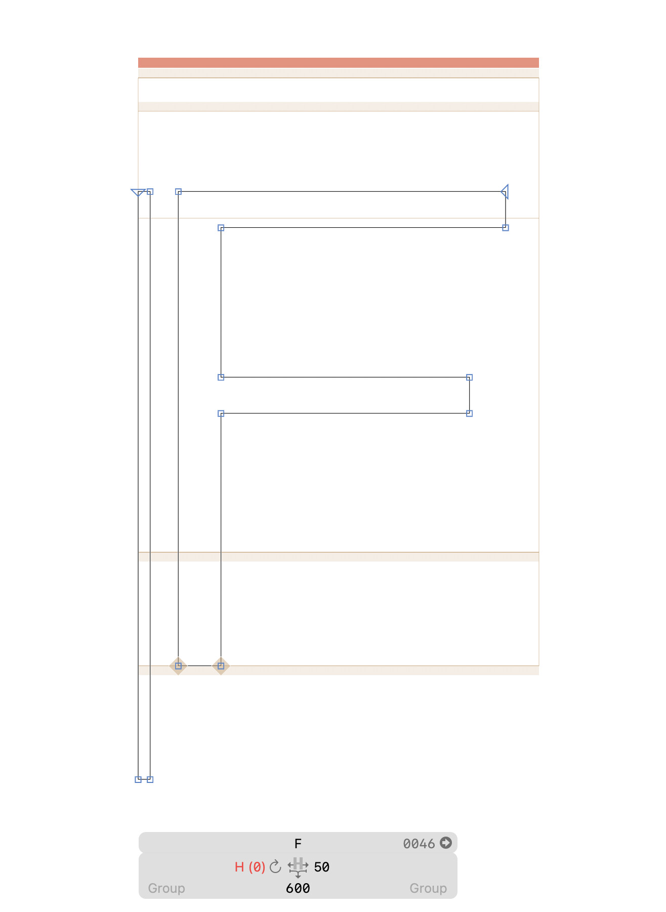
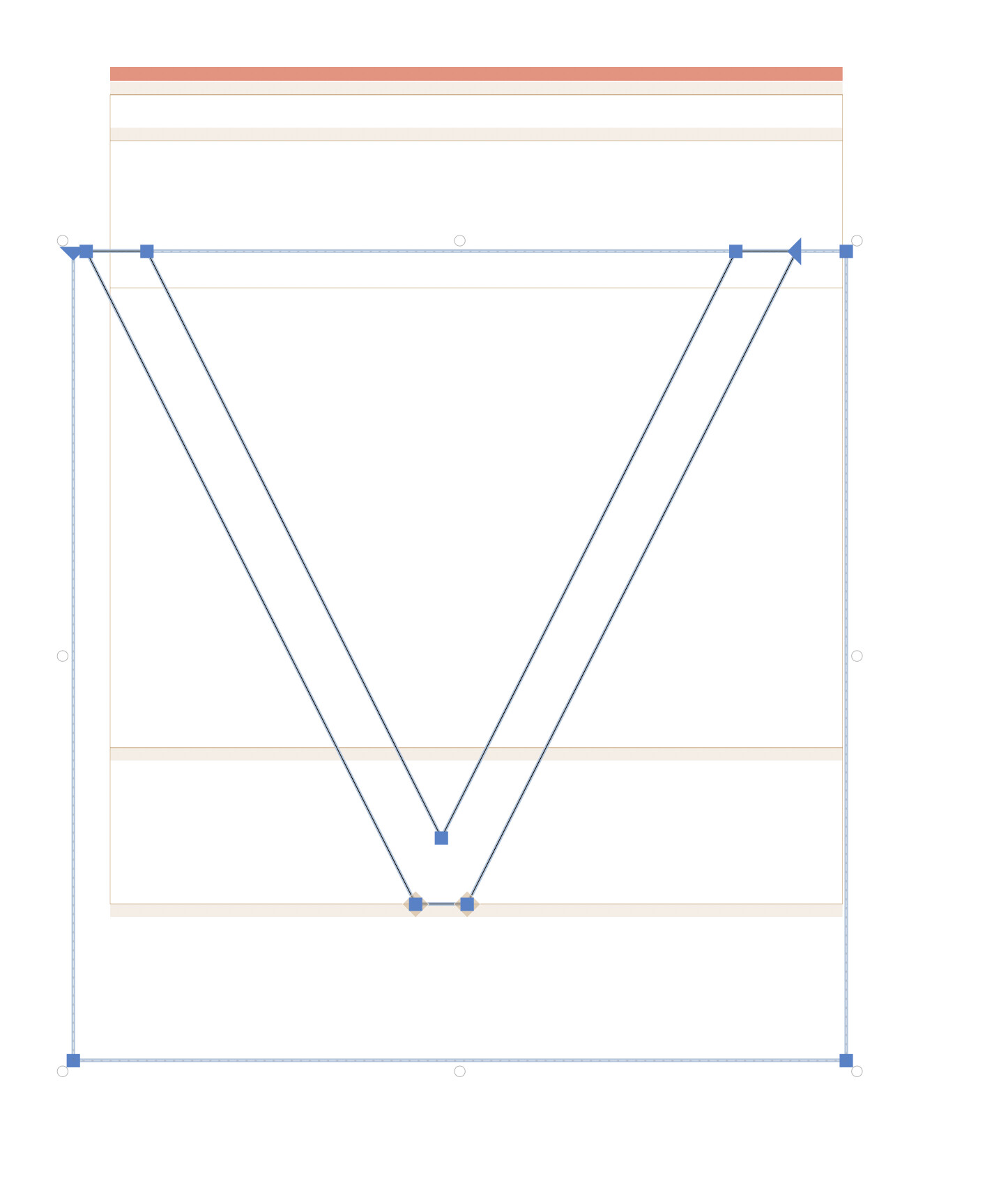
Update: unfortunately the box solution does not work. It merely shifts everything on the baseline down to the descender line, so that the box extends well below the frame of the letter (see screenshot).
I honestly can’t figure out what is going wrong. This is happening to every letter I try to import into the upper case of this weight. Here is a list of things I have tried already:
— Redrawing the letter
— Redrawing the letter in a different Illustrator document
— Re-zeroing the baseline in the Illustrator document
— Copying the letter into Glyphs, repositioning it manually, then copying it back to Illustrator
If anyone has any suggestions how to stop this from happening I would be extremely grateful.
Update: This is not going to make any sense, but … I just adjusted the descender in the master from -170 to -180 and now everything works fine. I then tried -190, -200 etc. and those also work fine. Anything under -170, however, shifts the baseline down to the descender. I don’t know why this is happening – and why it wasn’t happening on the lower case – but I thought I would let you know in case it was of interest.
I’m still extremely curious to know why this is happening, but at least there is now a viable workaround.
I had a look at the code to be sure: When the side of the pasted shape is bigger than 80% of ascender+descender, it will move down to the descender line. Moving the descender lower, increased that threshold just enough to skip the movement.
To get the bounding rect to work, you need to run this in the macro window:
Glyphs.defaults["GSScalePasteToUPM"] = True
But the box needs to be the size of ascender+descender. The easiest is to draw a box like this in Glyphs and copy it to Illustrator. Maybe add some markers for the baseline and cap height to make it easier to position the box in relation to the outlines.
But as Sebastian suggested. You probably should start drawing in Glyphs. It is much faster and more precise.
Thank you so much for looking into this. I’m glad to know there is an explanation (although there are still some oddities: the O, S, and C – basically anything with an overshoot – still move down, no matter how much I adjust the descender line) and that it’s not just some random bug.
Unfortunately I need Illustrator as part of my workflow for a variety of reasons, so drawing in Glyphs is not an option. But so long as there is a way of moving easily between one and the other everything should be fine.
There are a few practical things about Illustrator: I really like having an extremely fine grid (I have mine set to one grid line per point), and I find it especially useful to be able to put a reference image in the background and trace over it (much of what I do originates as pen drawings). I also like having a canvas in which points are mapped to absolute values (rather than one in which the location of the points changes with the left side-bearing), but this is mostly because I struggle with numbers … in all aspects of life.
However – and I don’t wish to speak ill of Glyphs, as it is one of the most extraordinary programmes I have ever used – I don’t find drawing in Glyphs very intuitive. It is great for the final refinements (especially being able to nudge the control points of bézier curves), but I much prefer Illustrator for creating the initial shape, and I like being able to move back and forth between the two for larger edits and smaller refinements. Using Glyphs has definitely changed the way I draw in Illustrator.
In any event, I expect I am far from your target market … I am in no way technologically-minded (I don’t know what a ‘macro’ is and flee instinctively from anything that looks like code). But I appreciate you taking the time to listen.
I should start by saying that I am one of the earliest users of Illustrator from version 1.0. I know what you mean. However, “units” in a drawing program differ from those in a type design program. While you are free to use an unlimited number of units in a drawing application, type units are limited. Type is accessed by other applications to be partners in the display and printing process and must play nice with each other. When you draw type in units that are not available in the type world, those units get rounded off to be within the parameters of the font world. In other words, all of your painstaking work at minute units just gets thrown out the window as soon as you move them to the type universe. It is better that you decide how to deal with the units right away as a human than that you allow rounding errors to decide for you.