I am making a script monoline font, I have designed the lower case with 0 LSB and 0 RSB so that the last anchor point of each letter is in the same position as the first of the following letter.
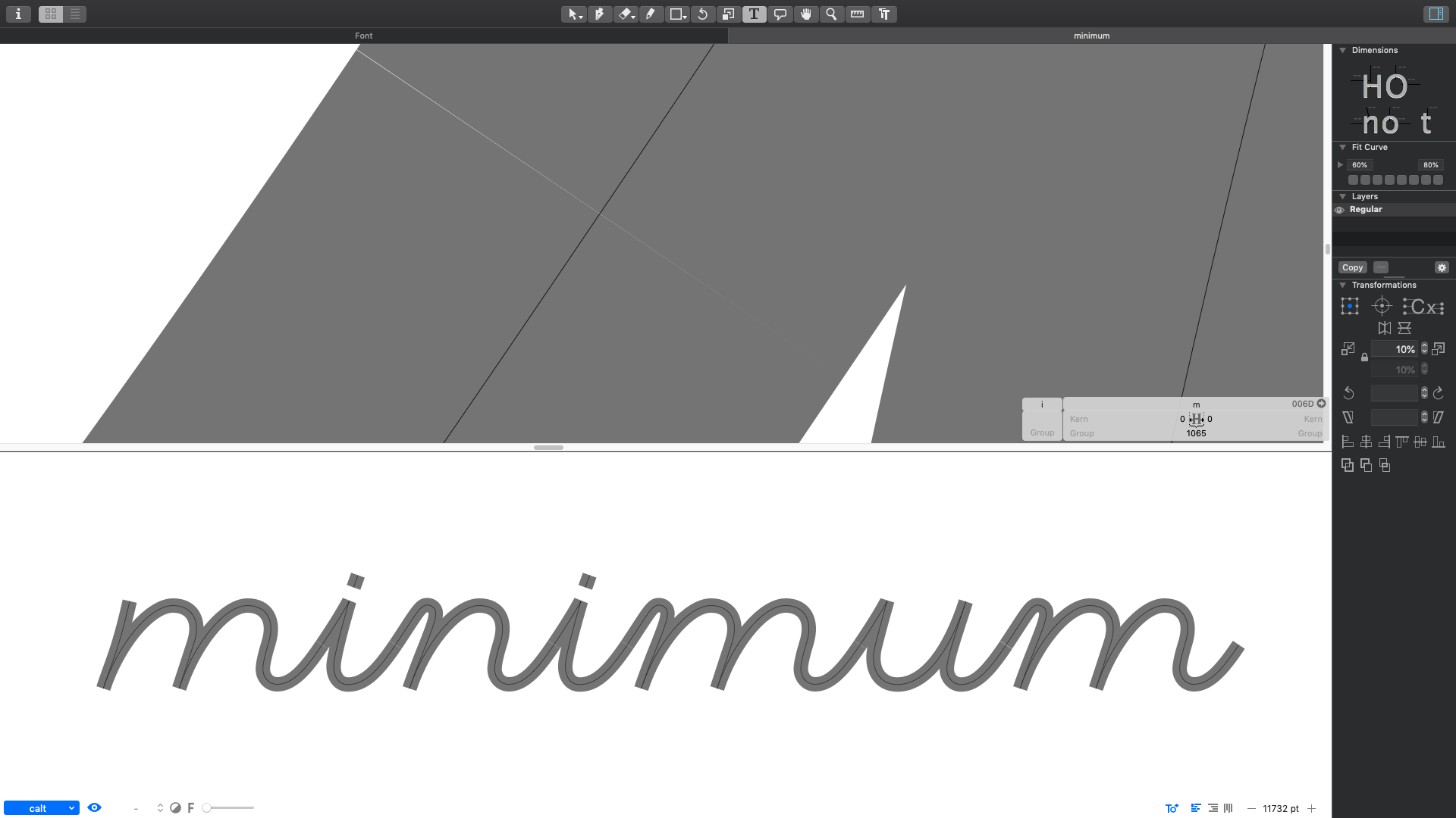
The offset filter does not make the two strokes touch correctly though, there is a little white space, which is visible if I zoom in, and even more visible in illustrator or indesign, where the output is even jagged. I did uncheck autohinting upon exporting.
How can I solve this?
Do I have to actually apply the filter before exporting and adjust the anchor points letter by letter or is there a quicker and more clever way?
Thanks!
Hi Georg, thanks, but I have not, since I want to keep straight terminals for initial and final forms, to achieve a more vintage italian sign look, round ends would look too contemporary.
Would it be possible to apply the filter only on some points or does it work for the whole glyph?
Thanks
Maybe extend the connecting bits by a unit? Best is a little overlap in the middle of the stroke, or a circle. In that case, cannot spare you from expanding and finetuning, sorry.
Thank you Rainer, fine tuning is ok if it is the only way to get exactly what I want. It is the first font I make, so sometimes I am a little bit unsure if I come to the right conclusion or I just don’t know better.
Thanks for all the help here in the forum and the instructional material you provide, it makes such a great difference.