Inconsistent Kerning Compatibility with Flash / Animate

Previously, I had believed that Flash (aka Adobe Animate) did not support kerning, and that I would have to live with its lack of kerning capabilities for the rest of my life. But I recently got upset enough to try to find a solution, only to learn that it did in fact have a feature for using kerning from the fonts.

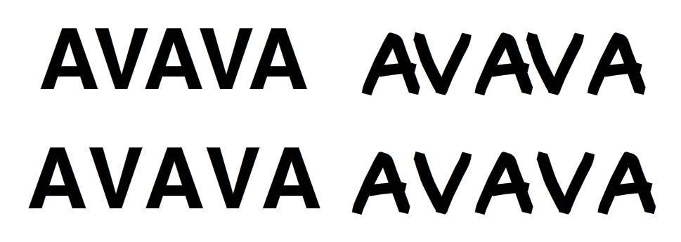
Below is Helvetica on the left and a draft of my font on the right.

On the top row, “Auto Kern” is enabled, which basically means it uses the kerning information from the font, or at least, so I’m told.

On the bottom row, Auto Kern is disabled for both fonts. But, as you might’ve guessed, the one I made in Glyphs isn’t having its kerning information read correctly.

Now, I know it’s not anyone’s job here to worry about an animation program’s ability to do type correctly (I mean it can’t even access OpenType alternates… seriously dude?) but what bugs me about this issue is that it’s clearly working fine with Helvetica, a professionally released font, but it’s not working at all with my amateur font.

I double checked in Photoshop to make sure that I hadn’t just forgot to kern AV, and yeah, it works fine in Photoshop, so I know it’s in there.

But there must be some kind of difference here that’s causing my font’s kerning to be ignored, while another font’s kerning is read just fine, and, since Flash can’t be expected to do anything right, I was hoping that I could try to fix something about MY font instead.

By the way, I know the easiest answer is “don’t use flash” but I wouldn’t be here with this if that was an option. I can’t manually kern this because there’s loads and loads of text, and this font is kind of kerning-heavy, due to its handwritten nature.

So yeah, I need help figuring out how to restructure my font’s innards to be readable to even the stupidest of programs, if that’s even an option available to me with the filetypes Glyphs can publish as.

AHA! One more thing, I suspected it might be because Helvetica, being a font that came with my computer, might be a different file format. And it was, I think a .dfont, so I went to try out a bunch of TTFs that came with my computer to see if any of them had compatible kerning.

Anyway, Apple Chancery was a bust, but that one’s kind of weird anyway so I wasn’t too surprised. I checked Arial next, which was a TTF, and, admittedly to my surprise, Flash played nice with its kerning, and it actually worked!

02%20AM

So now I just need to figure out what Arial is doing right, where I’m doing something wrong.

I didn’t check this but it might be that the font that do work have a kern table (as opposed to a kern OpenType feature). There is a custom parameter that makes Glyphs write a kern table.

Thanks, I should try that. But wouldn’t exporting at TTF mean it’s doing that anyway, since it’s not OpenType? Or am I confused?

Also, what’s the name of the custom parameter?

TrueType is just the same as OpenType nowadays. Just the format of the outlines is different.

Cool, good to know. I looked through the custom parameters and couldn’t find anything about kerning, so I’m not sure if I’m doing something wrong.

I forgot, this parameter is kind of secret. It is Write Kern Table. Add it to an instance or the font.

2 Likes

AAAAAAAAAAAAAA!!! IT WORKS!!! THANKYOUTHANKYOUTHANKYOU OMGOM GOMOMG OMG

1 Like

Flash?! wow, would love to see what you use it for.

I hope to eventually use it for a comic that people are actually supposed to look at, but in the meantime, I’ve been using it for a private, production-only comic/storyboard for a cartoon I’m working on. Forgive the tight crop, it’s for something that’s not publicly released yet. Also, this is from before I added kerning.
01%20PM
There’s a huge amount of text in this storyboard, and it would be a complete waste of time to write it out by hand. But I wanted to at least match the handwritten look of my lettering, even if I WAS using a font, so that’s what this one is for.

There’s a number of reasons why I should be drawing my comics in other programs, but the main reason I’m sticking with flash for now is that its line quality is really weird, in a way that feels like drawing on paper, in a way no other program has yet been able to achieve.

1 Like

Yeah, there’s been no other app like Flash that was so accessible to designers in making drawings, animations and interactive pieces.
nice stuff!

1 Like