I have created a font in Glyphs Mini 2 and it all looks fine in there. When I export the font and type some text in Word, the kerning is off and the spacing between letters is different than in Glyphs.
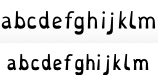
Glyphs at the top, Word at the bottom:
Notice that, in Word, the space between “f” and “g” is larger and between “g” and “h” is smaller. What can I do about this?
Hi. If I remember correctly, Word doesn’t automatically have kerning enabled for, you need to activate it individually per document. In your image above it simply looks like the kerning is disabled.
In Word, go to Format > Font, click Advanced and check the Kerning box under Character Spacing.