I’ve read a few times across the forum that inflection points can cause difficulties with interpolation. I’m deleting them as much as possible, using select all, cmd J to try and preserve the original shapes. This is working quite well.
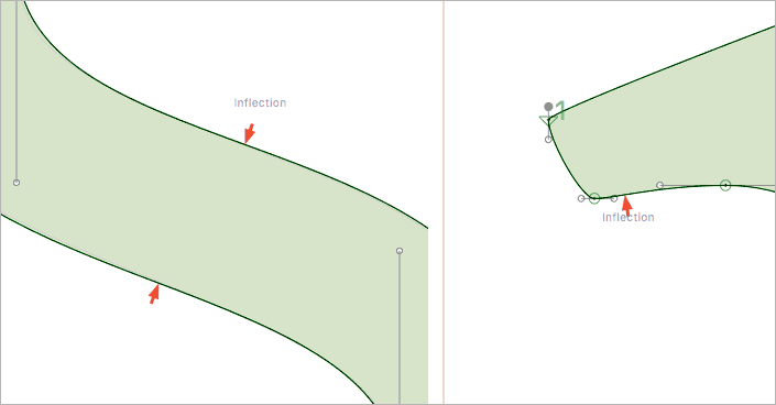
My question relates to the red arrows plug-in. This is flagging inflections, as shown below. Should these be of concern when it comes to interpolation, and if so, what should I do about it?
Inflection are find with CFF based font. But trueType based Variable fonts will be problematic.
Thanks for the quick response, Georg. I’m not making the font variable, just a few weights between light and bold — no condensed or extended.
I do intend making CFF and TT versions though. Do the issues with TT only arise with Variable fonts?
Normal TrueType export will automatically insert the inflection points.
Yes. But of course, it is always a good idea to double check and pay special attention to the issue when you are testing your fonts.
I’m the author of RedArrow. Somebody requested that inflection points be flagged and I added that feature. The corresponding FontAudit test in FontLab, on which RedArrow is based, flags only inflection points that may not be easily visible, like in your second image.
RedArrow points at possible errors; it is perfectly normal that you may choose to ignore some of them. I haven’t yet found a way to reliable discern real errors from ‘errors’ made by the designer on purpose.
1 Like
Thanks jkutilek. I suspected as much but wanted to know any possible pitfalls before proceeding with a second master.